8 ggplot2によるデータの可視化
8.1 はじめに
ggplot2の初歩のページでは、ggplot2 が「グラフの文法」に基づいてグラフを構築する仕組みを解説しました。
具体的には、グラフの3つの必須要素である data(データ)、aes(マッピング)、geom(ジオメトリ)の役割を学び、最も基本的なグラフとして散布と棒グラフの作成方法を扱いました。また、labs() によるラベル設定、theme_bw() によるデザインテーマの適用、ggsave() によるグラフ画像の保存という、データ可視化の基本的な流れを説明しました。
ggplot2 パッケージを知らない場合はまず上記の記事を読んでください。
このページの目標
このページでは、ggplot2 が持つより応用的・発展的な機能について解説します。
まず、下記のようなさまざまなタイプのグラフの作成方法を紹介します。
- 散布図 (geom_point)
- 棒グラフ (geom_bar, geom_col)
- 折れ線グラフ (geom_line)
- ヒストグラム & 密度プロット (geom_histogram, geom_density)
- 箱ひげ図 & バイオリンプロット (geom_boxplot, geom_violin)
- ヒートマップ (geom_tile)
次に、scale_*() ファミリーの関数を使った色・形・軸の目盛りの詳細なカスタマイズ方法や、theme() 関数を使った凡例の位置やグリッド線の表示といった、グラフの詳細なデザインの方法を示します。
最後に、facet_wrap() を用いたグラフの分割や、geom_smooth() による統計情報の追加など、より高度なデータ表現テクニックを紹介します。
8.2 散布図 (geom_point)
散布図は2つの量的変数(数値)の関係性を視覚化するのに最も適したグラフです。
geom_point() を使って作成できます。
penguins データの bill_length_mm(クチバシの長さ)と body_mass_g(体重)の関係を示す散布図を作成します。
library(ggplot2)
library(palmerpenguins)
dat = palmerpenguins::penguins

fig = ggplot(dat, aes(x = bill_length_mm, y = body_mass_g)) +
  geom_point()
plot(fig)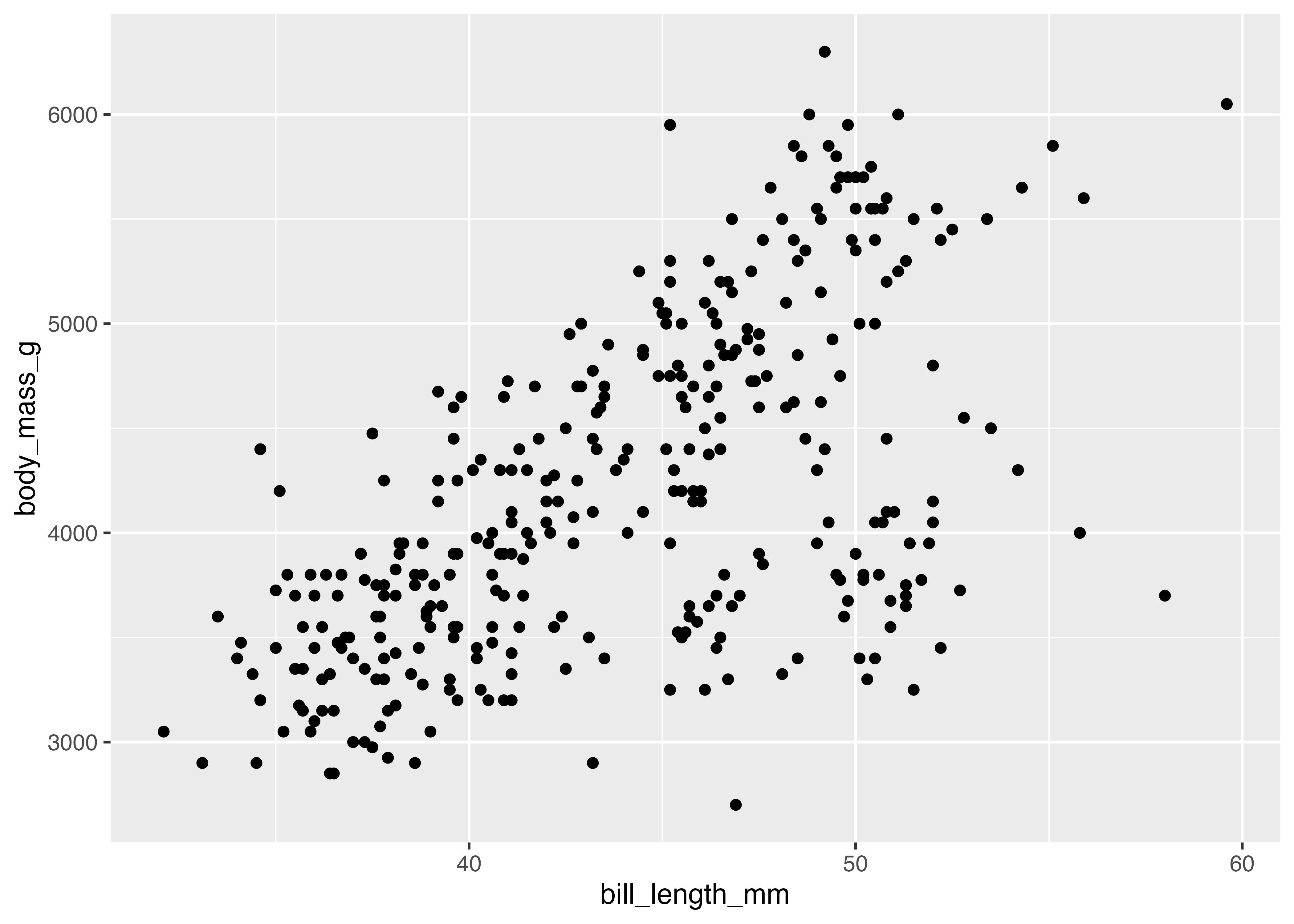
グラフに装飾を加えます。点の色を島(island)でマッピングし、点の形を性(sex)でマッピングします(aesの中で指定)。また、点のサイズ(size)を大きくし、透明度(alpha)も指定します(geom_point()の中で指定)。
fig = ggplot(dat, aes(
  x = bill_length_mm,
  y = body_mass_g,
  color = island,
  shape = sex)
  ) +
  geom_point(size = 3, alpha = 0.75) +
  theme_classic()
plot(fig)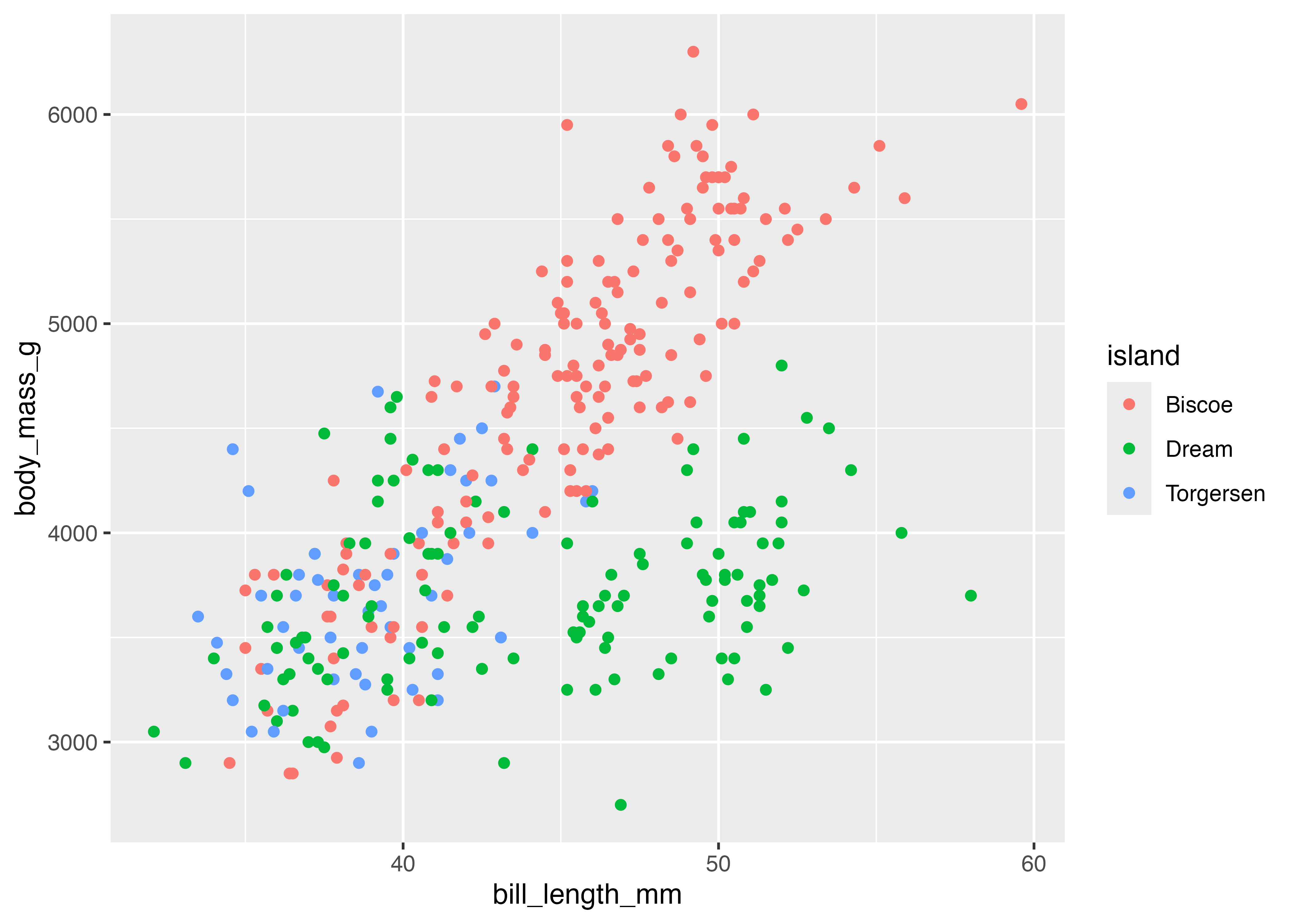
8.3 棒グラフ (geom_bar, geom_col)
棒グラフは、カテゴリ(質的変数)ごとの量や値の大小を比較するのに適しています。ggplot2には、棒グラフを作成するgeomが2種類(geom_barとgeom_col)あり、目的によって使い分ける必要があります。
geom_bar(): データの件数を自動で集計する
geom_bar() は、指定されたカテゴリに属するデータの行数(件数)を自動的にカウントし、その結果を棒の高さにします。aes() では通常、X軸(またはY軸)のみを指定します。
例えば、species(種)ごとのペンギンの数を可視化する場合は、X軸に species を指定するだけです。
library(ggplot2)
library(palmerpenguins)
dat = palmerpenguins::penguins

fig = ggplot(dat, aes(x = species)) +
  geom_bar(fill = "#88b5d3")
plot(fig)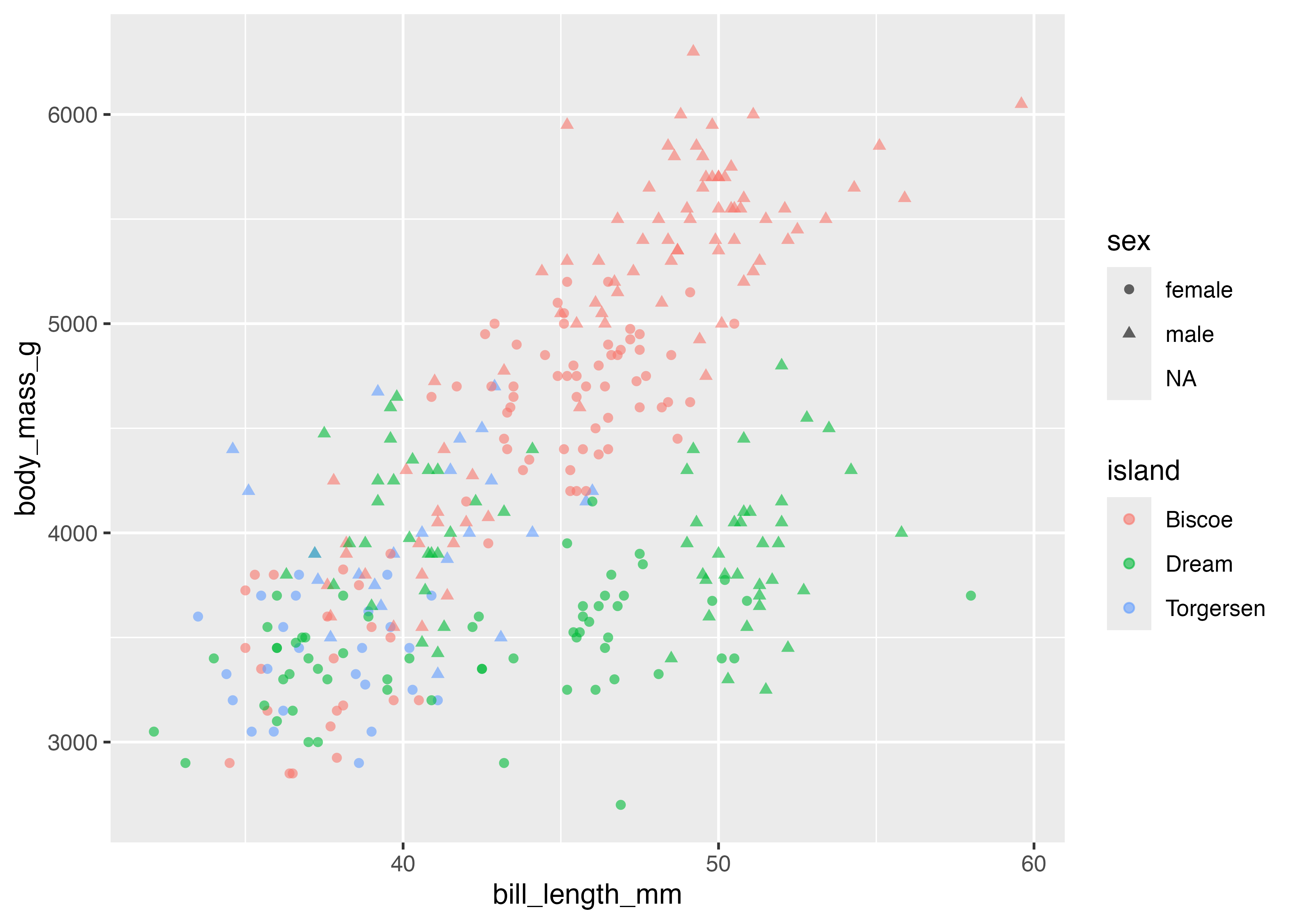
棒グラフに修正を加えます。
- 棒の色を指定する際は
fillを使います(colorではないので注意)。 - 棒の横幅を変えるには、geom_bar() の中で
widthを指定します。デフォルト値は0.9なので、少し細めにするために0.5を指定してみます。 - デフォルトではX軸の下側に余白がありますが、棒グラフの場合はこの余白を無くしたい。そこで
cale_y_continuous()を追加し、expand引数を設定します。
library(ggplot2)
library(palmerpenguins)
dat = penguins

fig = ggplot(dat, aes(x = species)) +
  geom_bar(fill = "#88b5d3", width = 0.5) +
  scale_y_continuous(expand = expansion(mult = c(0, 0.05))) +
  theme_classic()
plot(fig)
ここで使われているmult = c(0, 0.05)の意味:
0: 下側の余白を 0% にする(これで棒がx軸に接します)。0.05: 上側の余白はデフォルトの 5% を維持する(棒グラフの先端がプロット領域の天井にぶつからないように)。
fill による積み上げと横並び
aes() で fill(塗りつぶし)を指定すると、それぞれの棒の内訳を色で示すことができます。デフォルトでは棒はposition = "stack"(積み上げ)で表示されます。
fig = ggplot(dat, aes(x = species, fill = sex)) +
  geom_bar(width = 0.5) +
  scale_y_continuous(expand = expansion(mult = c(0, 0.05))) +
  theme_classic()
plot(fig)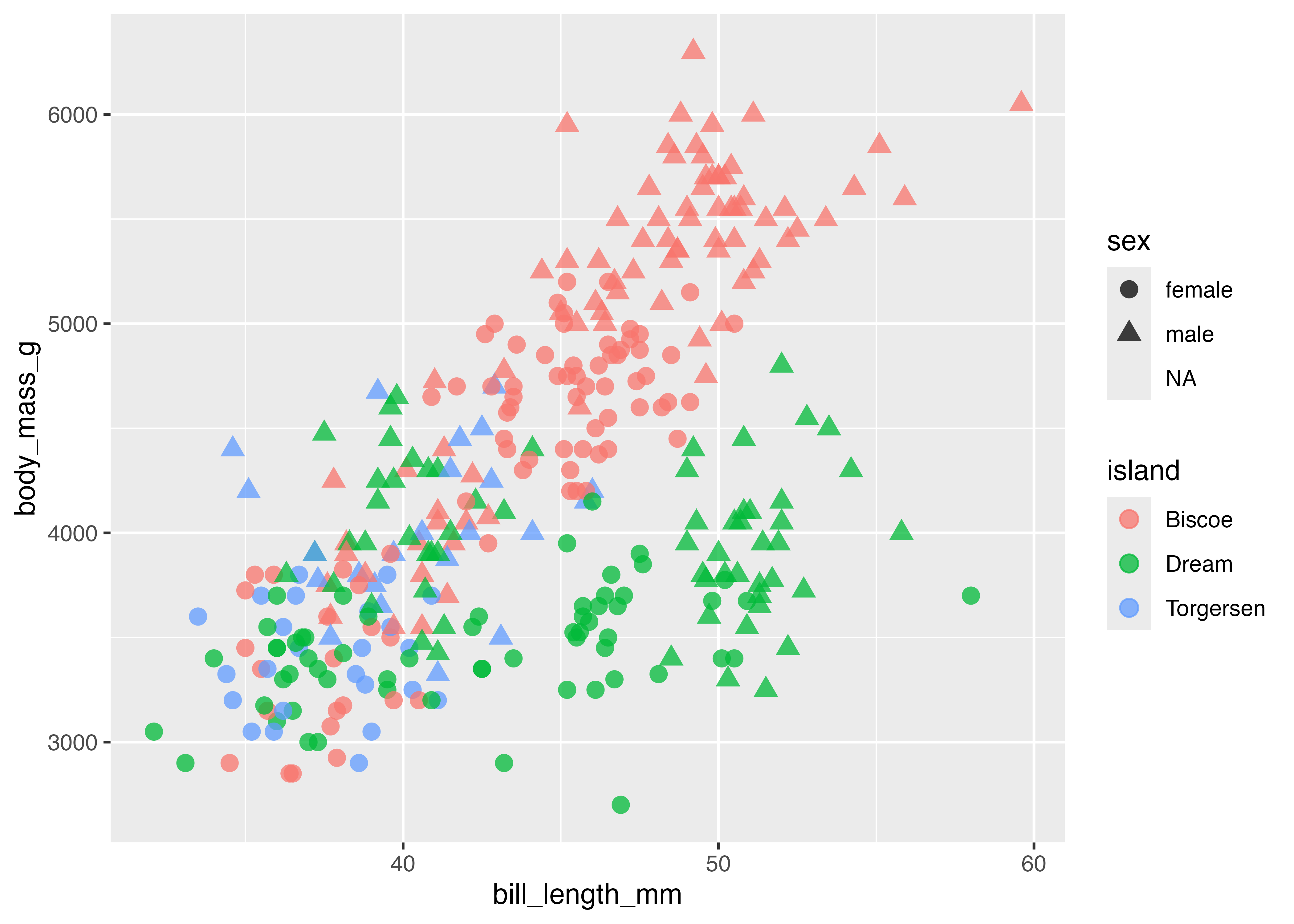
積み上げではなく、横に並べて比較したい場合は、geom_bar() の中でposition = "dodge"を設定します。
fig = ggplot(dat, aes(x = species, fill = sex)) +
  geom_bar(width = 0.5, position = "dodge") +
  scale_y_continuous(expand = expansion(mult = c(0, 0.05))) +
  theme_classic()
plot(fig)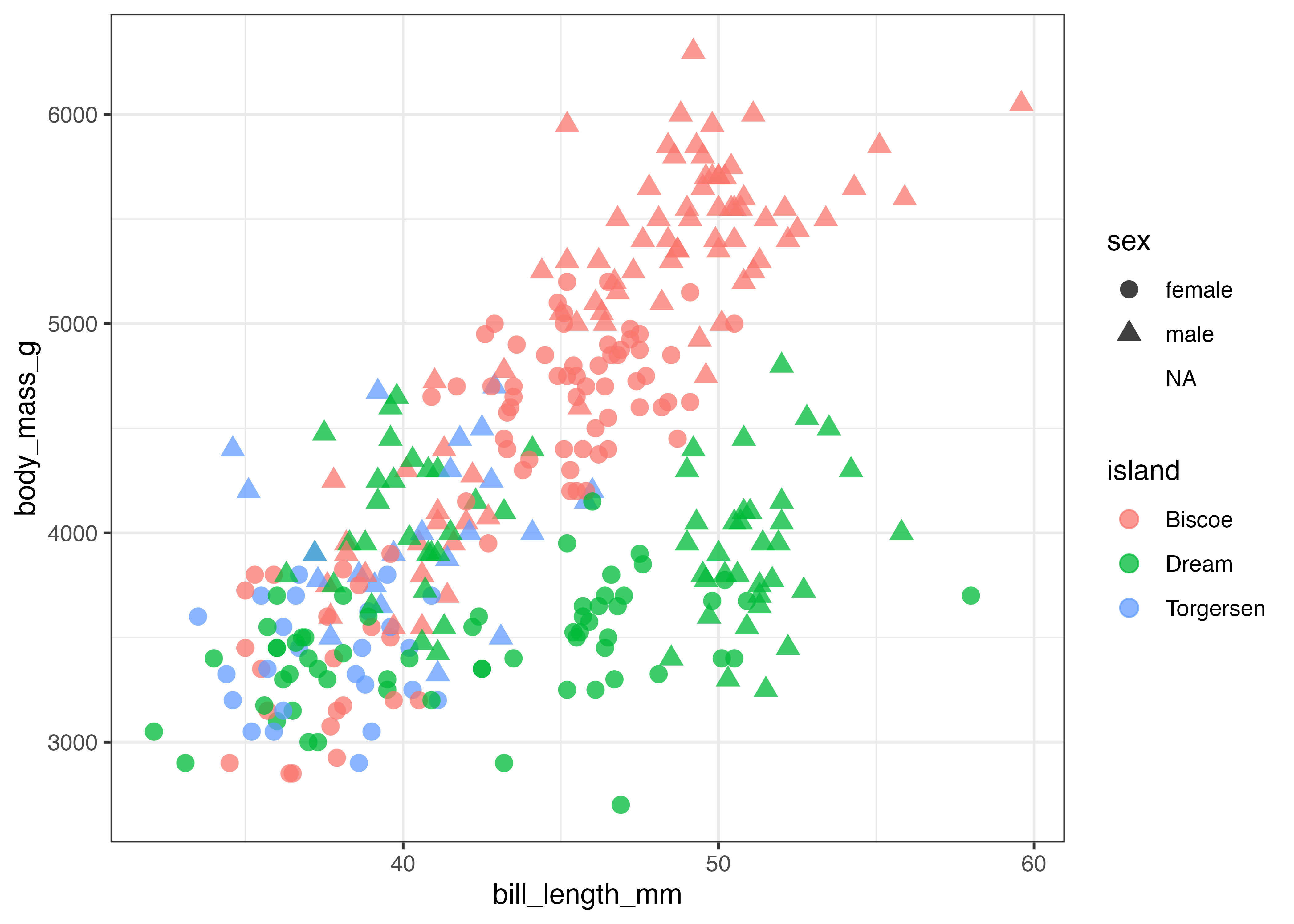
性別が欠損値であるデータが含まれているせいで、NAの棒が現れています。これが不要な場合は、データからNAの列を除外した上でグラフを作成するとよいでしょう。
dat2 = subset(dat, !is.na(sex))
fig = ggplot(dat2, aes(x = species, fill = sex)) +
  geom_bar(width = 0.5, position = "dodge") +
  scale_y_continuous(expand = expansion(mult = c(0, 0.05))) +
  theme_classic()
plot(fig)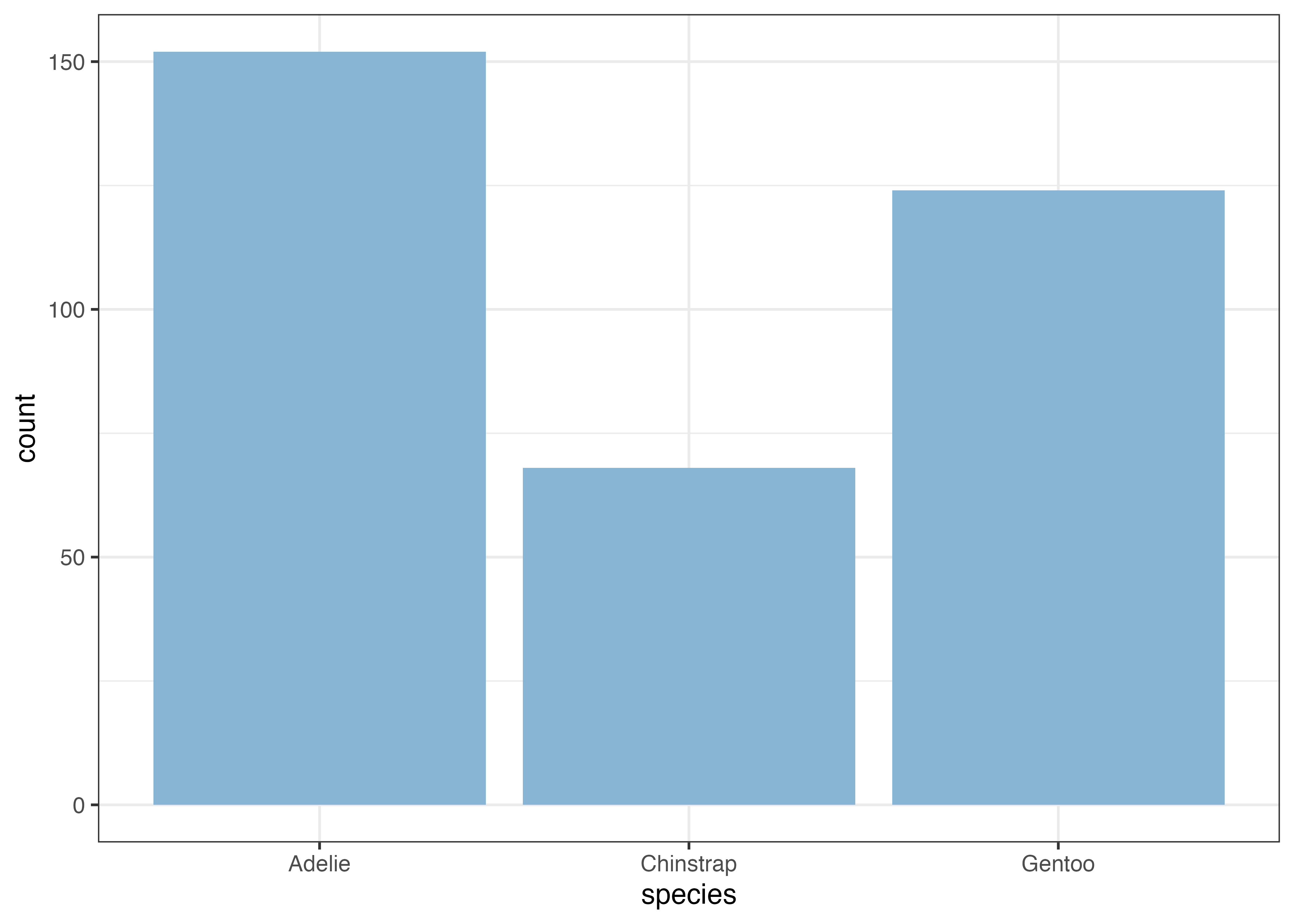
棒グラフを横向きにする
棒グラフの方を縦方向ではなく横方向に伸ばしたい場合があります。
やり方は2通りあります:
aes(x, y)のマッピングを入れ替える
xとyに指定する値(列名)を逆にすればよいです。coord_flip()を使う
これはグラフの方向を90度回転させる関数です。これを使う場合は aes の書き方は元のままで、グラフ作成の最後の方で coord_flip() を追加します。
coord_flip() は、箱ひげ図 geom_boxplot() など、xとyを入れ替えるだけでは横向きにならないグラフを回転させたい場合にも使います。
上のグラフ作成処理の最後の部分に coord_flip() を追加してみます。
dat2 = subset(dat, !is.na(sex))
fig = ggplot(dat2, aes(x = species, fill = sex)) +
  geom_bar(width = 0.5, position = "dodge") +
  scale_y_continuous(expand = expansion(mult = c(0, 0.05))) +
  theme_classic() +
  coord_flip()
plot(fig)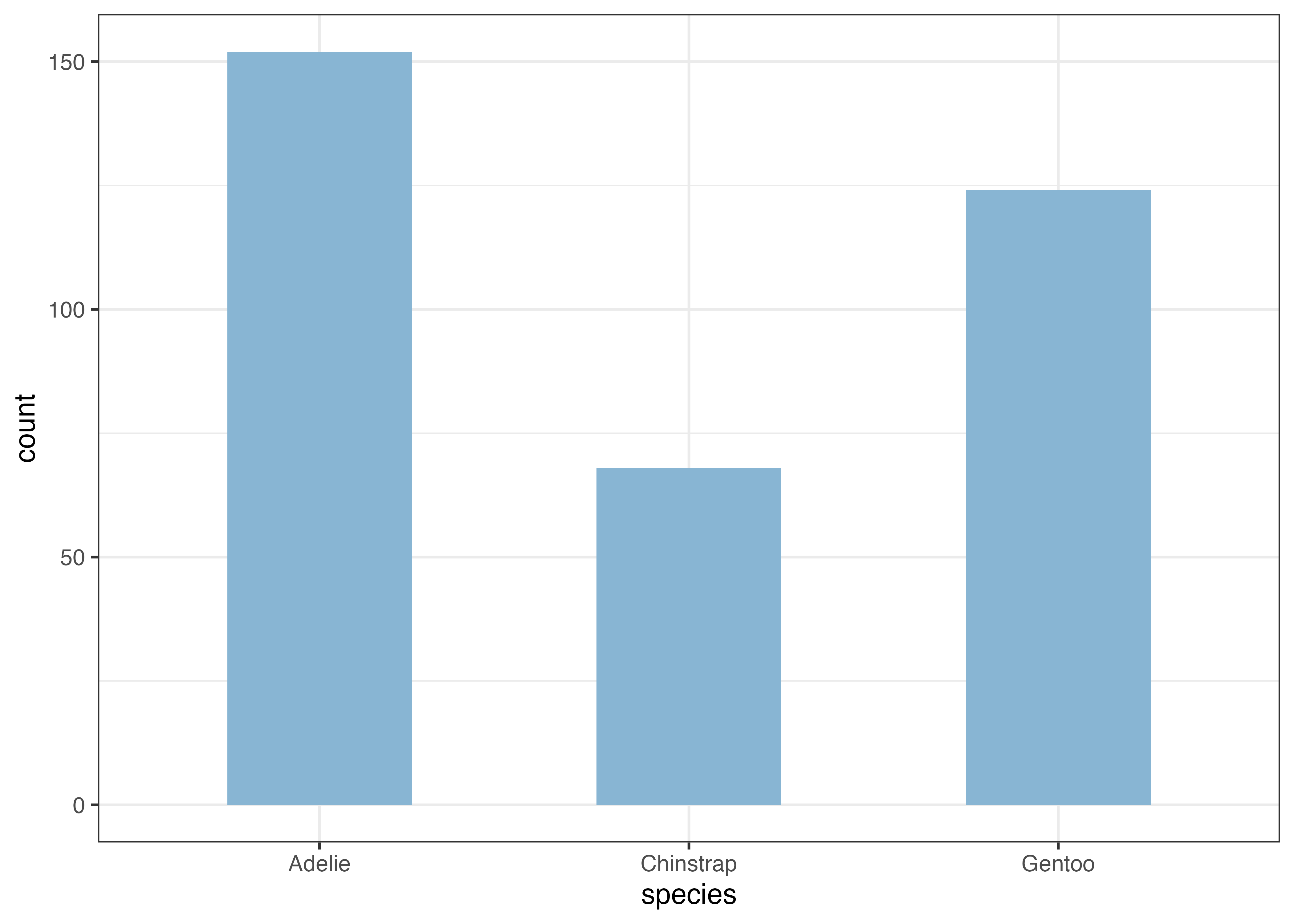
なお、coord_flip() は棒グラフだけではなく、他の種類のグラフでも使うことができます。
geom_col(): あらかじめ集計された値を使用する
上述したgeom_bar()は、指定されたカテゴリごとのデータの件数(カウント数)を表示します。一方で、カウント数以外の値を縦軸として表示したい場合もあります。たとえば、ペンギンの種ごとの平均体重を表示する、などです。
このような場合にはgeom_col()を使います。この関数を使うことで、平均値などの集計値を棒グラフにすることができます。aes() では、カテゴリを指定するX軸と、値を指定するY軸の両方が必要です。
例として、species ごとの平均体重 (body_mass_g) を可視化します。まず、aggregate() 関数(Base Rの関数)を使って集計用のデータフレームを作成します。
aggregate 関数の第一引数は集計対象の列名 ~ 集計したいカテゴリの列名という形式で指定します。dataには元となるデータを、FUNには集計値を計算するための関数(平均値であれば mean 関数)を指定します。na.rm = TRUEは欠損値(NA)を除外して計算するオプションです。
# 種類(species)ごとの平均体重を計算
df = aggregate(body_mass_g ~ species, data = dat, FUN = mean, na.rm = TRUE)
print(df)
##     species body_mass_g
## 1    Adelie    3700.662
## 2 Chinstrap    3733.088
## 3    Gentoo    5076.016

# 作成した df を使ってプロット
fig = ggplot(df, aes(x = species, y = body_mass_g)) +
  geom_col(fill = "#88b5d3", width = 0.6) +
  scale_y_continuous(expand = expansion(mult = c(0, 0.05))) +
  theme_classic()
plot(fig)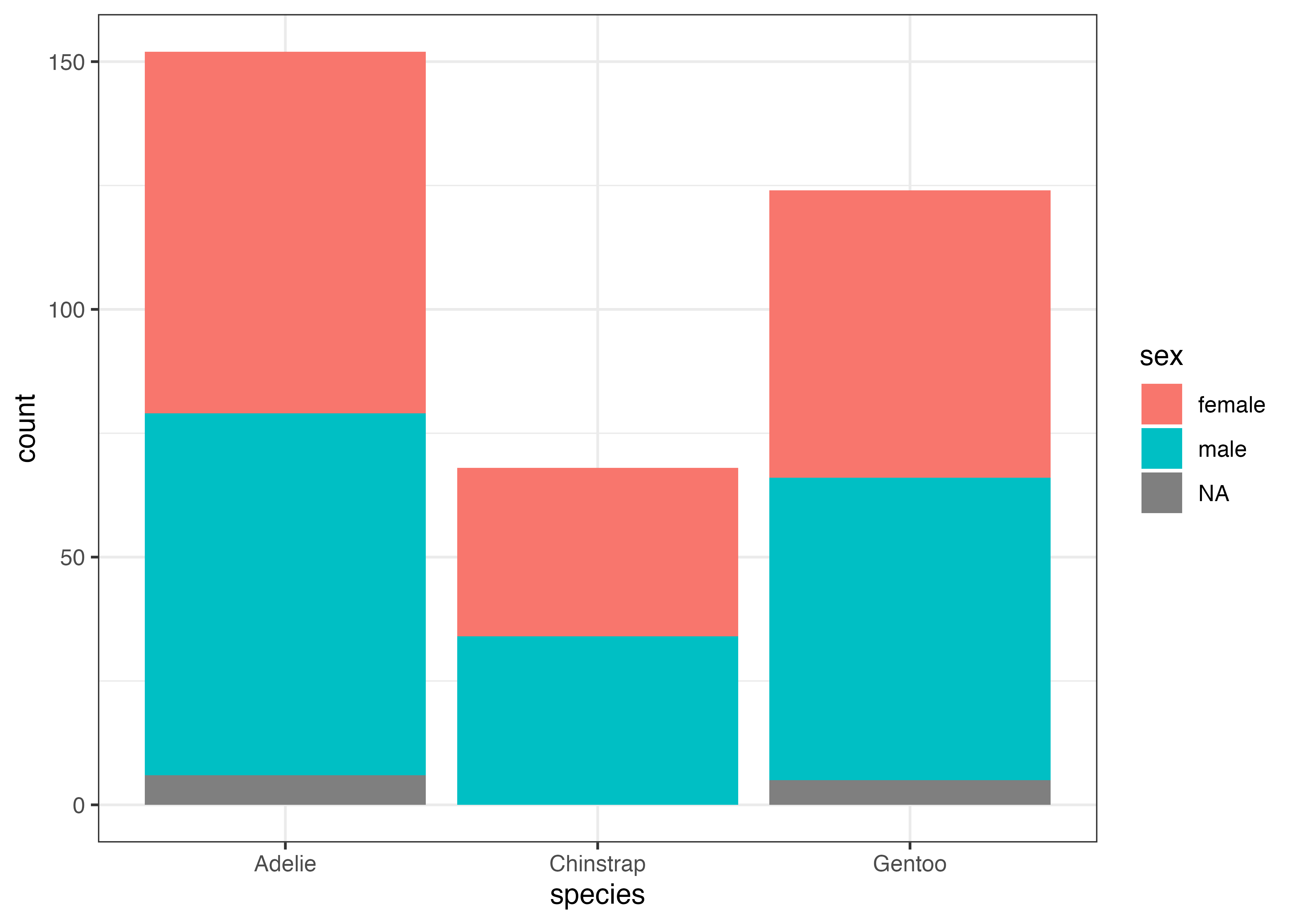
上記の df は体重の平均値が集計された2列3行だけのデータフレームです。これを ggplot 関数のデータとして使っています。aes() 内では x 軸と y 軸に df のそれぞれの列名を指定しています。
カウント数の表示に使ったgeom_bar()では元のデータである dat(344行)をそのまま使っていたのに対し、geom_col()では集計済みのデータである df(3行だけ)を使用している点が大きな違いです。
なお、geom_col()でもfillやposition = "dodge"は利用可能です。species と island ごとの平均体重を比較してみましょう。今回は「種ごと」かつ「島ごと」での平均体重を集計したいので、aggregate 関数においてbody_mass_g ~ species + islandと書きます。
# 種類(species)と島(island)ごとの平均体重を計算
df = aggregate(body_mass_g ~ species + island, data = dat, FUN = mean, na.rm = TRUE)
print(df)
##     species    island body_mass_g
## 1    Adelie    Biscoe    3709.659
## 2    Gentoo    Biscoe    5076.016
## 3    Adelie     Dream    3688.393
## 4 Chinstrap     Dream    3733.088
## 5    Adelie Torgersen    3706.373

# df を使い、island で色分けして横並びに
fig = ggplot(df, aes(x = species, y = body_mass_g, fill = island)) +
  geom_col(position = "dodge", width = 0.6) +
  scale_y_continuous(expand = expansion(mult = c(0, 0.05))) +
  theme_classic()
plot(fig)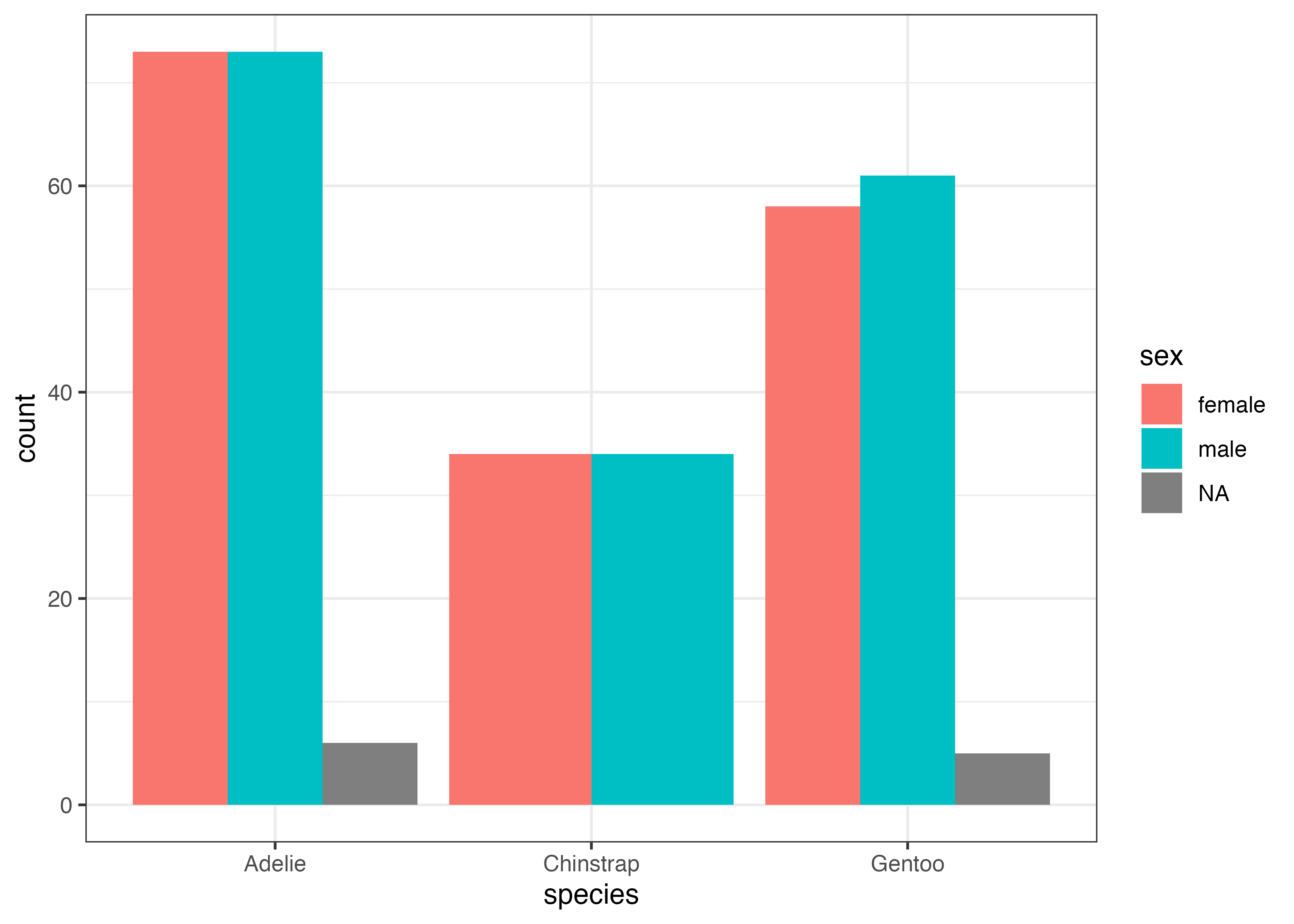
エラーバーの追加
エラーバーを追加するにはgeom_errorbar()を使います。この関数ではエラーバーの上端 (ymax) と下端 (ymin) を aes() で指定する必要があります。geom_errorbar() を使うためには、エラーバー用の値を計算したデータフレームを事前に用意する必要があります。
ペンギンの種ごとの平均体重を可視化する際に、エラーバーとしてSD(標準偏差)をつけてみましょう。種ごとに体重の平均値とSDを計算しまとめたデータフーレムを準備します。
# species ごとの平均値(mean)を計算
d_mean = aggregate(body_mass_g ~ species, data = dat, FUN = mean, na.rm = TRUE)
# species ごとの標準偏差(sd)を計算
d_sd = aggregate(body_mass_g ~ species, data = dat, FUN = sd, na.rm = TRUE)
# 平均値と標準偏差を一つデータフレームにまとめる
df = data.frame(
  species = d_mean$species,
  avg = d_mean$body_mass_g,
  sd = d_sd$body_mass_g
)
print(df)
##     species      avg       sd
## 1    Adelie 3700.662 458.5661
## 2 Chinstrap 3733.088 384.3351
## 3    Gentoo 5076.016 504.1162

fig = ggplot(df, aes(x = species, y = avg)) +
  geom_col(fill = "#88b5d3", width = 0.6) +
  geom_errorbar(aes(ymin = avg - sd, ymax = avg + sd), width = 0.1) +
  scale_y_continuous(expand = expansion(mult = c(0, 0.05))) +
  theme_classic()
plot(fig)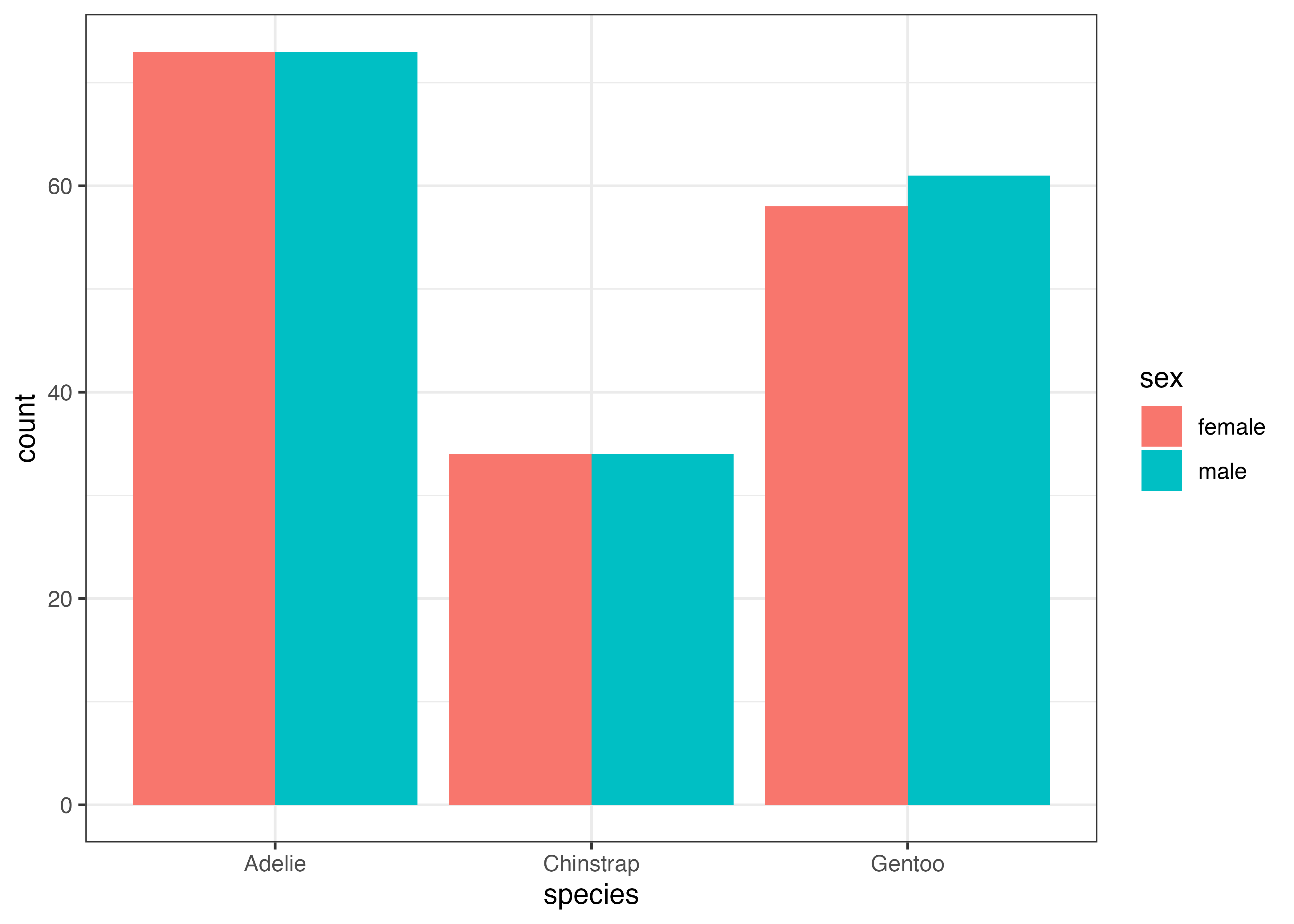
geom_errorbar() 関数において、ymin (下端)には「平均 - SD」、ymax (上端)には「平均 + SD」を指定しています。ここで使われている avg や sd という名前は df 変数にある avg 列や sd 列のことです。
なお、geom_errorbar() の中でwidth = 0.1のように設定すると、エラーバーの横幅が棒グラフの幅(ここでは0.5)より狭くなり、見やすくなります。
8.4 折れ線グラフ (geom_line)
8.4.1 stat_summary() を使う場合
折れ線グラフは、X軸に沿ったデータの連続的な変化や傾向を示すのに適しています。以下では penguins データセットの year 変数を使って、年ごとの平均体重を表示してみます。
stat_summary() 関数を用います。この関数には以下のような引数を指定します。
- fun(または fun.data):ここで指定した統計関数(今回は mean)で値を計算する。
- geom:ここで指定した形状(今回は line)で結果を描画する。
- fun.args:fun で指定した関数に渡したい引数をリストで指定する。
欠損値(NA)を含むデータで平均値を計算するにはmean(dat, na.rm = TRUE)という形でna.rm = TRUEという引数を使うので、これリストにして fun.args に渡します。
library(ggplot2)
library(palmerpenguins)
dat = palmerpenguins::penguins

fig = ggplot(dat, aes(x = year, y = body_mass_g)) +
  stat_summary(fun = "mean", geom = "line", fun.args = list(na.rm = TRUE))
plot(fig)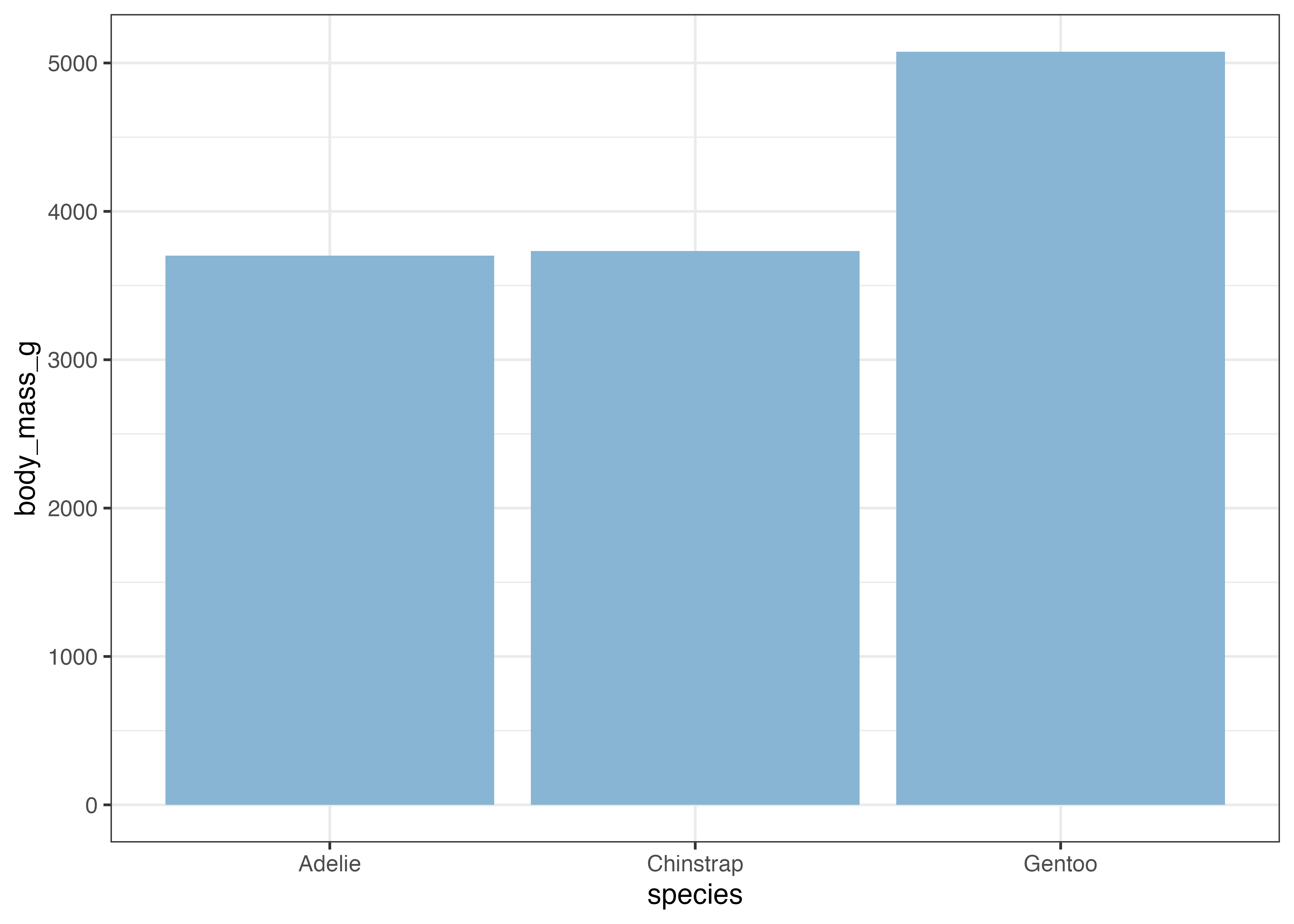
このグラフに、平均値の点を追加し、さらに標準偏差のエラーバーをつけてみます。点もエラーバーも stat_summary() 関数を使って描画します。以下の例ではエラーバー、折れ線、点の順で図形を描画しています。
fig = ggplot(dat, aes(x = year, y = body_mass_g)) +
  stat_summary(fun.data = "mean_sdl", geom = "errorbar",
               fun.args = list(mult = 1, na.rm = TRUE), width = 0.1) +
  stat_summary(
    fun = "mean", geom = "line", fun.args = list(na.rm = TRUE)) +
  stat_summary(
    fun = "mean", geom = "point", fun.args = list(na.rm = TRUE), size = 3)
plot(fig)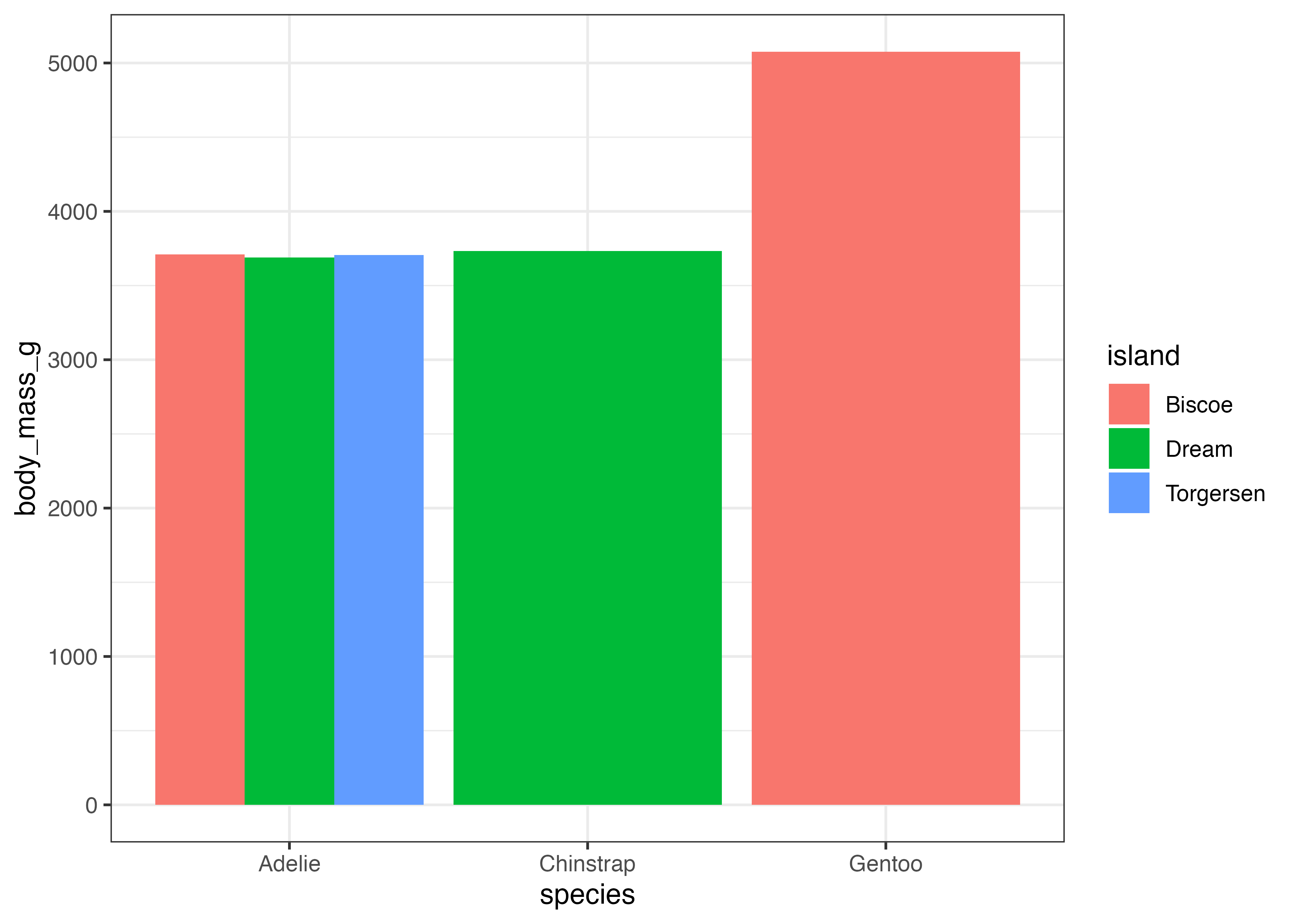
エラーバーを描画する場合のみ、引数を fun ではなく fun.data にする必要があります。stat_summary() 関数において fun を使うか fun.data を使うかは、どのような値を計算したいか(どのような geom で描画するか)によって決まります。
- fun: 1つの値を返す関数(mean, medianなど)を指定する時に使う。
geom = "point"(点)やgeom = "line"(線)のように、値が1つで描画できる geom と組み合わせて使います。 - fun.data: 複数の値を含むデータフレームを返す関数を指定する時に使う。
geom = "errorbar"(エラーバー)やgeom = "crossbar"(クロスバー)のように、範囲を必要とする geom と組み合わせて使います。
最後に、グラフの細かい見た目の調整を行います。
- X軸の目盛りを 2007, 2008, 2009 の3つに指定する。
- Y軸の範囲を 0 から 6000 にし、目盛りを 1500 刻みにする。Y軸の下の余白をなくす。
- 軸のラベルを指定する。
- クラシックテーマ(theme_classic)を指定する。
fig = ggplot(dat, aes(x = year, y = body_mass_g)) +
  stat_summary(fun.data = "mean_sdl", geom = "errorbar", fun.args = list(mult = 1, na.rm = TRUE), width = 0.1) +
  stat_summary(fun = "mean", geom = "line", fun.args = list(na.rm = TRUE)) +
  stat_summary(fun = "mean", geom = "point", fun.args = list(na.rm = TRUE), size = 3) +
  scale_x_continuous(breaks = c(2007, 2008, 2009)) +
  scale_y_continuous(
    breaks = c(0, 1500, 3000, 4500, 6000),
    limits = c(0, 6000),
    expand = expansion(mult = c(0, 0.05))) +
  labs(x = "Year", y = "Body Mass (g)") +
  theme_classic()
plot(fig)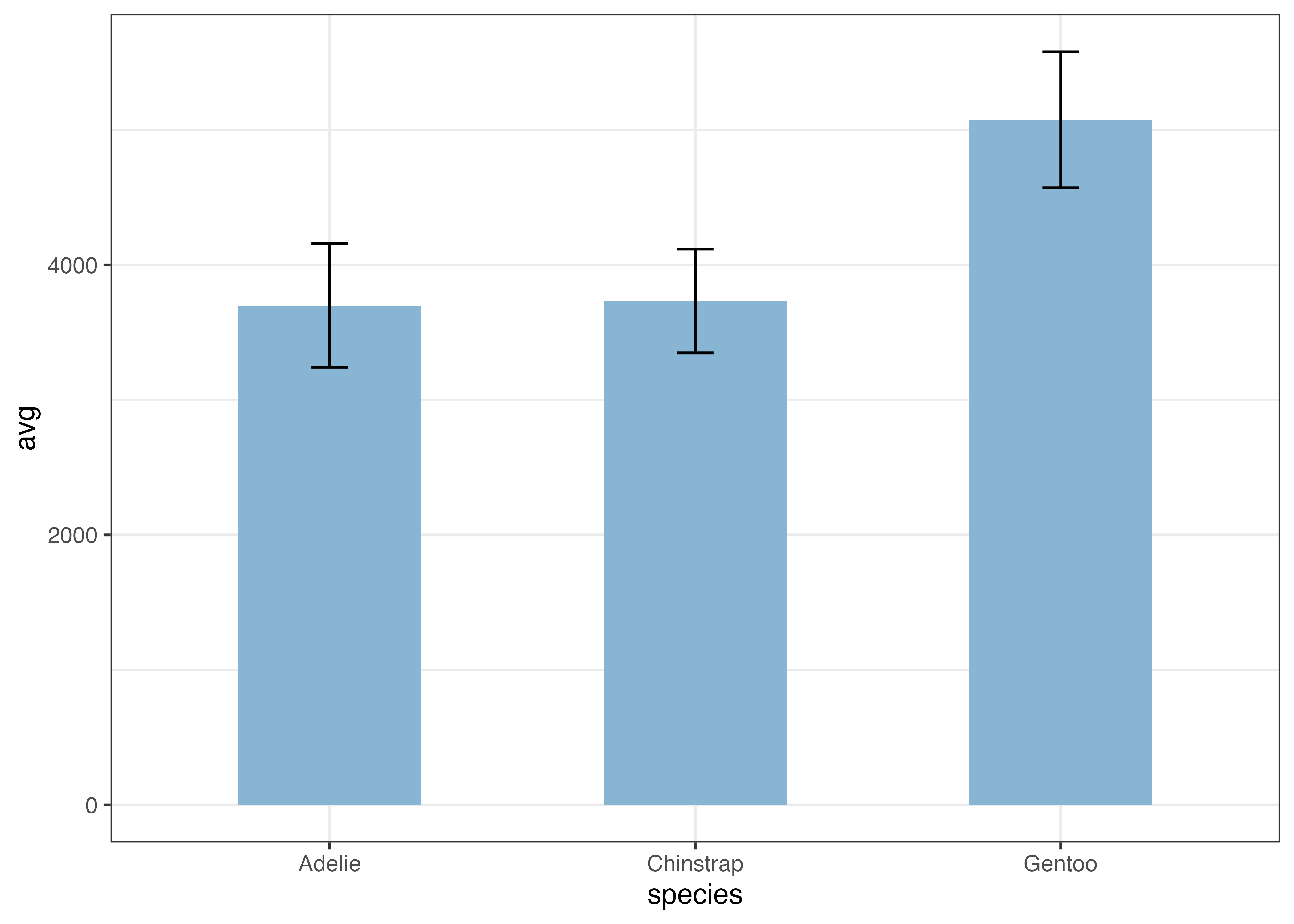
ここでさらに、種ごとで色をマッピングしてみましょう。
fig = ggplot(dat, aes(x = year, y = body_mass_g, color = species)) +
  stat_summary(fun.data = "mean_sdl", geom = "errorbar", fun.args = list(mult = 1, na.rm = TRUE), width = 0.1) +
  stat_summary(fun = "mean", geom = "line", fun.args = list(na.rm = TRUE)) +
  stat_summary(fun = "mean", geom = "point", fun.args = list(na.rm = TRUE), size = 3) +
  scale_x_continuous(breaks = c(2007, 2008, 2009)) +
  scale_y_continuous(
    breaks = c(0, 1500, 3000, 4500, 6000),
    limits = c(0, 6000),
    expand = expansion(mult = c(0, 0.05))) +
  labs(x = "Year", y = "Body Mass (g)") +
  theme_classic()
plot(fig)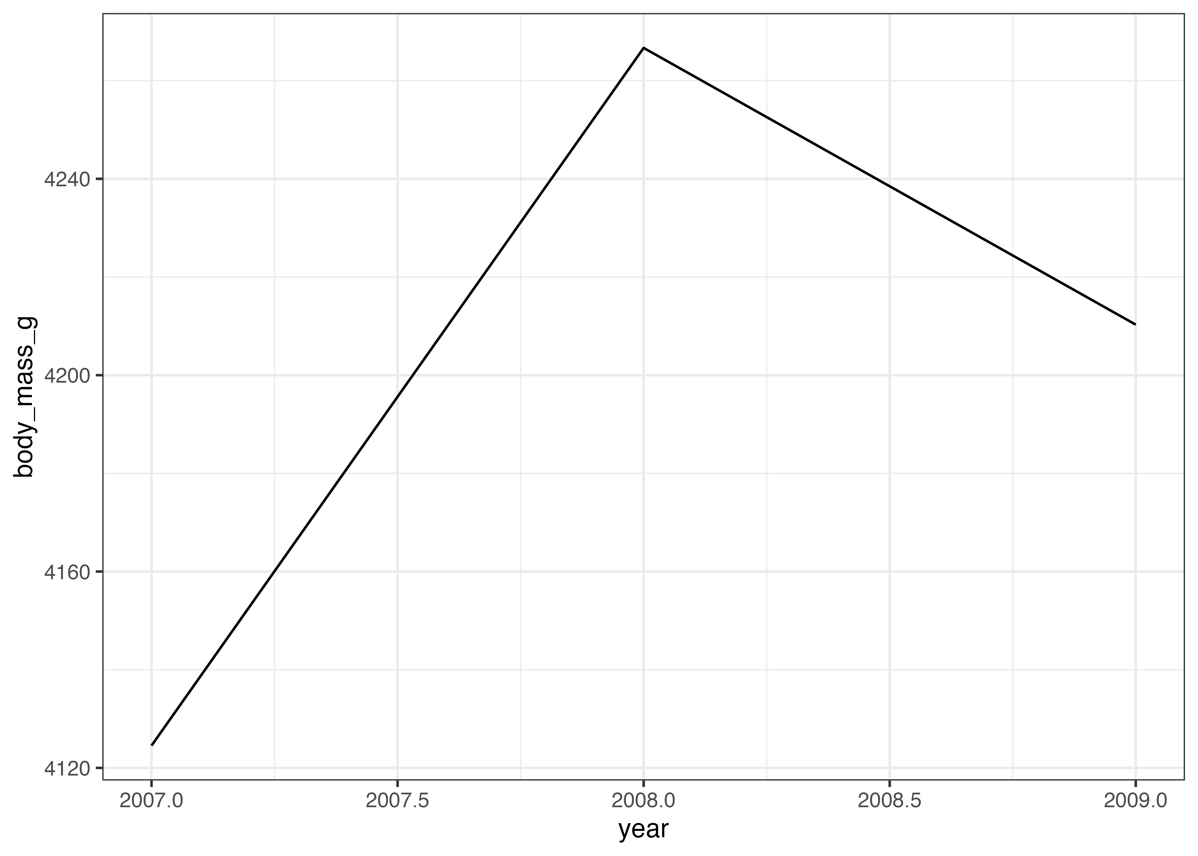
点やエラーバーが重なってしまい、見にくくなっています。このような場合には、stat_summary() 関数にposition = position_dodge(width = ずらす幅)という引数を指定します。
dodge_width = 0.1

fig = ggplot(dat, aes(x = year, y = body_mass_g, color = species)) +
  stat_summary(fun.data = "mean_sdl", geom = "errorbar", fun.args = list(mult = 1, na.rm = TRUE), width = 0.1, position = position_dodge(width = dodge_width)) +
  stat_summary(fun = "mean", geom = "line", fun.args = list(na.rm = TRUE), position = position_dodge(width = dodge_width)) +
  stat_summary(fun = "mean", geom = "point", fun.args = list(na.rm = TRUE), size = 3, position = position_dodge(width = dodge_width)) +
  scale_x_continuous(breaks = c(2007, 2008, 2009)) +
  scale_y_continuous(
    breaks = c(0, 1500, 3000, 4500, 6000),
    limits = c(0, 6000),
    expand = expansion(mult = c(0, 0.05))) +
  labs(x = "Year", y = "Body Mass (g)") +
  theme_classic()
plot(fig)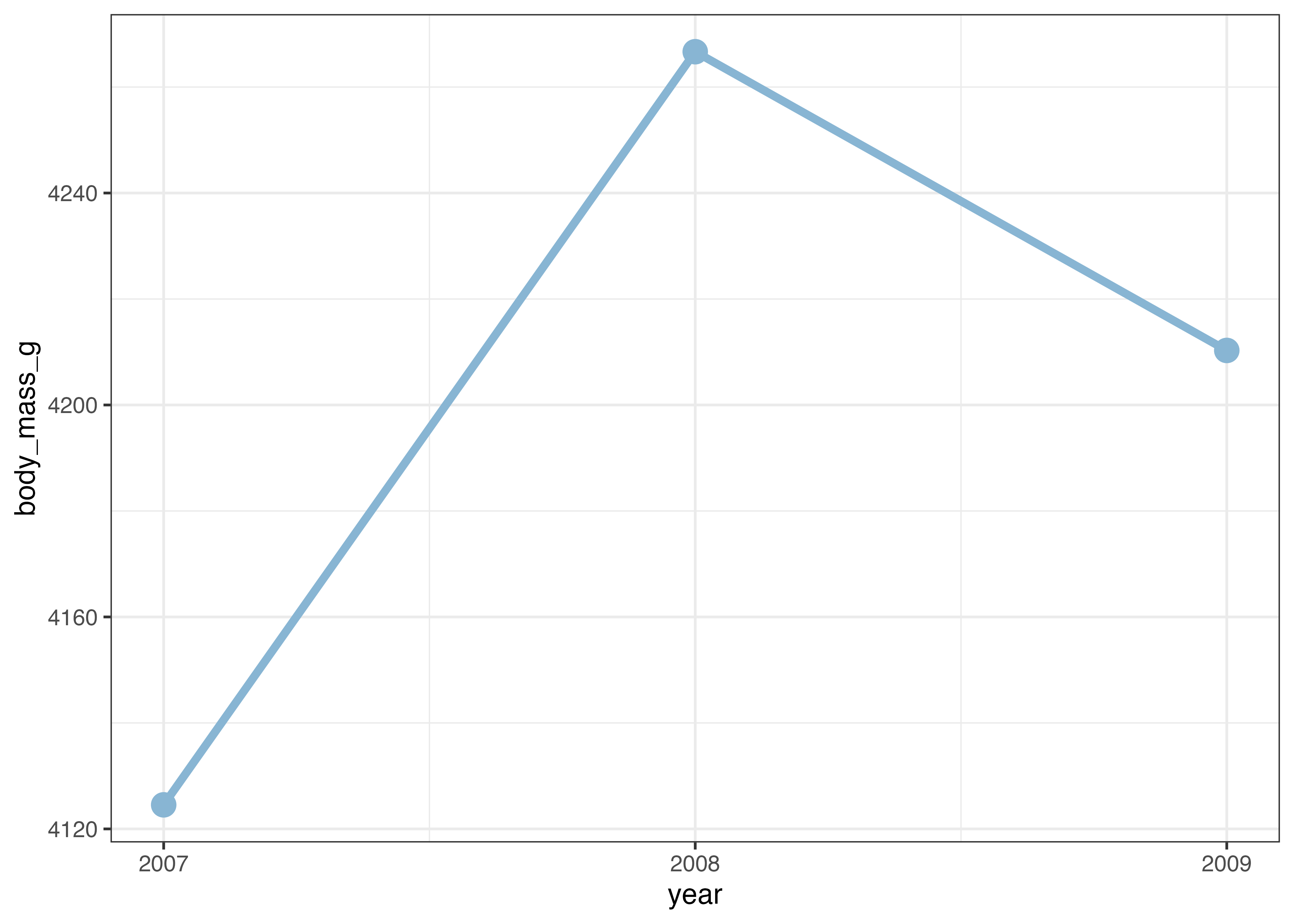
横方向に少しずれたおかげで、点やエラーバーの重なりが解消され、見やすくなりました。
8.4.2 geom_line() を使う場合
折れ線グラフを作る際に、棒グラフ(geom_col)の例と同様に、あらかじめデータを集計した上でグラフを作成することもできます。その場合は geom_line() 関数を使います。集計済みのデータしか手元にない場合にもこの関数を使って折れ線グラフを作成します。
library(ggplot2)
library(palmerpenguins)
dat = palmerpenguins::penguins

# 集計データの作成
df = aggregate(body_mass_g ~ year, data = dat, FUN = mean, na.rm = TRUE)
print(df)
##   year body_mass_g
## 1 2007    4124.541
## 2 2008    4266.667
## 3 2009    4210.294

# グラフの作成
fig = ggplot(df, aes(x = year, y = body_mass_g)) +
  geom_line()
plot(fig)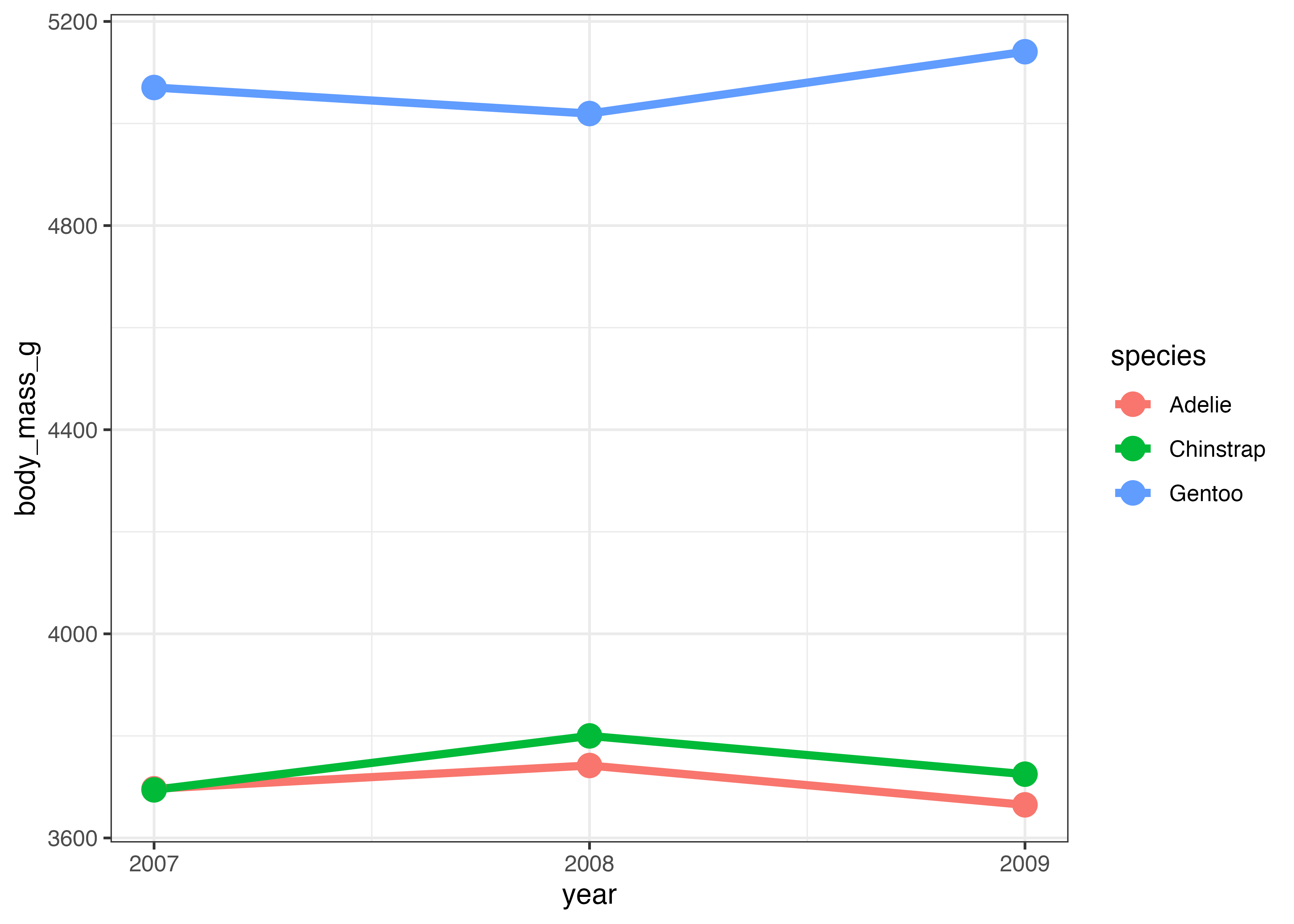
各データポイントに点を打ちたい場合はgeom_point()を追加します。size を使って線や点の太さを指定できます。色は color で指定します。
ついでに、X軸の値に2007.5など不必要な値が表示されているのを修正します。
fig = ggplot(df, aes(x = year, y = body_mass_g)) +
  geom_line(size = 1.5, color = "#88b5d3") +
  geom_point(size = 4, color = "#88b5d3") +
  scale_x_continuous(breaks = c(2007, 2008, 2009)) +
  theme_classic()
plot(fig)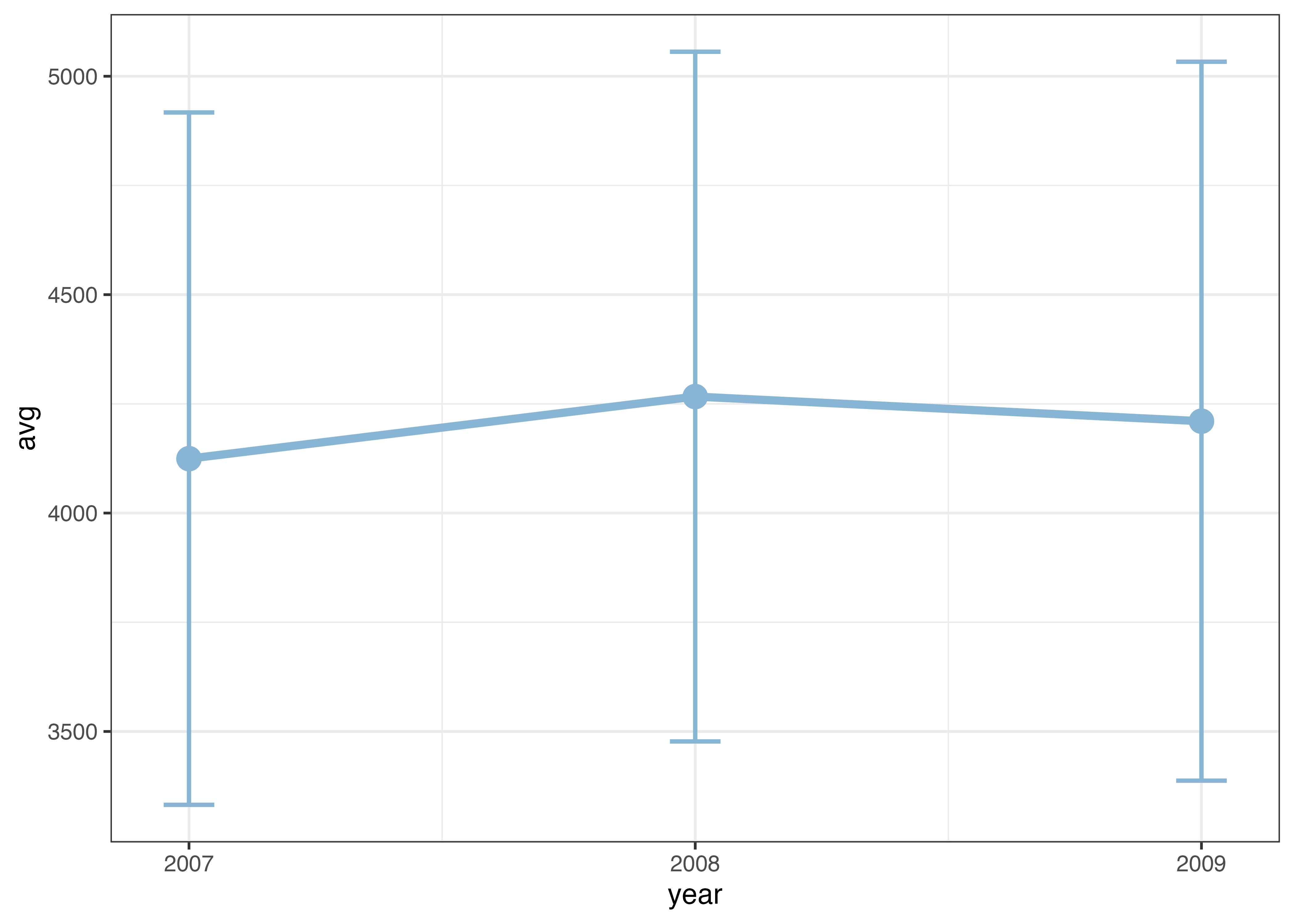
次に、ペンギンの種ごとに平均体重を表示してみます。aes() の中で color をマッピングすることで、グループ(カテゴリ)別に複数の折れ線グラフを描画できます。
df = aggregate(body_mass_g ~ species + year, data = dat, FUN = mean, na.rm = TRUE)
fig = ggplot(df, aes(x = year, y = body_mass_g, color = species)) +
  geom_line(size = 1.5) +
  geom_point(size = 4) +
  scale_x_continuous(breaks = c(2007, 2008, 2009)) +
  theme_classic()
plot(fig)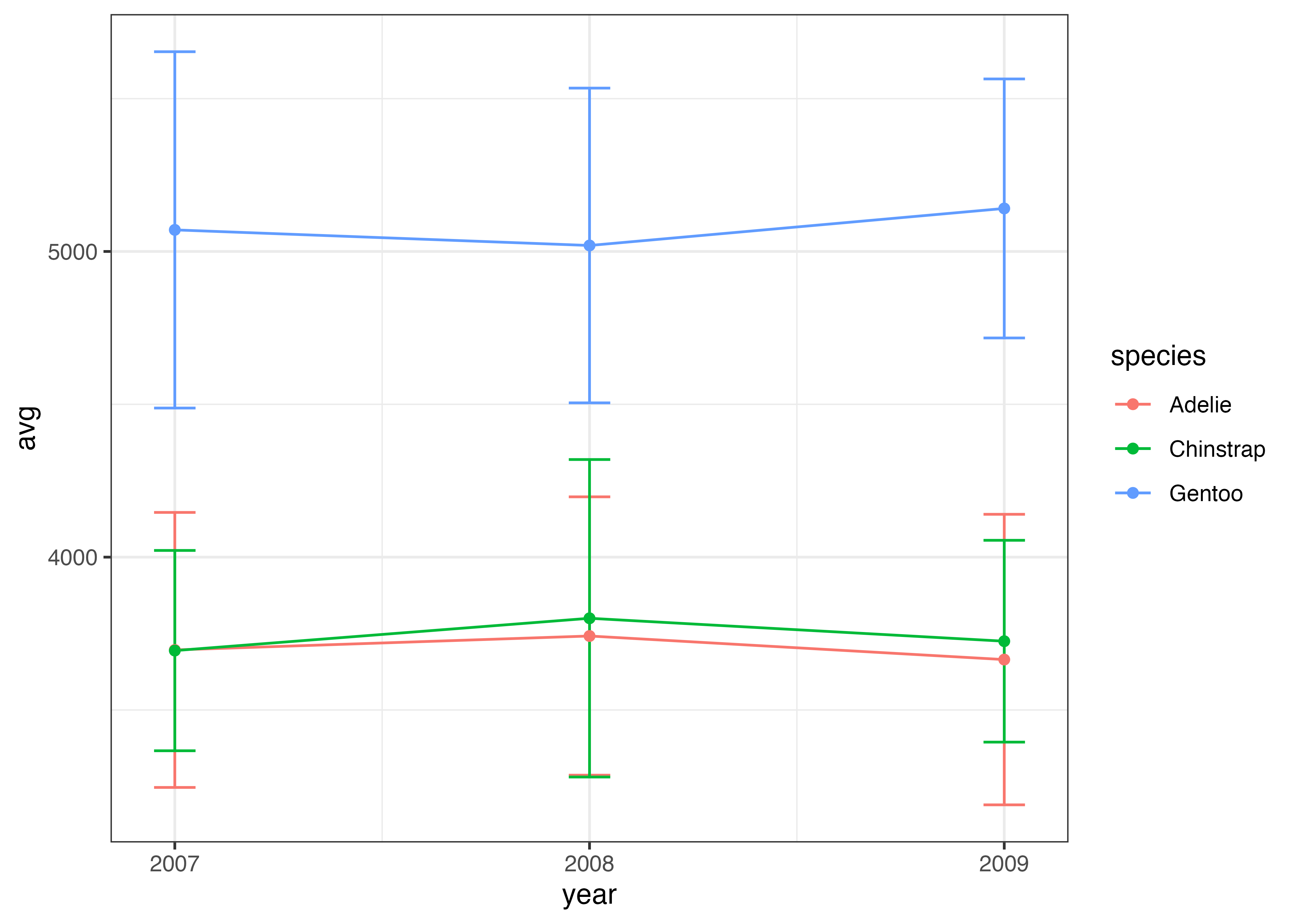
ペンギンの種を区別せずに平均値とSDを計算し、折れ線グラフにエラーバーを追加する例です。
# 年(year)ごとの平均体重
d_mean = aggregate(body_mass_g ~ year, data = dat, FUN = mean, na.rm = TRUE)
# 年(year)ごとの標準偏差(sd)
d_sd = aggregate(body_mass_g ~ year, data = dat, FUN = sd, na.rm = TRUE)
# 平均値と標準偏差を一つのデータフレームにまとめる
df = data.frame(
  year = d_mean$year,
  avg = d_mean$body_mass_g,
  sd = d_sd$body_mass_g
)
print(df)
##   year      avg       sd
## 1 2007 4124.541 792.5213
## 2 2008 4266.667 789.4679
## 3 2009 4210.294 822.9070

fig = ggplot(df, aes(x = year, y = avg)) +
  geom_errorbar(aes(ymin = avg - sd, ymax = avg + sd), width = 0.1, size = 0.8, color = "#88b5d3") +
  geom_line(size = 1.5, color = "#88b5d3") +
  geom_point(size = 4, color = "#88b5d3") +
  scale_x_continuous(breaks = c(2007, 2008, 2009)) +
  theme_classic()
plot(fig)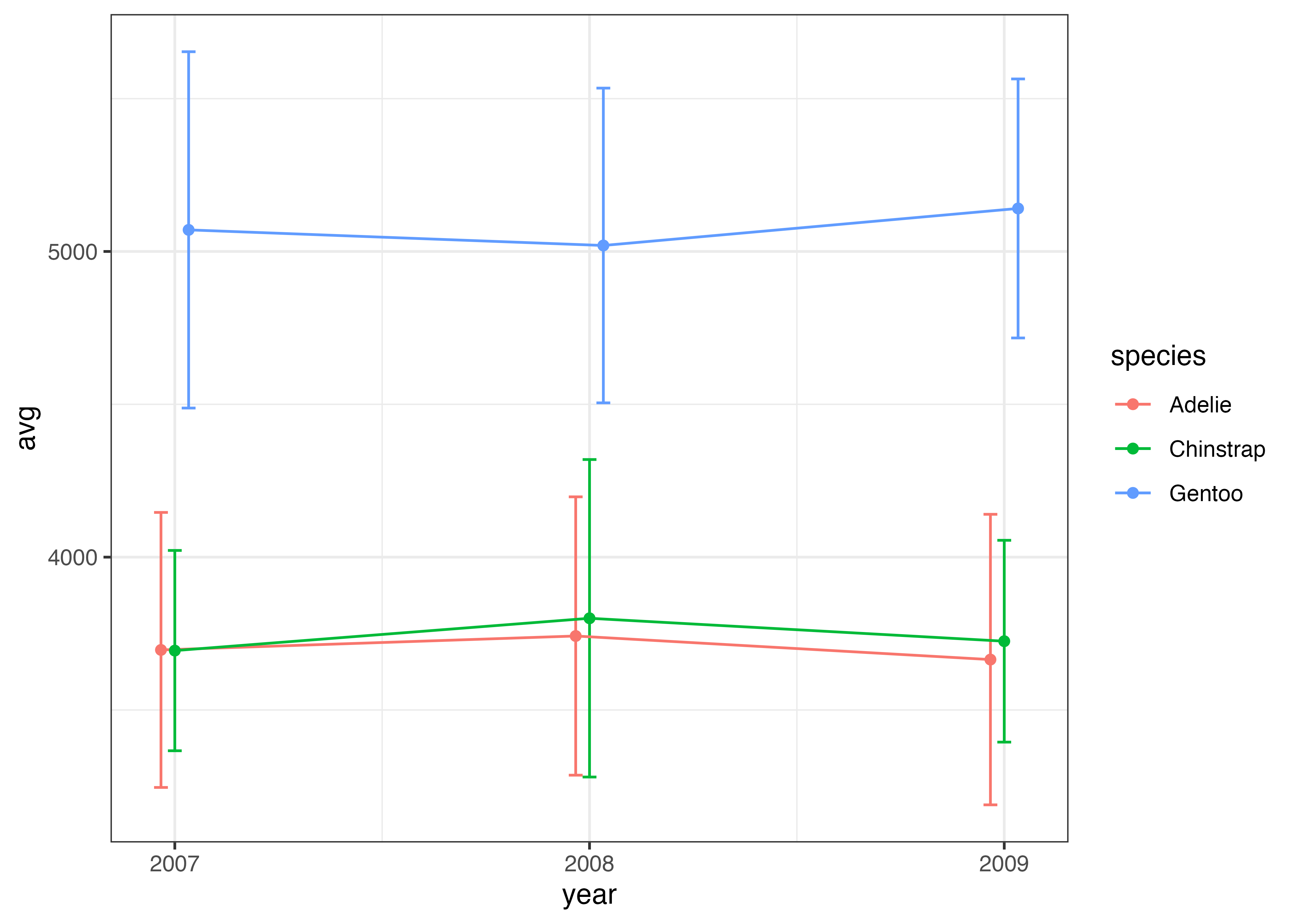
次の例では、ペンギンの種でマッピングする例です。種ごとに平均値とSDを計算したデータフレームを用意しています。
# 種類(species)と年(year)ごとの平均体重
d_mean = aggregate(body_mass_g ~ species + year, data = dat, FUN = mean, na.rm = TRUE)
# 種類(species)と年(year)ごとの標準偏差
d_sd = aggregate(body_mass_g ~ species + year, data = dat, FUN = sd, na.rm = TRUE)
# データを一つにまとめる
df = data.frame(
  species = d_mean$species,
  year = d_mean$year,
  avg = d_mean$body_mass_g,
  sd = d_sd$body_mass_g
)
print(df)
##     species year      avg       sd
## 1    Adelie 2007 3696.429 449.8553
## 2 Chinstrap 2007 3694.231 327.6666
## 3    Gentoo 2007 5070.588 582.8506
## 4    Adelie 2008 3742.000 455.2819
## 5 Chinstrap 2008 3800.000 519.3322
## 6    Gentoo 2008 5019.565 514.8331
## 7    Adelie 2009 3664.904 475.2517
## 8 Chinstrap 2009 3725.000 330.1021
## 9    Gentoo 2009 5140.698 423.6682

fig = ggplot(df, aes(x = year, y = avg, color = species)) +
  geom_errorbar(
    aes(ymin = avg - sd, ymax = avg + sd),
    width = 0.1
  ) +
  geom_line() +
  geom_point() +
  scale_x_continuous(breaks = c(2007, 2008, 2009)) +
  theme_classic()
plot(fig)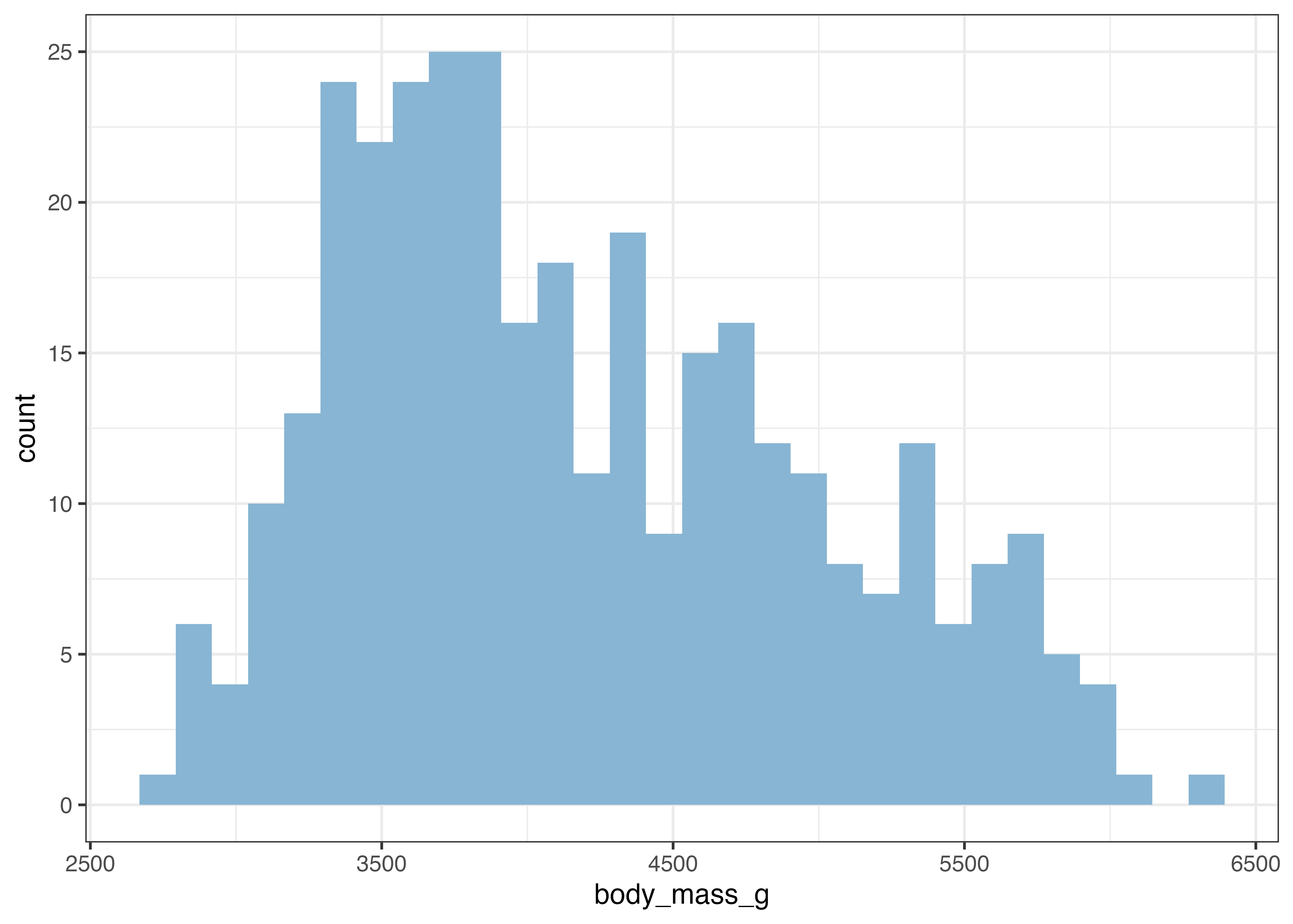
上の図では、Chinstrap と Adelie のエラーバー同士が重なってしまっています。
このような場合、エラーバーの位置を種ごとに少し横にずらすという対処をします。geom_errorbar, geom_line, geom_point のすべてにposition = position_dodge(0.1)を指定します。0.1という部分は横ずれの量を指定しています。状況に応じて適切な値に調整してください。
fig = ggplot(df, aes(x = year, y = avg, color = species)) +
  geom_errorbar(
    aes(ymin = avg - sd, ymax = avg + sd),
    width = 0.1,
    position = position_dodge(0.1)
  ) +
  geom_line(position = position_dodge(0.1)) +
  geom_point(position = position_dodge(0.1)) +
  scale_x_continuous(breaks = c(2007, 2008, 2009)) +
  theme_classic()
plot(fig)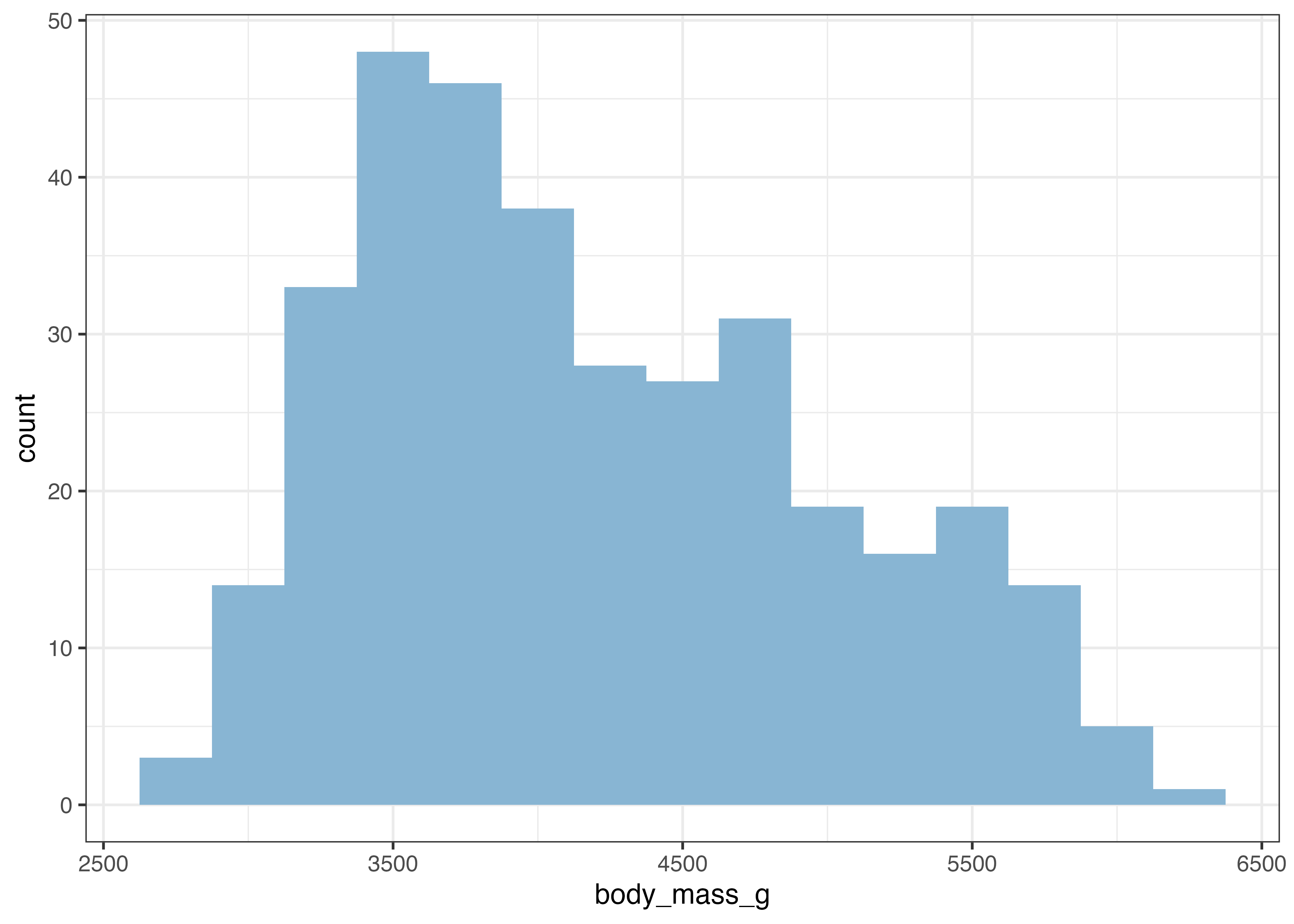
エラーバーの重なりが解消され、グラフが見やすくなりました。
8.5 ヒストグラム & 密度プロット (geom_histogram, geom_density)
ヒストグラムと密度プロットは、どちらも単一の量的変数(数値)が、どの範囲にどれだけ分布しているか(ばらつき)を可視化するために使用します。これらは集計済みのデータ(df)を必要とせず、元のデータ(dat)を直接使います。
geom_histogram(): データを区切り、件数を棒で示す
geom_histogram() は、数値データを一定の区間(bin: 階級)に区切り、各区間に含まれるデータの件数を棒グラフで表示します。aes() ではX軸のみを指定します。
(棒グラフの時と同様、expand 引数を使ってグラフの下側がX軸に接するようにしています。)
library(ggplot2)
library(palmerpenguins)
dat = palmerpenguins::penguins

fig = ggplot(dat, aes(x = body_mass_g)) +
  geom_histogram(fill = "#88b5d3") +
  scale_y_continuous(expand = expansion(mult = c(0, 0.05))) +
  theme_classic()
plot(fig)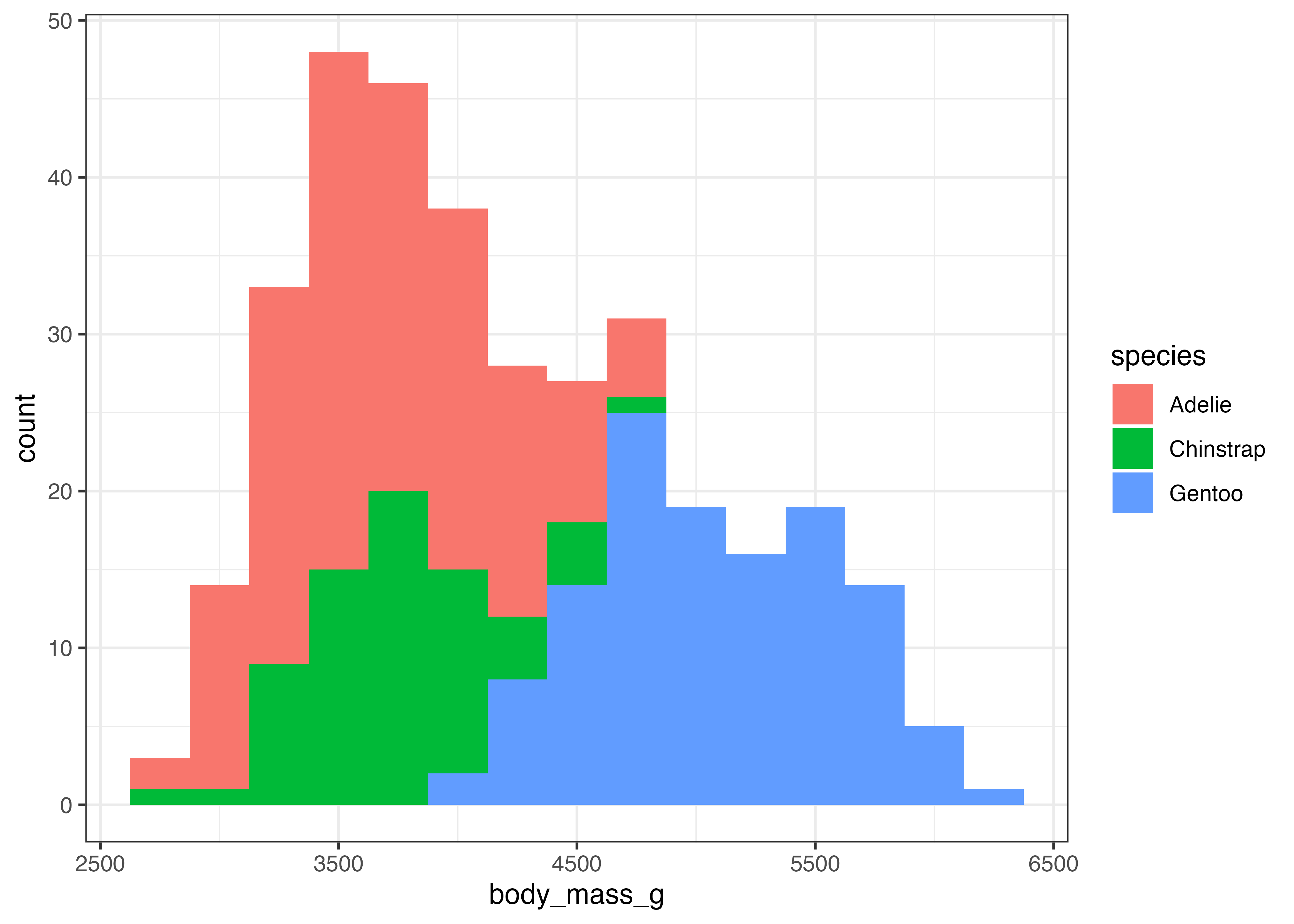
グラフを作成すると、stat_bin() が自動で階級の幅(binwidth)を決定した旨のメッセージ(例: bins = 30)が表示されることがあります。この階級の幅は binwidth 引数で明示的に設定でき、グラフの見た目が大きく変わります。
fig = ggplot(dat, aes(x = body_mass_g)) +
  geom_histogram(fill = "#88b5d3", binwidth = 250) +
  scale_y_continuous(expand = expansion(mult = c(0, 0.05))) +
  theme_classic()
plot(fig)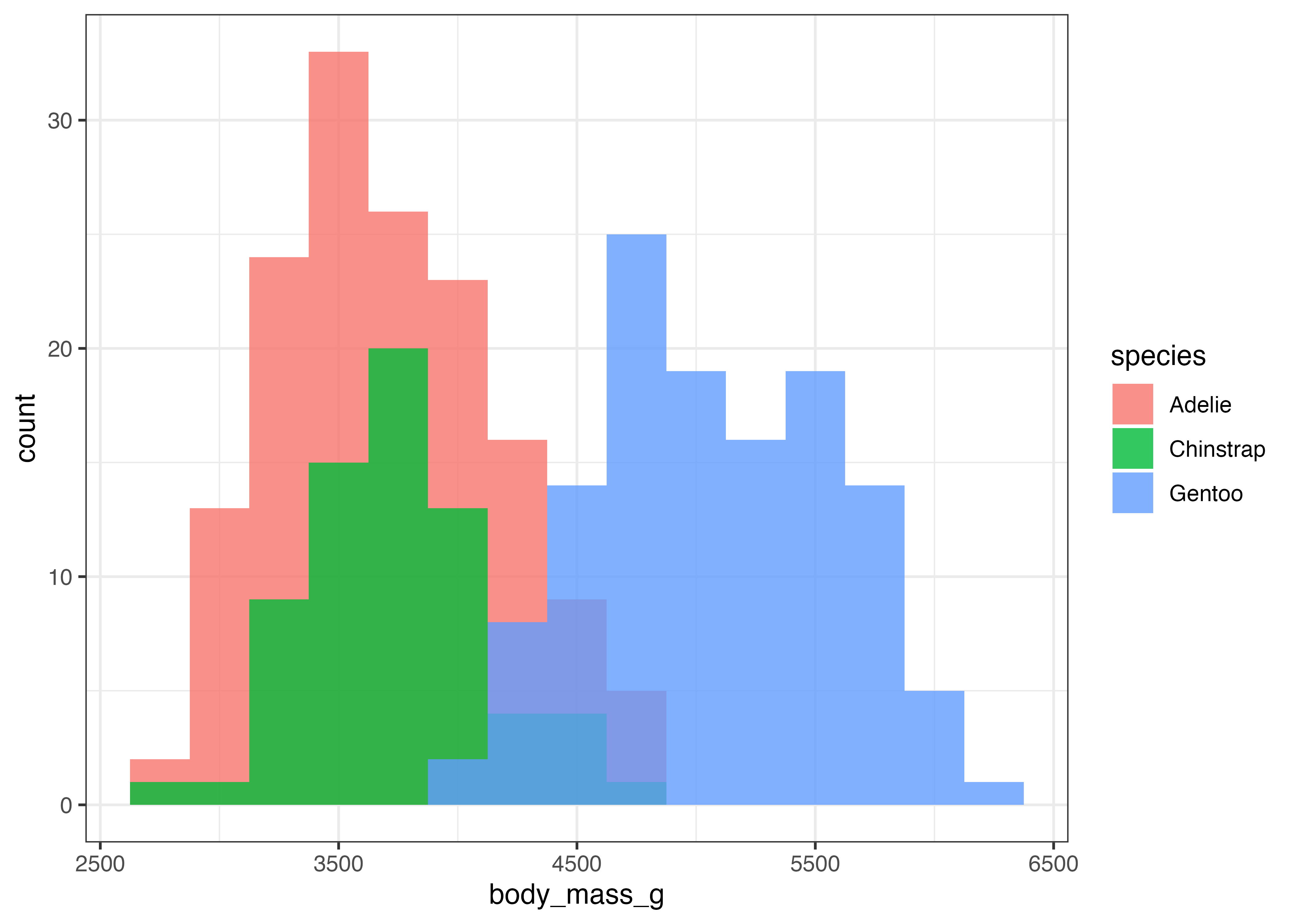
binwidth を調整することで、分布の形状をより詳細に、あるいはより大まかに捉えることができます。
aes() で fill(塗りつぶし)を指定すると、積み上げヒストグラムを作成できます。
fig = ggplot(dat, aes(x = body_mass_g, fill = species)) +
  geom_histogram(binwidth = 250) +
  scale_y_continuous(expand = expansion(mult = c(0, 0.05))) +
  theme_classic()
plot(fig)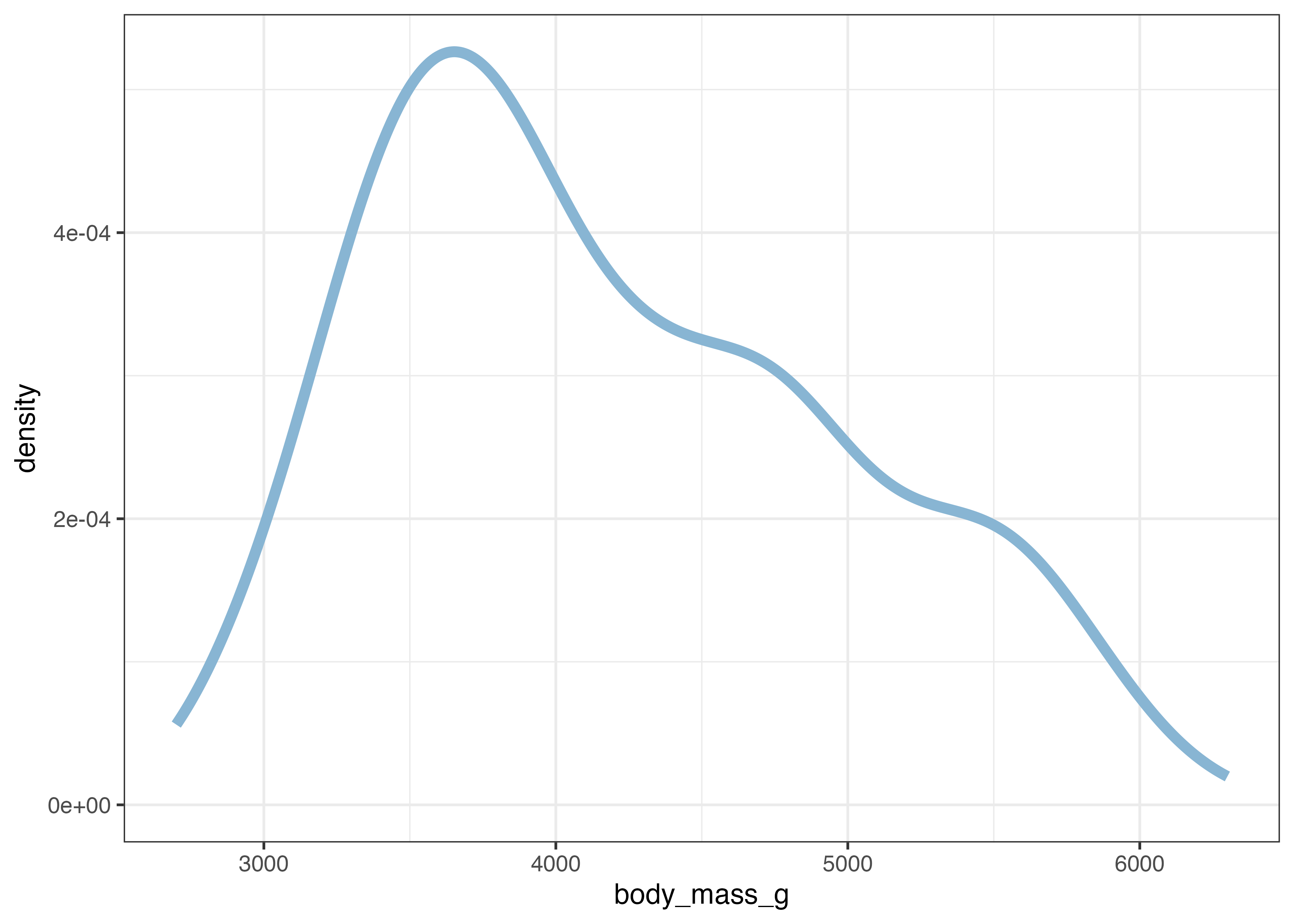
積み上げではなく、グループごとのヒストグラムを重ねて表示することもできます。position = "identity"を指定します。重なったグラフの場合は透明度(alpha)を指定して重なり部分がわかるようにする必要があります。
fig = ggplot(dat, aes(x = body_mass_g, fill = species)) +
  geom_histogram(position = "identity", alpha = 0.8, binwidth = 250) +
  scale_y_continuous(expand = expansion(mult = c(0, 0.05))) +
  theme_classic()
plot(fig)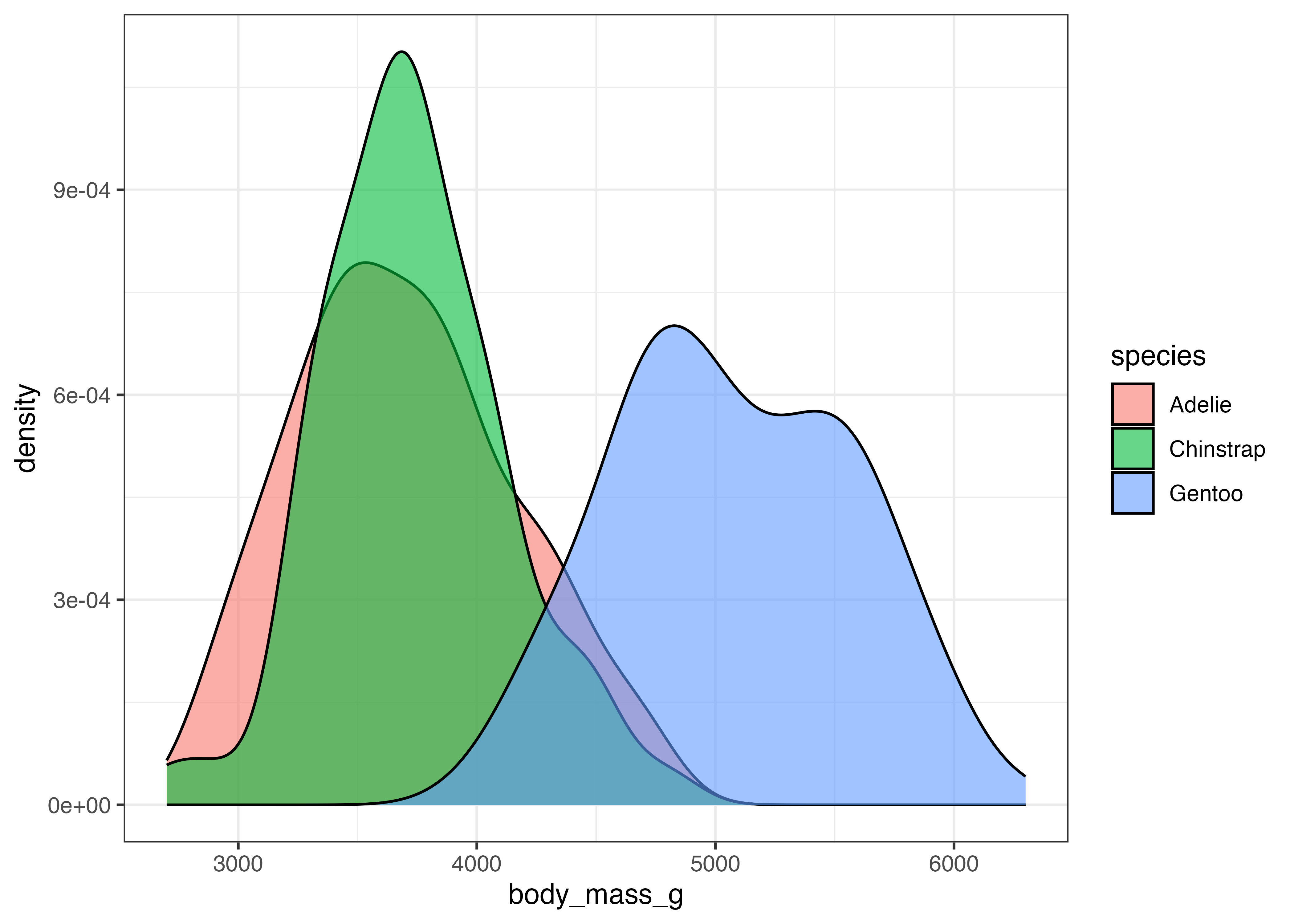
geom_density(): 分布の形状を滑らかな線で示す
geom_density() は、ヒストグラムを滑らかな曲線で表現したものです。データの密度(その値の周辺にデータがどれだけ集中しているか)を推定して描画します。
fig = ggplot(dat, aes(x = body_mass_g)) +
  geom_density(size = 2, color = "#88b5d3") +
  theme_classic()
plot(fig)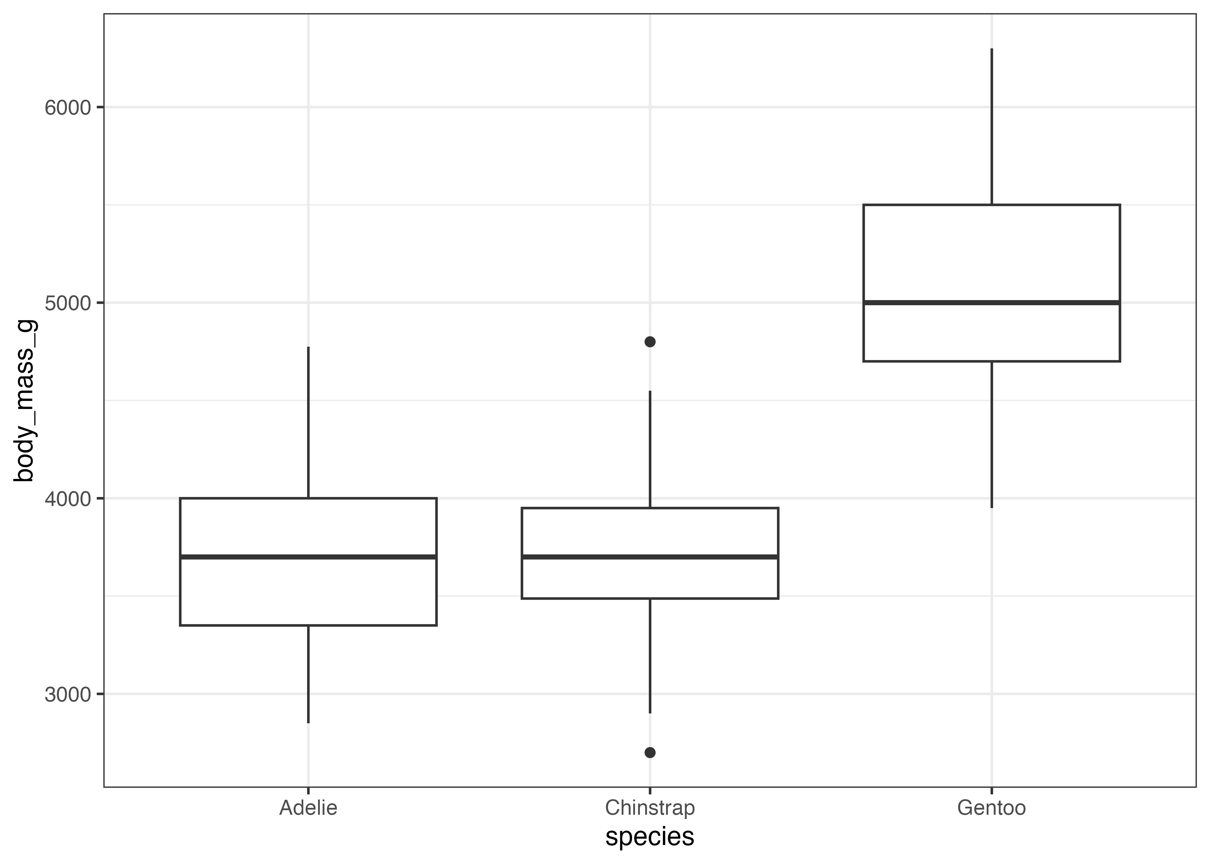
ヒストグラムと比較すると、体重の分布には左側の大きな山に加えて右側にも2箇所の盛り上がりがあることがわかりやすいです。
geom_density() は、fill をマッピングして重ね合わさったグラフにすることができます。その際は alpha(透明度)を設定するようにします。
fig = ggplot(dat, aes(x = body_mass_g, fill = species)) +
  geom_density(alpha = 0.6) +
  theme_classic()
plot(fig)
このグラフから、元の曲線で見えていた3つの山が、実際には Adelie と Chinstrap のグループによる左側の山と、Gentoo グループによる右側の山から構成されていることがわかります。
8.6 箱ひげ図 & バイオリンプロット (geom_boxplot, geom_violin)
箱ひげ図とバイオリンプロットは、どちらもカテゴリ(質的変数)ごとに、量的変数(数値)の分布を要約して比較するのに適しています。
geom_boxplot(): データの要約統計量を視覚化する
箱ひげ図は、データの第1四分位数(25%点)、中央値(50%点)、第3四分位数(75%点)を箱で示し、外れ値ではないとみなされる範囲の中の最大値と最小値を箱から上下に伸びる線(ひげと呼ばれる)で表現します。ひげの外側の値は外れ値であり、それらは個別に点としてプロットされます。
箱ひげ図はデータの分布の概要を示す際に便利な図です。
geom_boxplot() 関数で箱ひげ図を作成できます。
X軸にカテゴリ(例: species)、Y軸に数値(例: body_mass_g)を指定します。
library(ggplot2)
library(palmerpenguins)
dat = palmerpenguins::penguins

fig = ggplot(dat, aes(x = species, y = body_mass_g)) +
  geom_boxplot() +
  theme_classic()
plot(fig)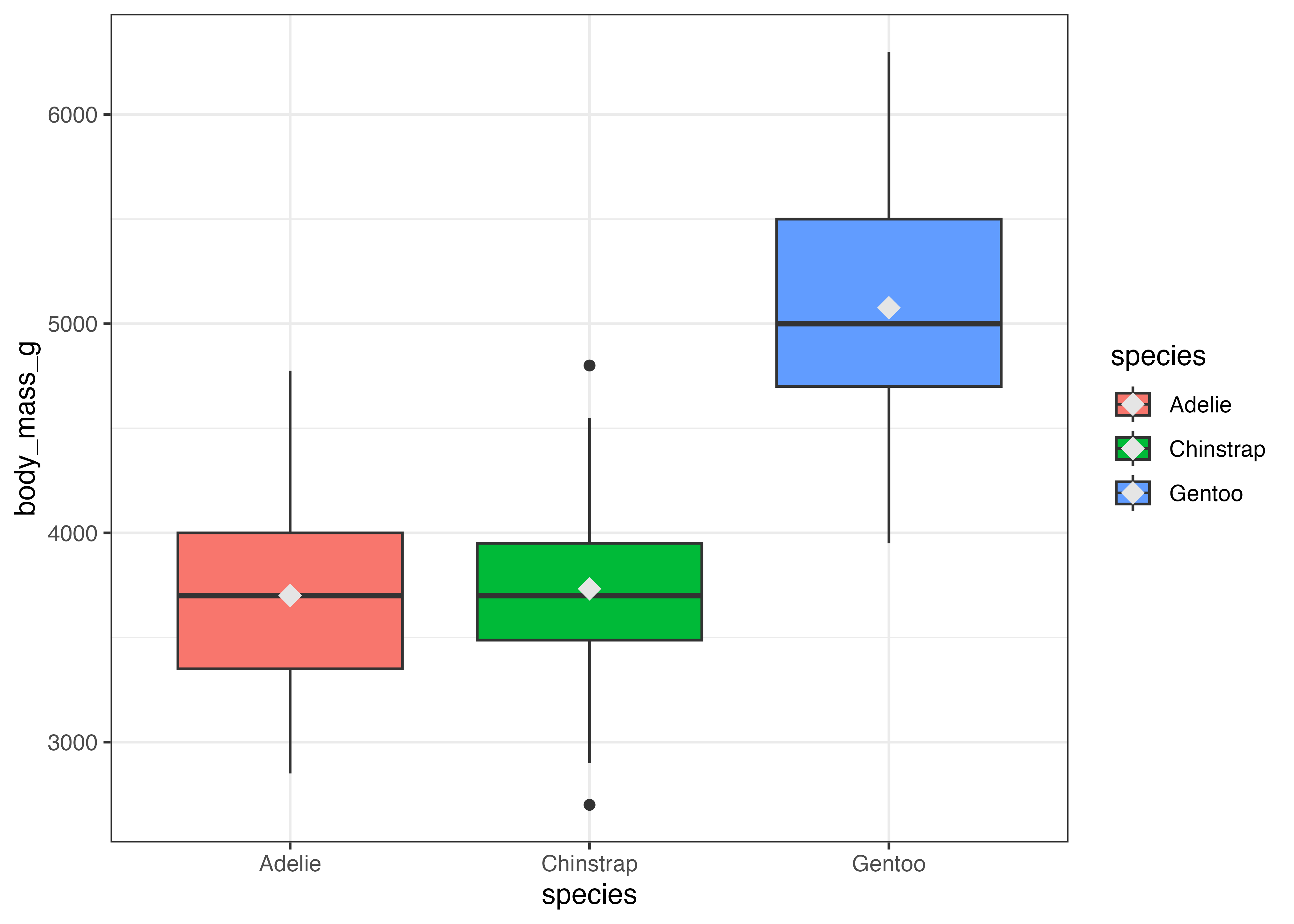
このグラフから、Gentoo 種は他の種に比べて体重の中央値が重く、分布の範囲(箱の長さ)もやや広いことがわかります。
aes() で fill(塗りつぶし)を指定すると、箱の色をカテゴリ別に変更できます。
fig = ggplot(dat, aes(x = species, y = body_mass_g, fill = species)) +
  geom_boxplot() +
  theme_classic()
plot(fig)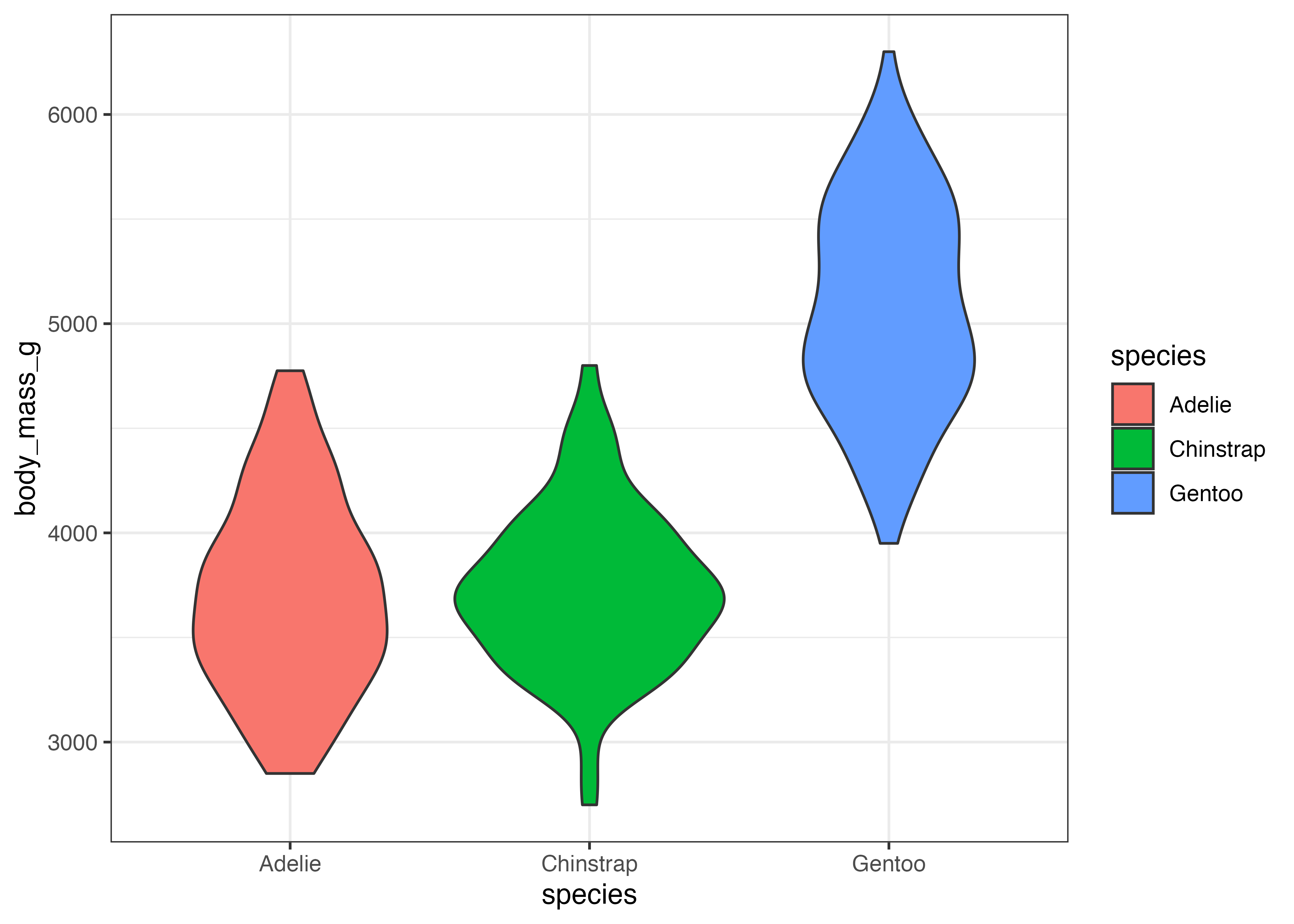
箱ひげ図の中の横棒は中央値を示します。この図に平均値も加えたい場合はstat_summary()関数を使います。この関数の引数ではfun = "mean"(計算する関数 = 平均)とgeom = "point"(描画する図形 = 点)を指定します。さらに、shape = 18によってひし形の形状を指定しています。
fig = ggplot(dat, aes(x = species, y = body_mass_g, fill = species)) +
  geom_boxplot() +
  stat_summary(fun = "mean", geom = "point", shape = 18, size = 4, color = "gray90") +
  theme_classic()
plot(fig)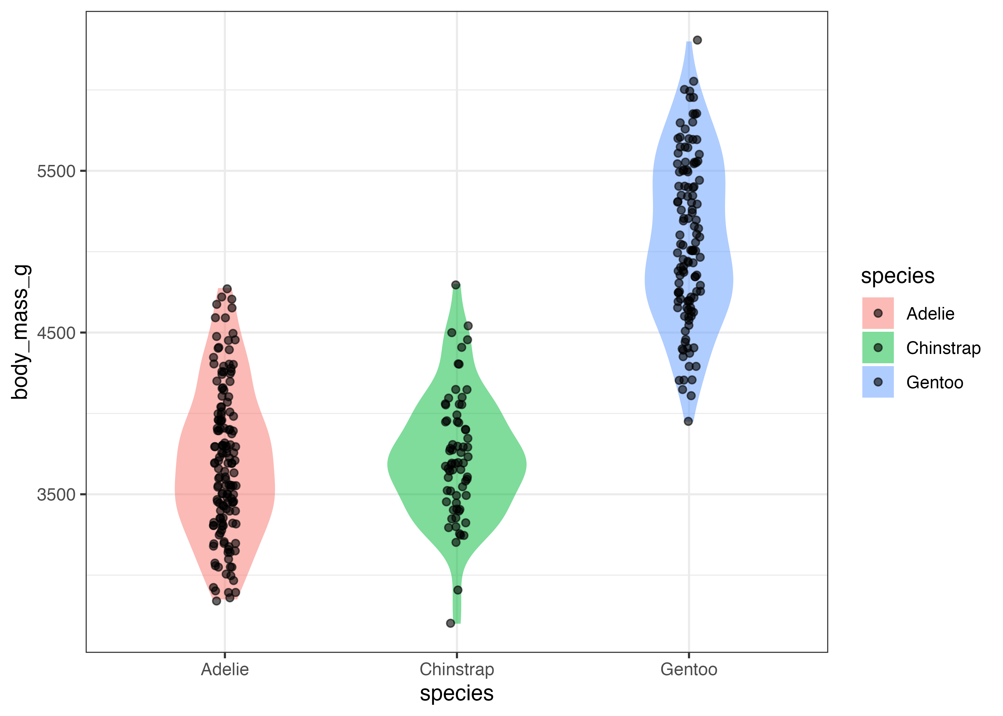
geom_violin(): データの分布の形状を視覚化する
バイオリンプロットはデータの密度プロットを左右対称に表示したものであり、形状の幅が広いほどその値を持つデータが密集している(密度が高い)ことを意味します。
geom_violin() 関数を使います。
fig = ggplot(dat, aes(x = species, y = body_mass_g, fill = species)) +
  geom_violin() +
  theme_classic()
plot(fig)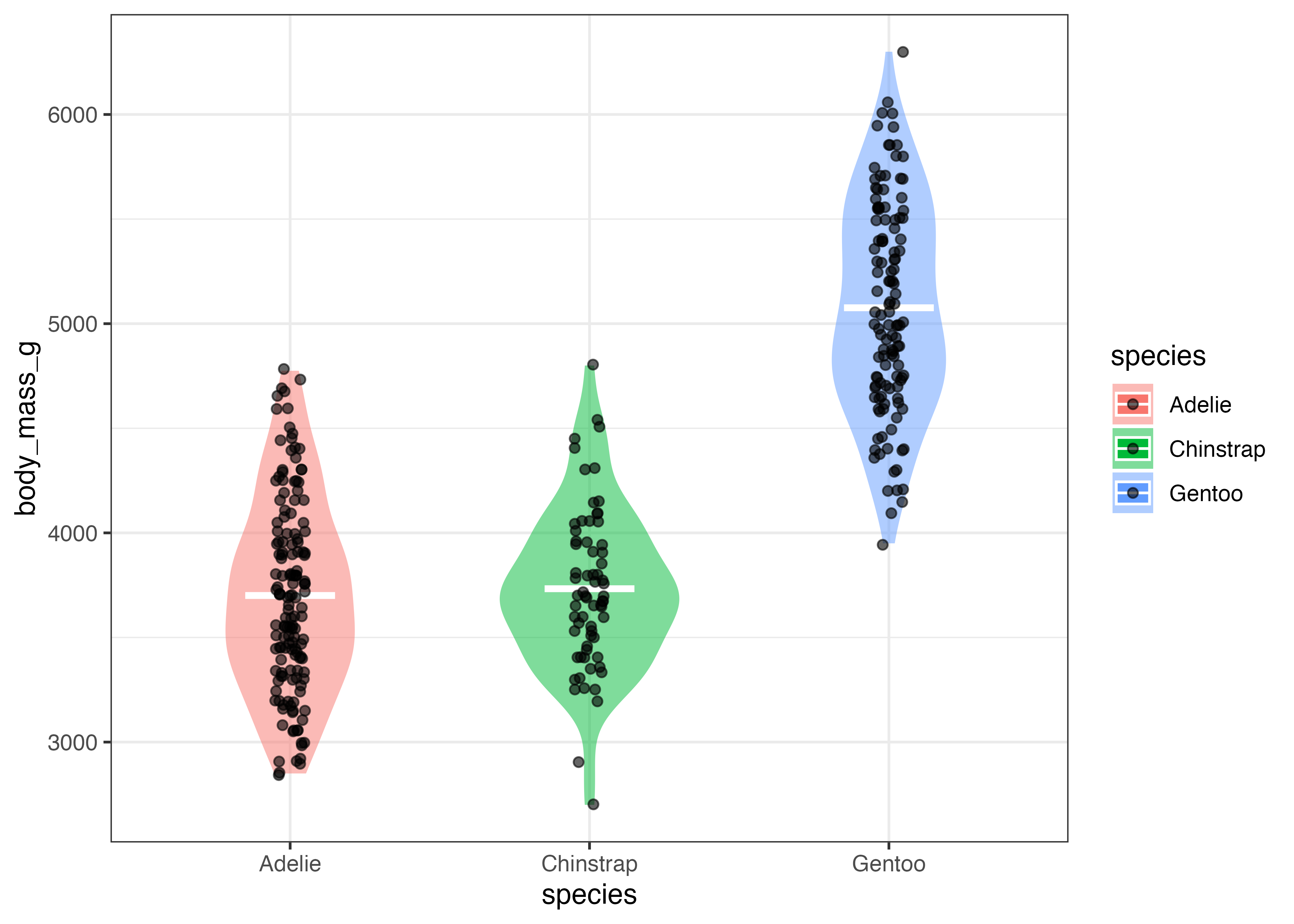
バイオリンプロットを使うことで、Chinstrap は3600付近に明確なピークがありますが、Adelie や Gentoo にはそれほどはっきりしたピークがないことがわかります。
バイオリンプロットに geom_point() を重ねることで、実際のデータがどのように分布しているかを同時に示すこともできます。
fig = ggplot(dat, aes(x = species, y = body_mass_g, fill = species)) +
  geom_violin(alpha = 0.5, width = 0.6, color = NA) +
  geom_jitter(alpha = 0.6, width = 0.05) +
  theme_classic()
plot(fig)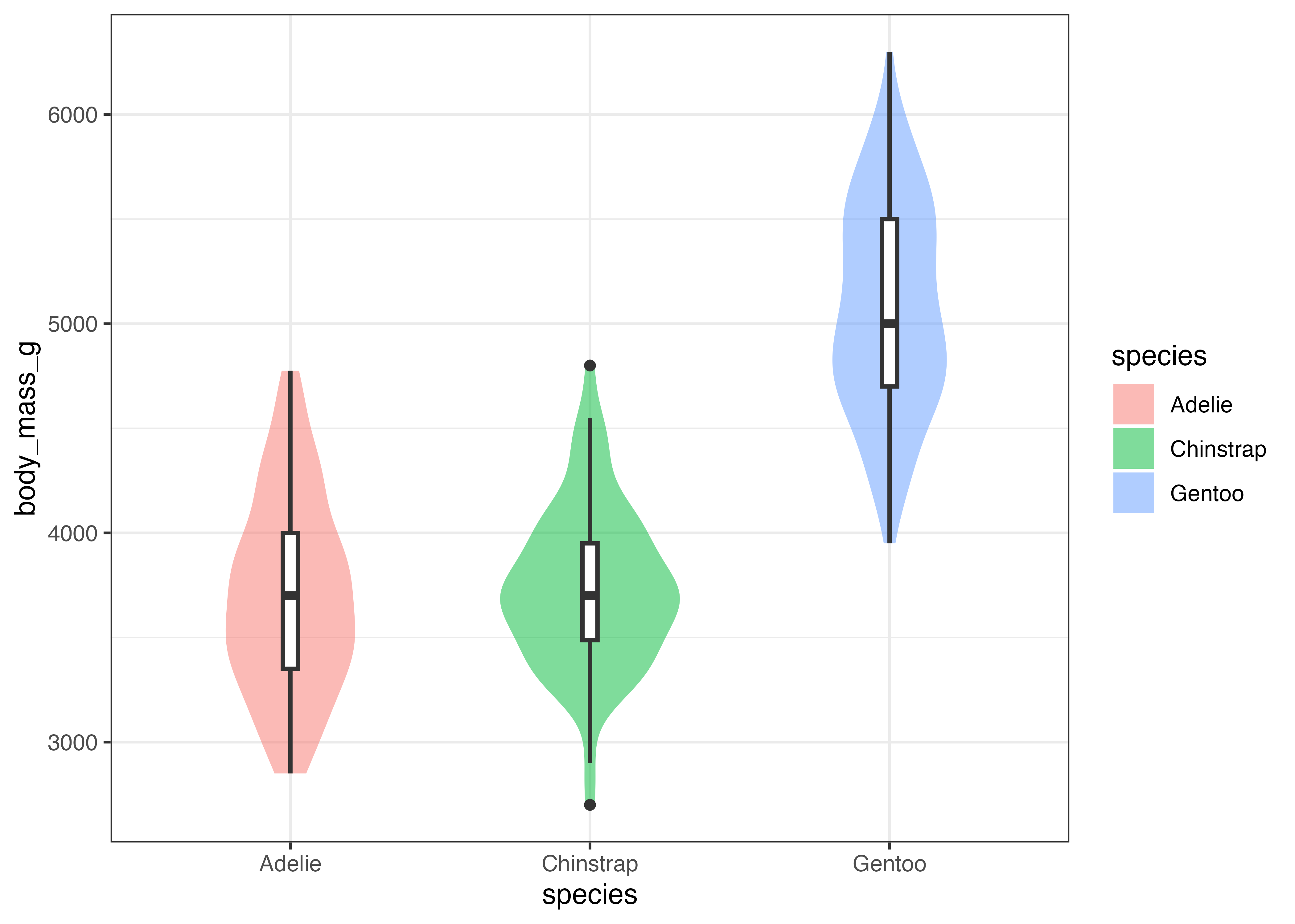
ここでは、バイオリンプロットから輪郭線を消し(color = NA)、色を薄め(alpha = 0.5)、さらに幅をスリムにする(width = 0.6)ことで、図を見やすくしています。
次に、この図に平均値の情報も追加してみましょう。stat_summary() 関数を使い、geom = "crossbar"を使うと横棒を描写することができます。
fig = ggplot(dat, aes(x = species, y = body_mass_g, fill = species)) +
  geom_violin(alpha = 0.5, width = 0.6, color = NA) +
  stat_summary(fun = "mean", geom = "crossbar", width = 0.3, color = "gray100") +
  geom_jitter(alpha = 0.6, width = 0.05) +
  theme_classic()
plot(fig)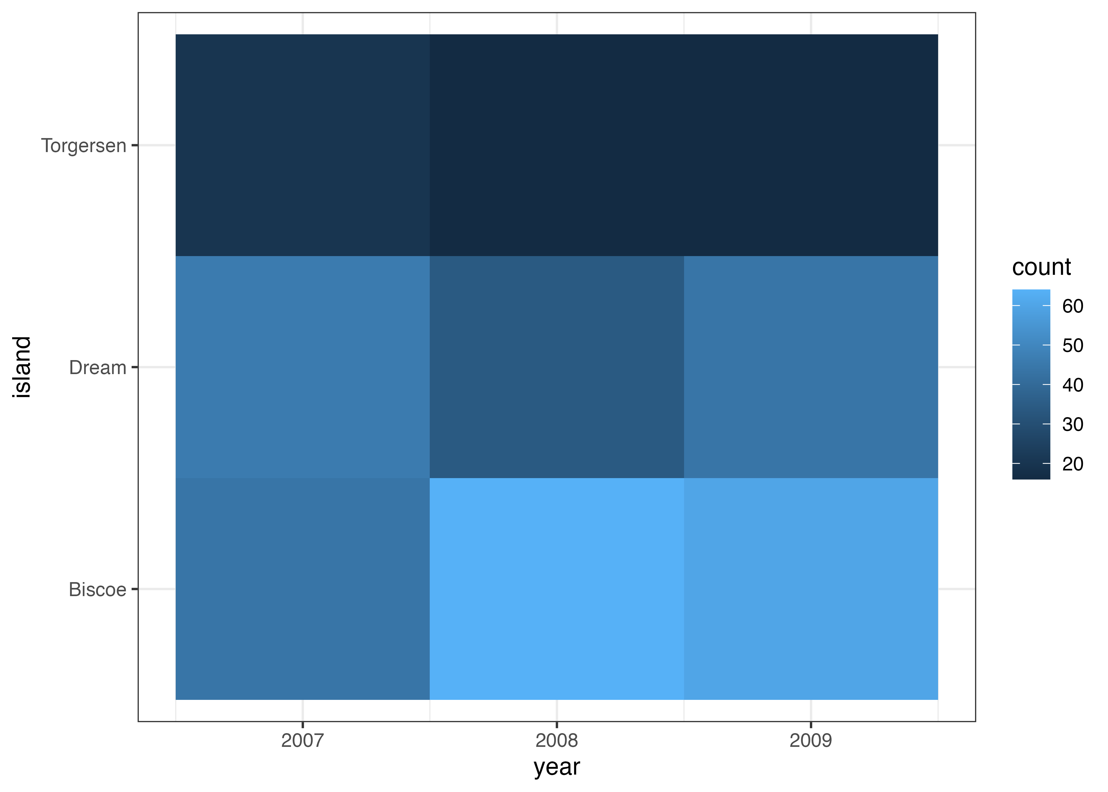
最後に、バイオリンプロットに箱ひげ図を重ねて描画する例です。
fig = ggplot(dat, aes(x = species, y = body_mass_g)) +
  geom_violin(aes(fill = species), alpha = 0.5, width = 0.6, color = NA) +
  geom_boxplot(width = 0.05, fill = "white", size = 0.8) +
  theme_classic()
plot(fig)
Chinstrap は箱が短く Gentoo は箱が長いことと、バイオリンで示された分布形状とが対応していることが視覚的に確認できます。
8.7 ヒートマップ (geom_tile)
ヒートマップは、geom_tile() を使い、2つのカテゴリ変数(X軸とY軸)の組み合わせに対して、3つ目の量的変数(数値)の大小を fill(塗りつぶし)の色で表現するグラフです。
ここでは例として、year(年)と island(島)の組み合わせごとに、ペンギンの件数をヒートマップで可視化します。
geom_tile() を使う際は、あらかじめ集計されたデータフレームを用意します。下記の例では、dat をコピーした tmp 変数を用意し、count という名前の列(値はすべて1)を追加しています。このデータに対して aggregate 関数を使って count の合計値(sum)を計算することでデータの件数を集計しています。
library(ggplot2)
library(palmerpenguins)
dat = palmerpenguins::penguins

tmp = dat
tmp$count = 1
df = aggregate(count ~ island + year, data = tmp, FUN = sum)
print(df)
##      island year count
## 1    Biscoe 2007    44
## 2     Dream 2007    46
## 3 Torgersen 2007    20
## 4    Biscoe 2008    64
## 5     Dream 2008    34
## 6 Torgersen 2008    16
## 7    Biscoe 2009    60
## 8     Dream 2009    44
## 9 Torgersen 2009    16

fig = ggplot(df, aes(x = year, y = island, fill = count)) +
  geom_tile() +
  theme_bw()
plot(fig)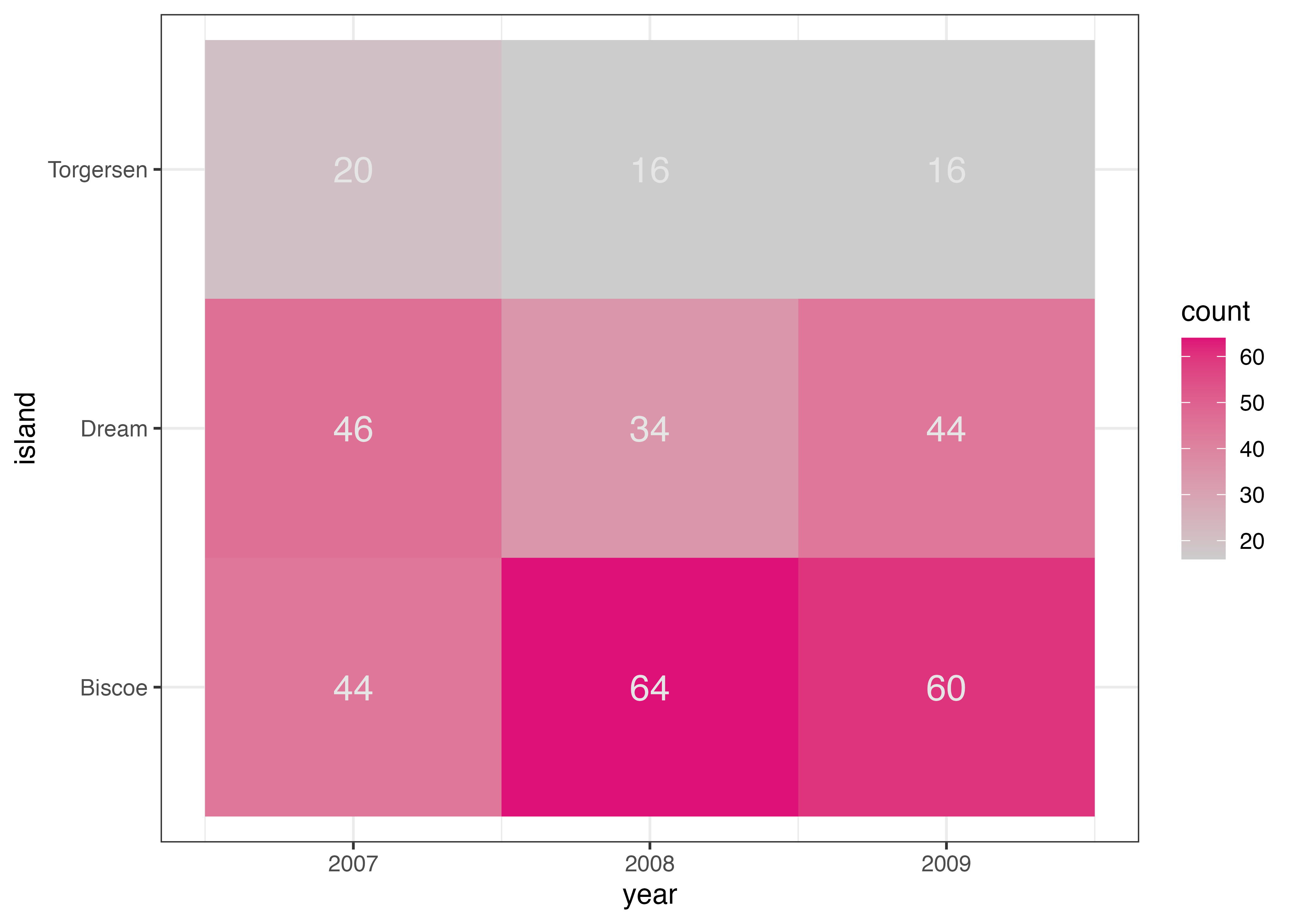
geom_text() を追加することで、count の値をタイル上にテキストとして表示できます。aes() で label = count を指定します。
fig = ggplot(df, aes(x = year, y = island, fill = count)) +
  geom_tile() +
  geom_text(aes(label = count), color = "gray90", size = 5) +
  theme_bw()
plot(fig)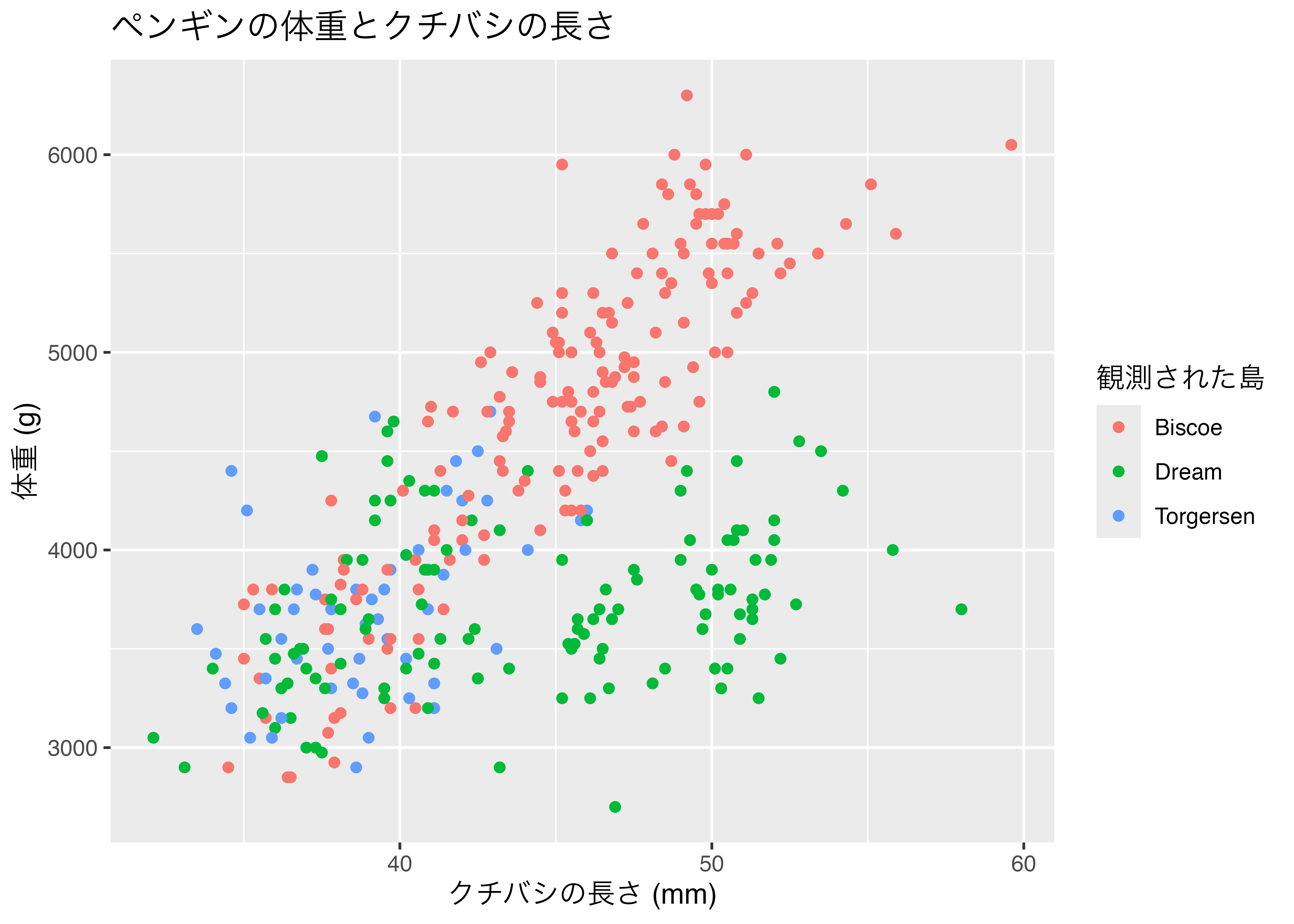
タイルの色を変更するには scale_fill_…() 系の関数を追加します。たとえば、scale_fill_gradient() を使う場合、low(最小値の色)と high(最大値の色)を指定することでその2色のグラデーションを指定できます。
fig = ggplot(df, aes(x = year, y = island, fill = count)) +
  geom_tile() +
  geom_text(aes(label = count), color = "gray90", size = 5) +
  scale_fill_gradient(low = "#cccccc", high = "#dd1177") +
  theme_bw()
plot(fig)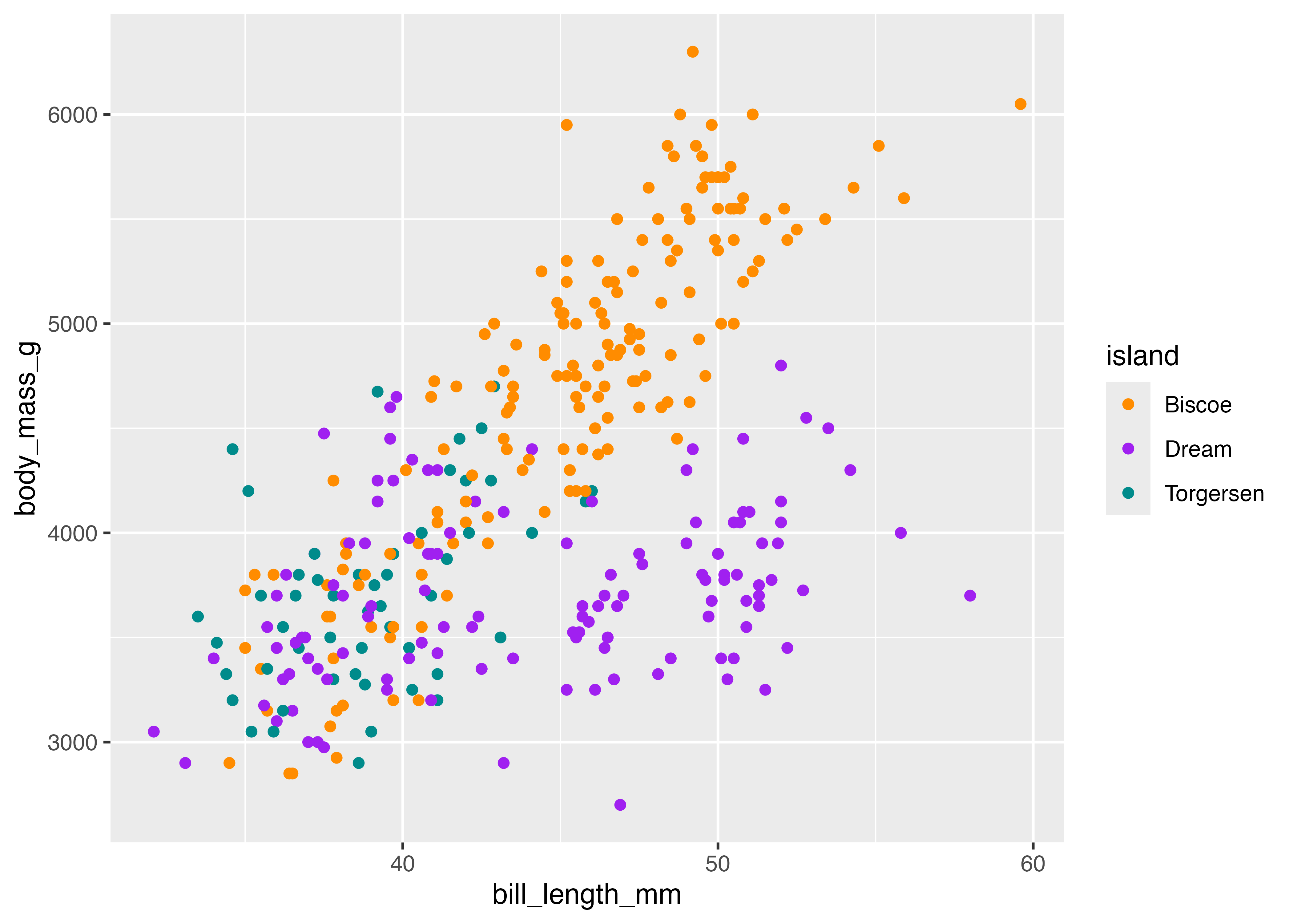
8.8 グラフの見た目の調整
8.8.1 ラベルとタイトル (labs)
ggplot2 のグラフにタイトルや分かりやすい軸ラベルを追加するには、labs() レイヤーを + で追加します。
labs() 関数を使うことで、title(タイトル)、x(X軸ラベル)、y(Y軸ラベル)などを指定できます。
library(ggplot2)
library(palmerpenguins)
dat = palmerpenguins::penguins

fig = ggplot(dat, aes(x = bill_length_mm, y = body_mass_g, color = island)) +
  geom_point() +
  labs(
    title = "ペンギンの体重とクチバシの長さ",
    x = "クチバシの長さ (mm)",
    y = "体重 (g)",
    color = "観測された島"
  )
plot(fig)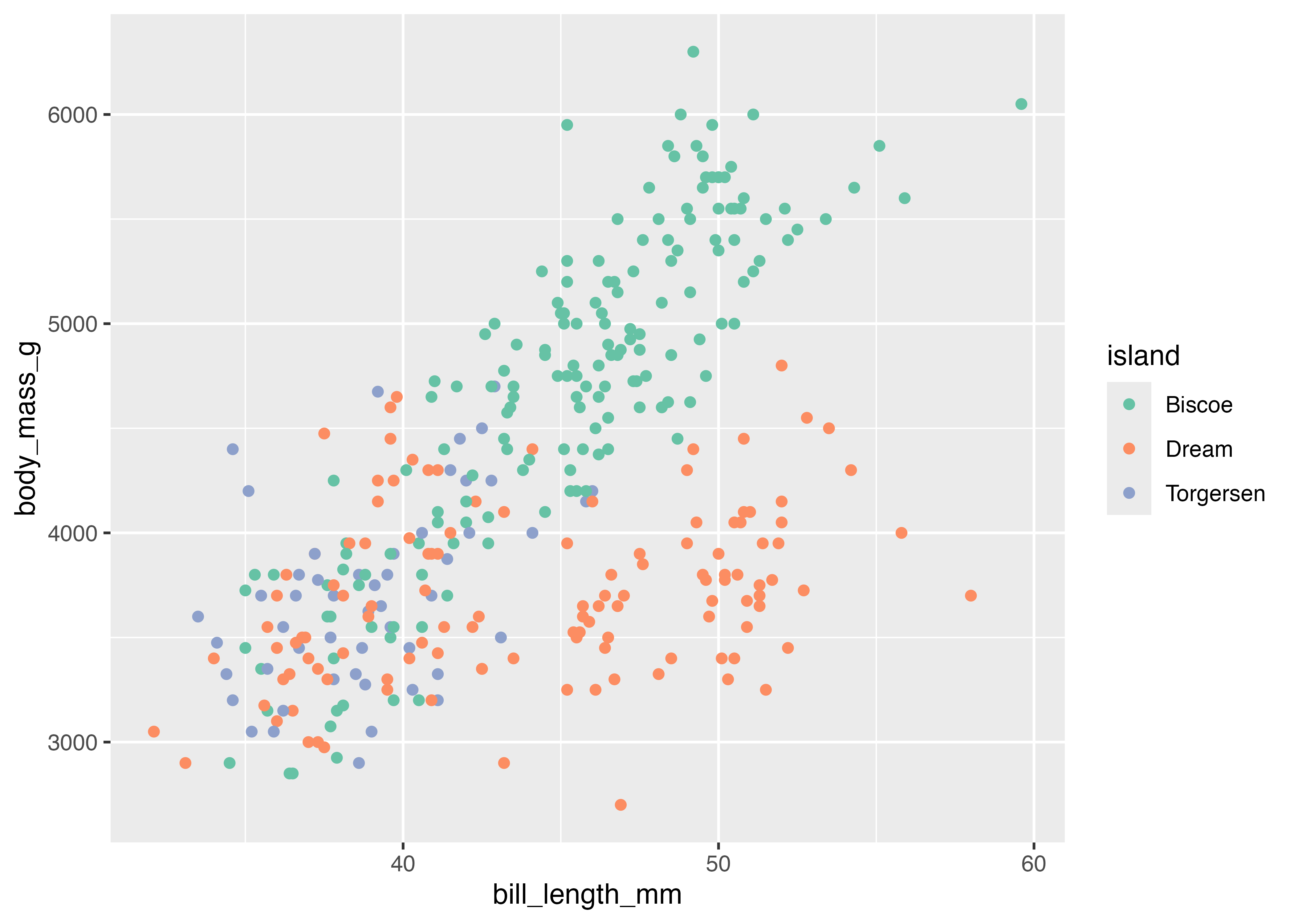
凡例タイトルはcolor = "観測された島"の部分で指定しています。 aes() の中でcolor = islandとマッピングを指定したため、labs() の中で color 引数に文字列を指定すると、凡例のタイトルが変更されます。aes() で shape = sex を指定した場合は、labs(shape = "性別") のように指定します。fill の場合も同様です。
ラベルとして日本語を使った場合に文字化けすることがあります。その場合は以下のように対処してください。
- RStudioのメニューバーから Tools を選択します。
- Global Options… を選択します。
- 開いたウィンドウで、左側の General を選択し、右側の Graphics タブをクリックします。
- Backend が Default になっている設定を AGG に変更します。
- OK または Apply を押して設定を保存します。
設定を変更したら、RStudioを一度再起動してください。
8.8.2 色と形のカスタマイズ (scale_*)
aes() を使って color(色)、fill(塗りつぶし)、shape(形)をデータにマッピングすると、ggplot2 は自動的にデフォルトの色や形を割り当てます。
これらの割り当てを明示的に制御・変更するのが scale_*() ファミリーの関数です。
aes(color = ...)を変更:scale_color_...()aes(fill = ...)を変更:scale_fill_...()aes(shape = ...)を変更:scale_shape_...()
カテゴリ変数のカスタマイズ
scale_color_manual() で色を手動で指定します。
library(ggplot2)
library(palmerpenguins)
dat = palmerpenguins::penguins

fig = ggplot(dat, aes(x = bill_length_mm, y = body_mass_g, color = island)) +
  geom_point() +
  scale_color_manual(values = c("darkorange", "purple", "cyan4"))
plot(fig)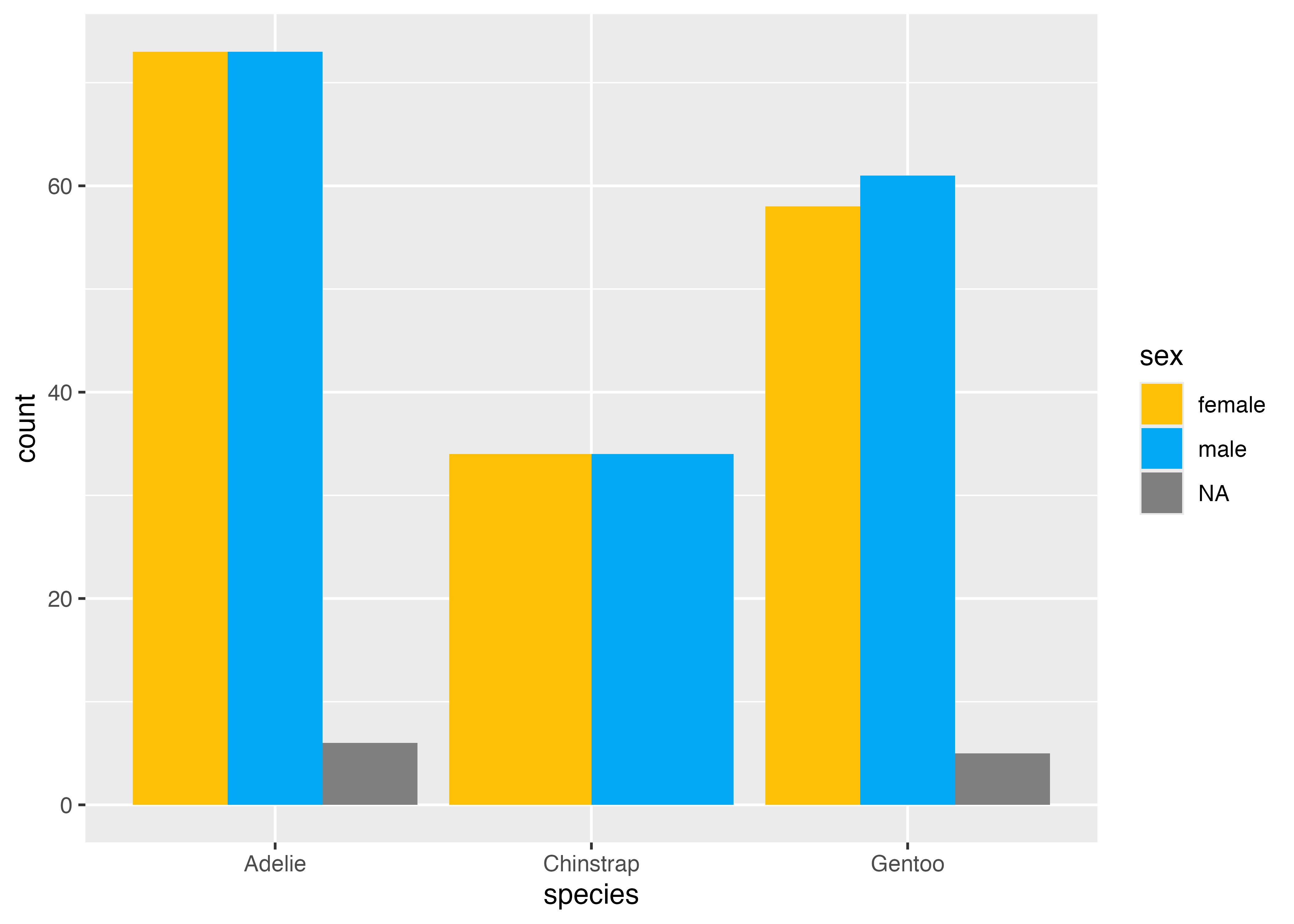
scale_color_brewer() を使うと、RColorBrewer パッケージに基づいたデザイン性の高い配色パレットを適用できます。
どのようなパレットがあるかはこちらのページの冒頭に掲載されている画像を参照してください。以下の例では「Set2」という名前のパレットを指定しています。
library(ggplot2)
library(palmerpenguins)
dat = palmerpenguins::penguins

fig = ggplot(dat, aes(x = bill_length_mm, y = body_mass_g, color = island)) +
  geom_point() +
  scale_color_brewer(palette = "Set2")
plot(fig)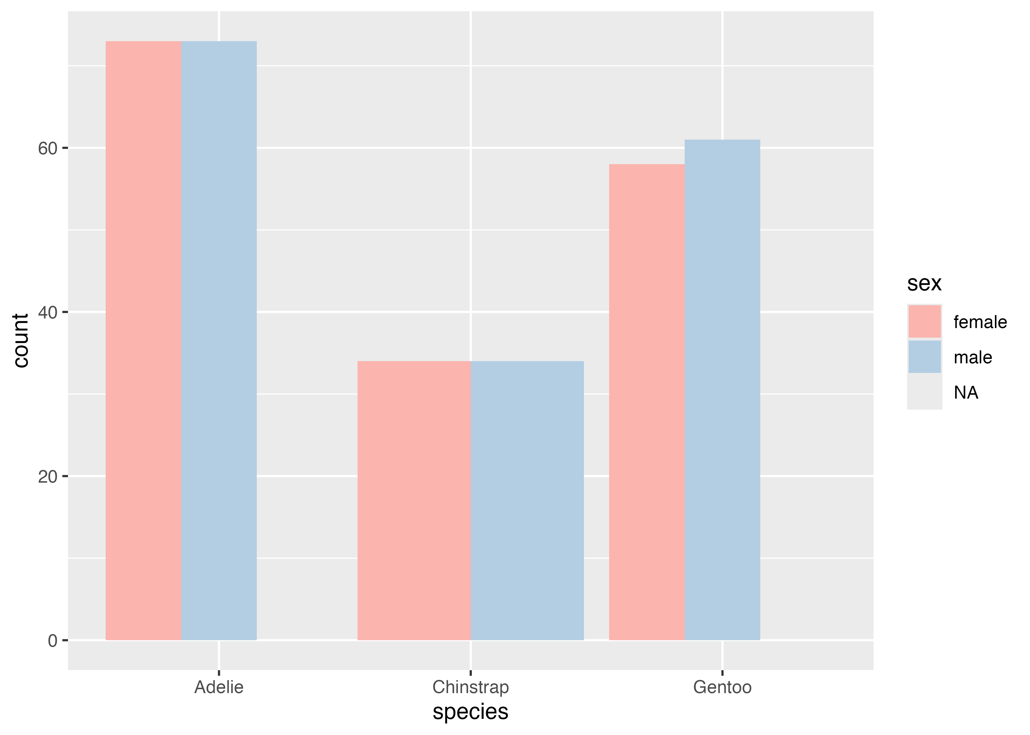
次に、棒グラフ (geom_bar) でfill = sexをマッピングしたグラフを例にします。
# 色をマニュアルで指定する例
fig = ggplot(dat, aes(x = species, fill = sex)) +
  geom_bar(position = "dodge") +
  scale_fill_manual(values = c("#FFC107", "#03A9F4"))
plot(fig)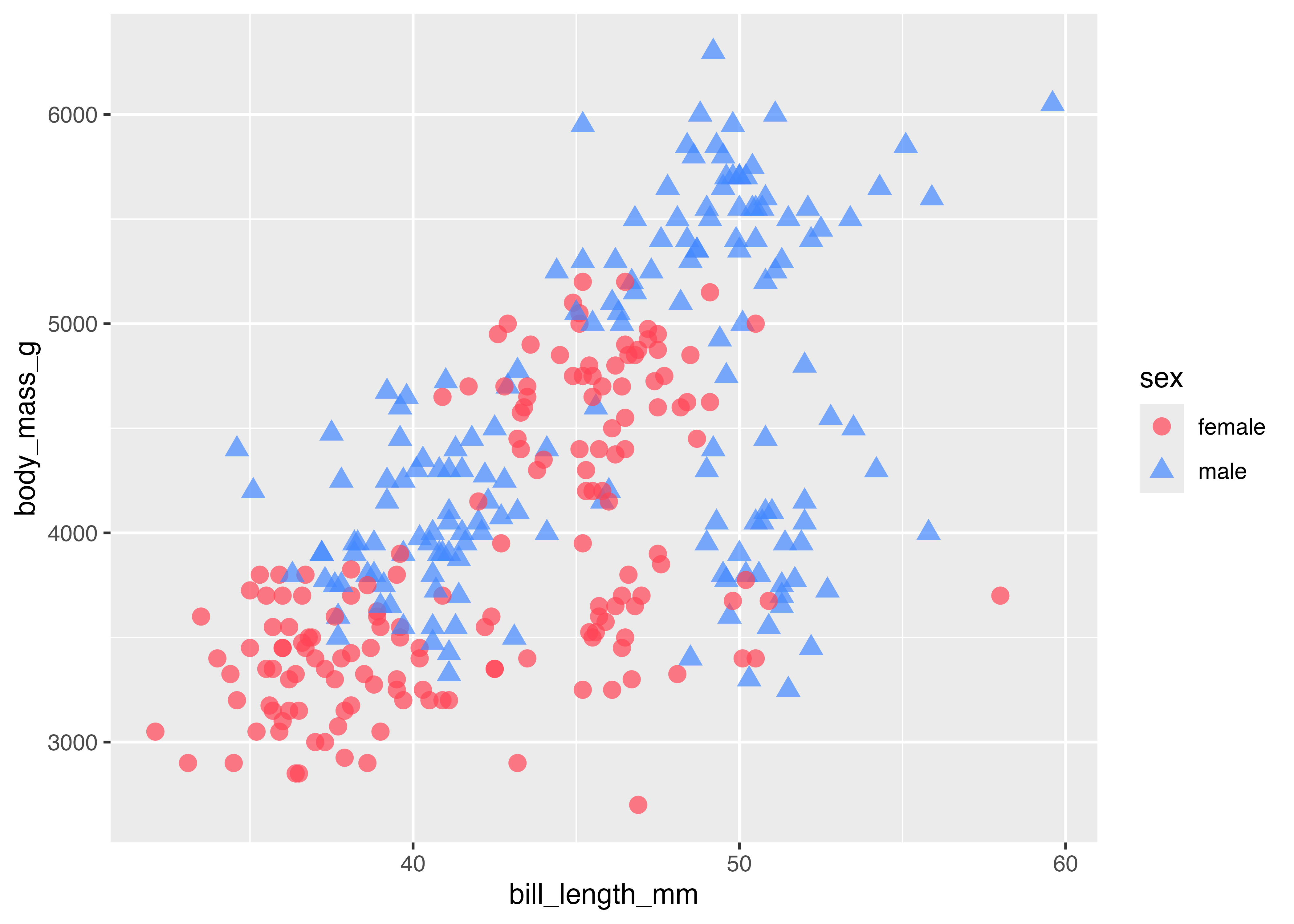
# 色を RColorBrewer を使って指定する例
fig = ggplot(dat, aes(x = species, fill = sex)) +
  geom_bar(position = "dodge") +
  scale_fill_brewer(palette = "Pastel1")
plot(fig)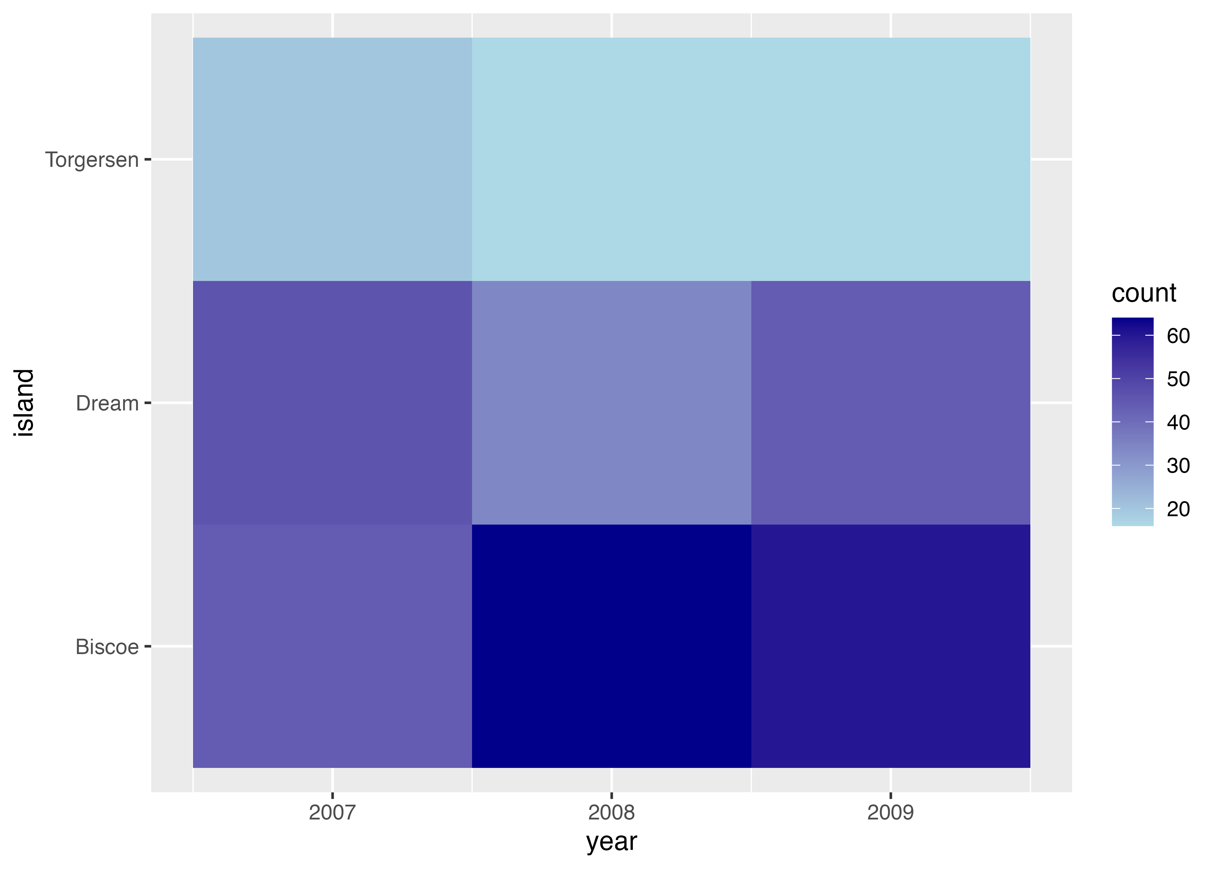
点の形をマッピング aes(shape = ...) した場合、scale_shape_manual() を使って形を手動で指定できます。
- 形は番号で指定します(例: 0=四角, 1=丸, 2=三角)。
- よく使われるのは 15〜18 の塗りつぶされた形です。 (15=■, 16=●, 17=▲, 18=◆)
- こちらのページの一番下の図に点の形の一覧と形の番号がまとめられています。
以下の例では色と形を手動で指定しています。形は、female に 16 (●)、male に 17(▲) を割り当てています。
dat2 = subset(dat, !is.na(sex)) # NAを除外
fig = ggplot(dat2, aes(
  x = bill_length_mm, y = body_mass_g, shape = sex, color = sex)) +
  geom_point(alpha = 0.7, size = 3) +
  scale_color_manual(values = c("#ff4455", "#4488ff")) +
  scale_shape_manual(values = c(16, 17))
plot(fig)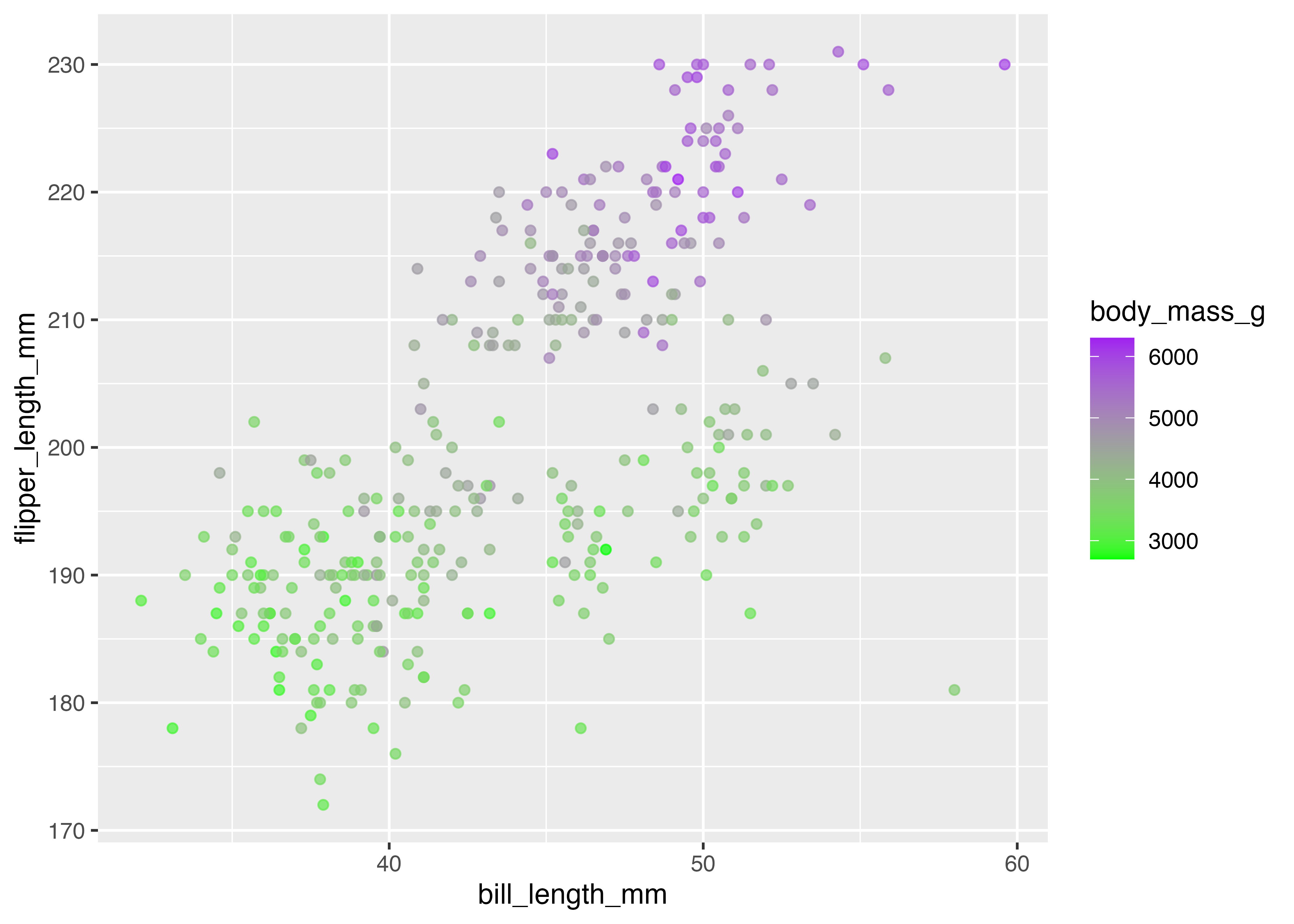
連続変数(数値)のカスタマイズ
ヒートマップでの場合のように、aes(fill = ...)で数値(連続値)を色にマッピングした場合、scale_fill_gradient() で色のグラデーションを変更できます。low と high 引数でグラデーションの両端の色を指定します。
# ヒートマップ用の集計データを作成
tmp = dat
tmp$count = 1
df = aggregate(count ~ island + year, data = tmp, FUN = sum)

fig = ggplot(df, aes(x = year, y = island, fill = count)) +
  geom_tile() +
  scale_fill_gradient(low = "lightblue", high = "darkblue")
plot(fig)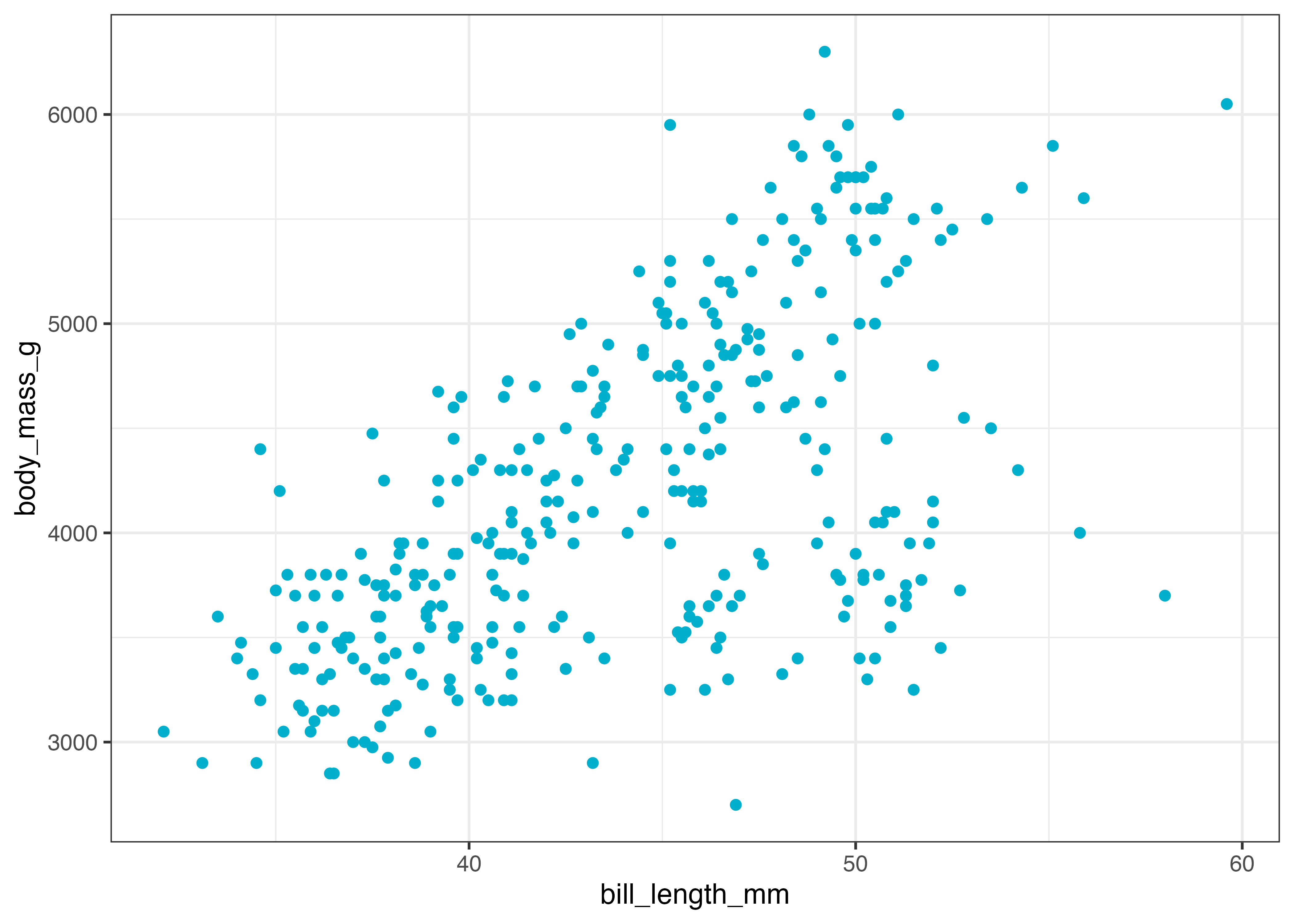
以下は散布図の点の color に、体重 body_mass_g(連続値)をマッピングした例です。
fig = ggplot(dat, aes(x = bill_length_mm, y = flipper_length_mm, color = body_mass_g)) +
  geom_point(alpha = 0.7) +
  scale_color_gradient(low = "green", high = "purple")
plot(fig)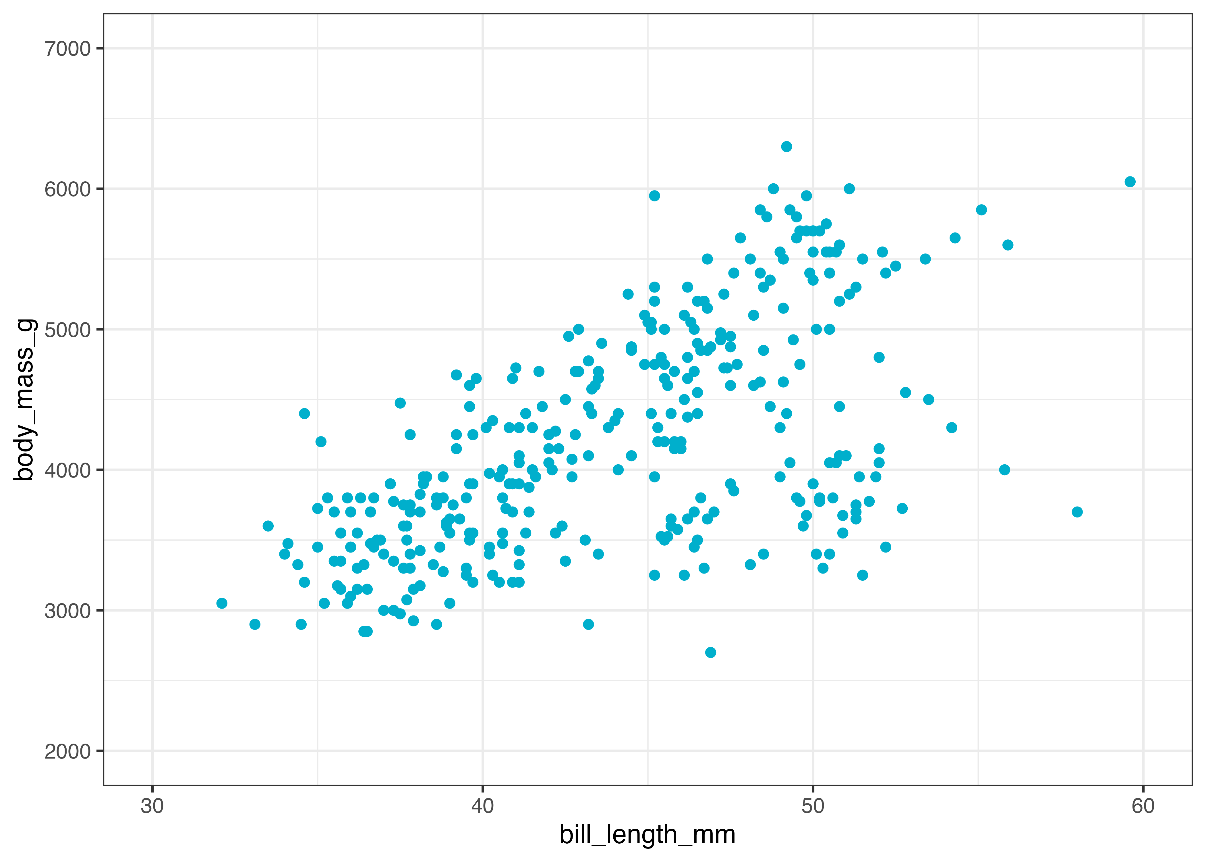
色と形のカスタマイズのまとめ
scale_*() 関数は、aes() で何をマッピングしたか(color, fill, shape など)と、マッピングした変数の型(カテゴリカル or 連続)によって、使用する関数が決まります。
1. aes(color = ...)とaes(fill = ...)(色と塗りつぶし)
マッピングにカテゴリ変数(種や性別など)を指定した場合:
scale_color_manual(values = c(...)): 色を手動で指定します。scale_color_brewer(palette = ...): RColorBrewer のパレットを適用します。- fill の場合は
scale_fill_manual()やscale_fill_brewer()
マッピングに連続変数(カウント数や体重など)を指定した場合:
scale_color_gradient(low = ..., high = ...): 2色のグラデーションを指定します。- fill の場合は
scale_fill_gradient()
2. aes(shape = ...)(形)
マッピングにカテゴリ変数(種や性別など)を指定した場合:
scale_shape_manual(values = c(...)): 形(数値)を手動で指定します。
連続変数 の場合:
- 数値のような連続変数を「形」にマッピングすることは一般的ではありません。そのため、scale_shape_gradient() に相当する関数は ggplot2 には用意されていません。
8.8.3 軸の調整 (xlim, ylim)
ggplot2 は自動で適切な軸の範囲や目盛りを設定しますが、グラフの特定の部分を拡大(ズーム)したい場合や、目盛りの間隔を自分で指定したい場合があります。
軸の表示範囲を指定する
xlim() と ylim() を追加すると、X軸とY軸の表示範囲(最小値, 最大値)を指定できます。
散布図を例に説明します。
library(ggplot2)
library(palmerpenguins)
dat = palmerpenguins::penguins

fig = ggplot(dat, aes(x = bill_length_mm, y = body_mass_g)) +
  geom_point(color = "#00afcc") +
  theme_classic()
plot(fig)
上記のデフォルトの状態では、横軸も縦軸も中途半端な値の範囲になっています。そこで、キリの良い値でグラフの範囲を指定してみます。
fig = ggplot(dat, aes(x = bill_length_mm, y = body_mass_g)) +
  geom_point(color = "#00afcc") +
  xlim(30, 60) +
  ylim(2000, 7000) +
  theme_classic()
plot(fig)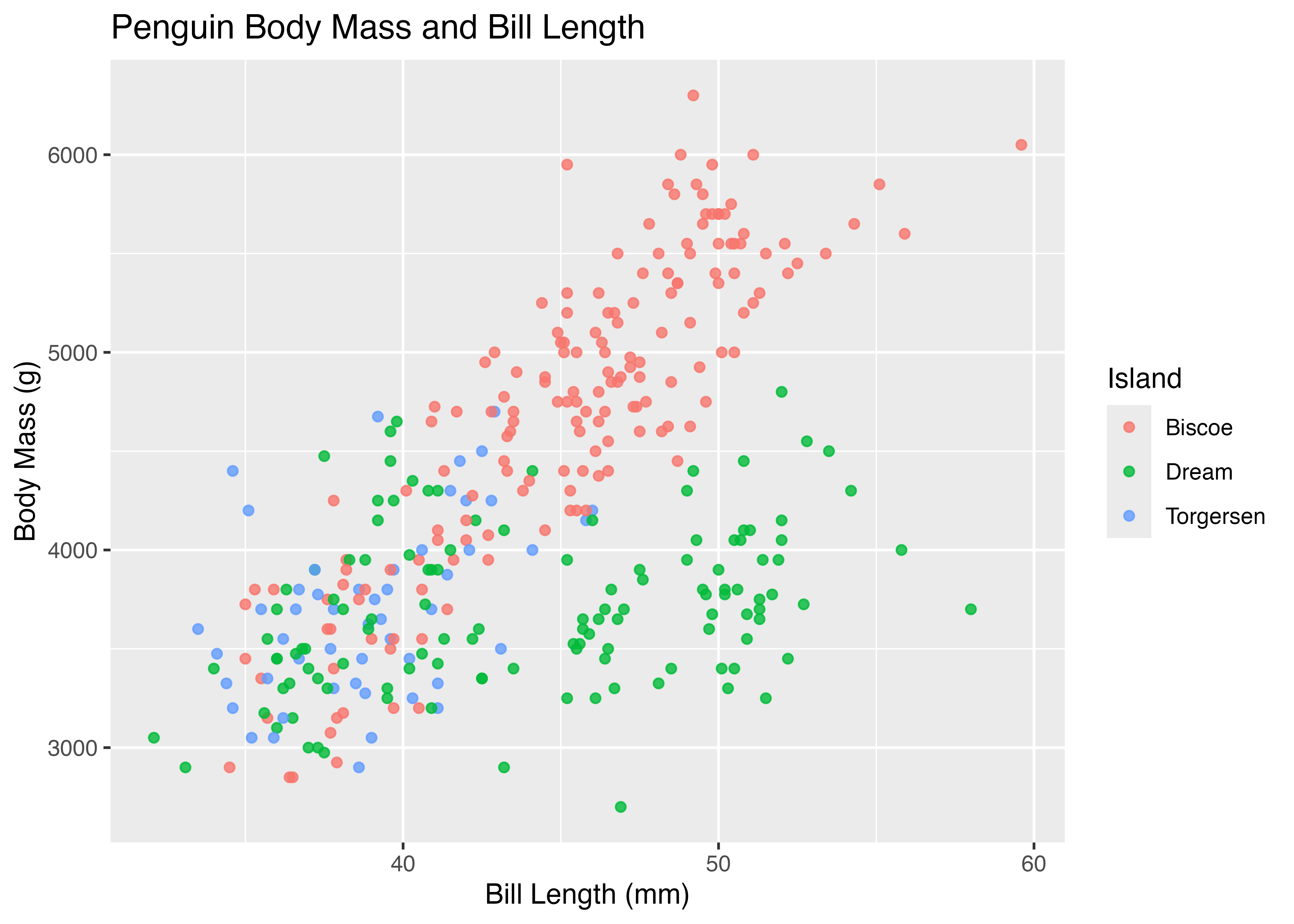
これで横軸は30から60、縦軸は2000から7000の範囲を取るようになりました。
軸の表示範囲と目盛りを調整する
軸の「範囲」ではなく「目盛り」を調整したい場合は、scale_x_continuous() や scale_y_continuous() を使います。
それぞれの関数において、limits 引数で軸の範囲を指定し、breaks 引数で目盛りの数値を指定します。
fig = ggplot(dat, aes(x = bill_length_mm, y = body_mass_g)) +
  geom_point(color = "#00afcc") +
  scale_x_continuous(
    limits = c(30, 60),
    breaks = c(30, 35, 40, 45, 50, 55, 60)
  ) +
  scale_y_continuous(
    limits = c(2000, 7000),
    breaks = c(2000, 3500, 5000, 6500)
  ) +
  theme_classic()
plot(fig)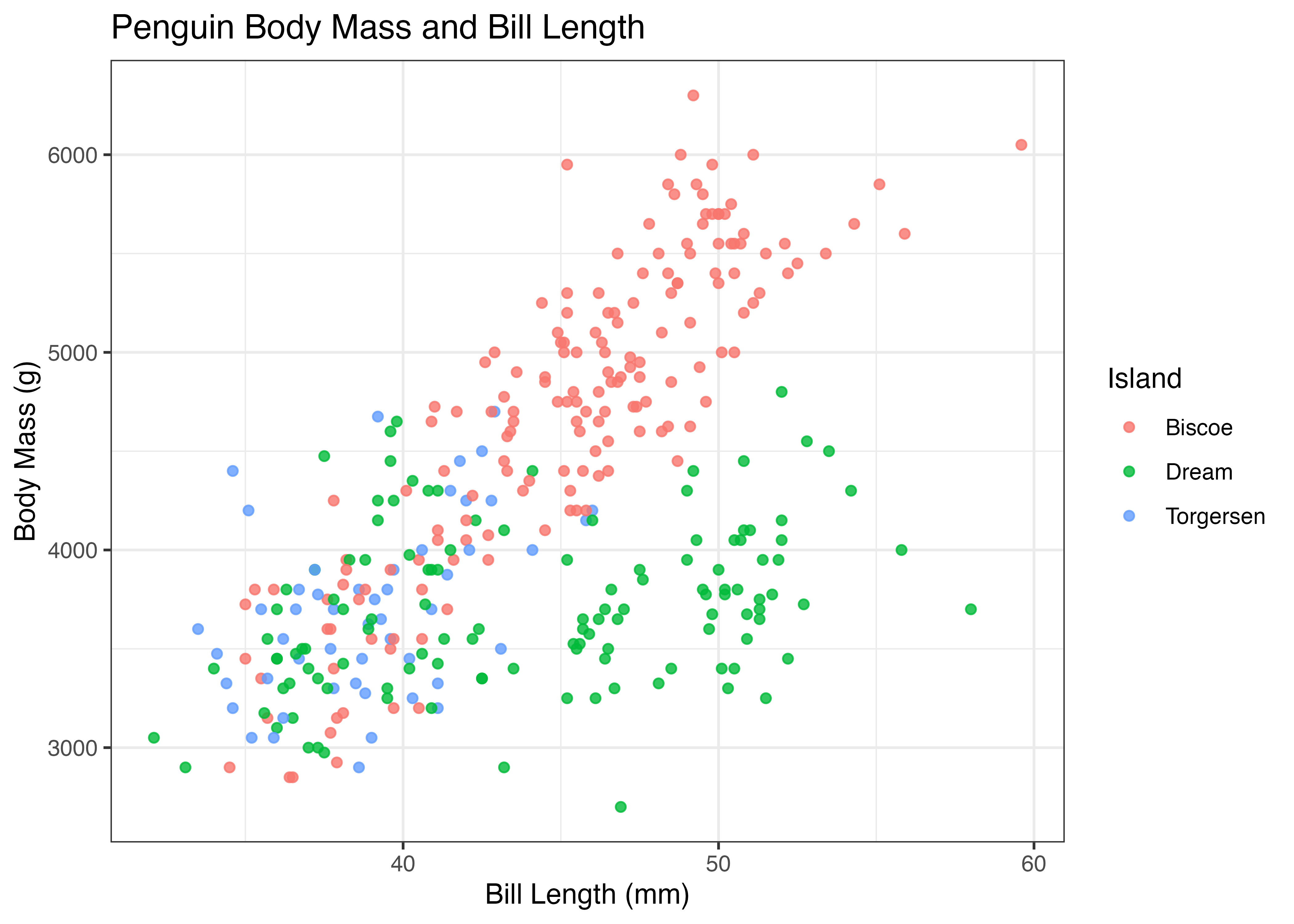
注意点として、scale_x_continuous() や scale_y_continuous() を使う際は、xlim() や ylim() を同時に使わないようにするということです。
なぜかと言えば、xlim(30, 60)といった命令は、実際には scale_x_continuous(limits = c(30, 60)) として ggplot の中では扱われるからです。xlim と scale_x_continuous を同時に使ってしまうと、後から記述した方の関数が先に書いた方の関数を上書きしてしまいます。これによって意図しない設定でグラフが描画されてしまいます。
実用上、グラフの見た目を調整する際は、軸の範囲だけではなく目盛りも同時に指定するべき場面が多いです。したがって、xlim() や ylim() は使わずに常に scale_x_continuous() や scale_y_continuous() を使うようにすると良いと思われます。
8.8.4 テーマの適用 (theme_* / theme)
ggplot2 の「テーマ (Theme)」は、グラフのデータと無関係なすべての視覚的要素(背景色、グリッド線、文字フォント、凡例の位置など)を制御します。
プリセットテーマの適用 (theme_*())
theme_*() 関数を使うと、グラフ全体のデザインを一括で変更できます。これまでしばしば使っていた theme_classic() もそうした関数のひとつです。
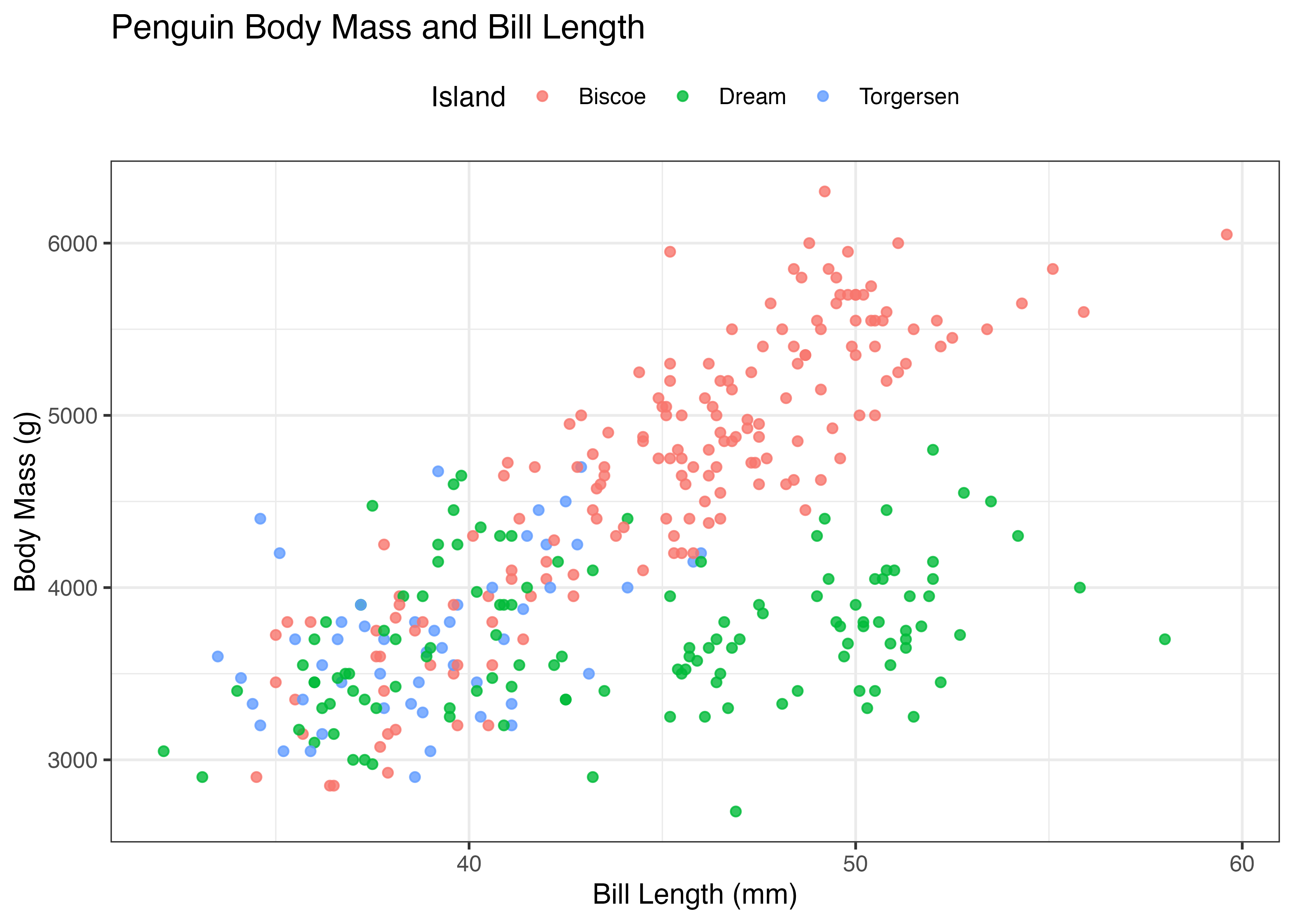
散布図にラベルを指定したグラフをベースに、いくつかのテーマを適用してみます。まずはデフォルトの灰色の背景のグラフです。
library(ggplot2)
library(palmerpenguins)
dat = palmerpenguins::penguins

fig = ggplot(dat, aes(x = bill_length_mm, y = body_mass_g, color = island)) +
  geom_point(alpha = 0.8) +
  labs(
    title = "Penguin Body Mass and Bill Length",
    x = "Bill Length (mm)",
    y = "Body Mass (g)",
    color = "Island"
  )
plot(fig)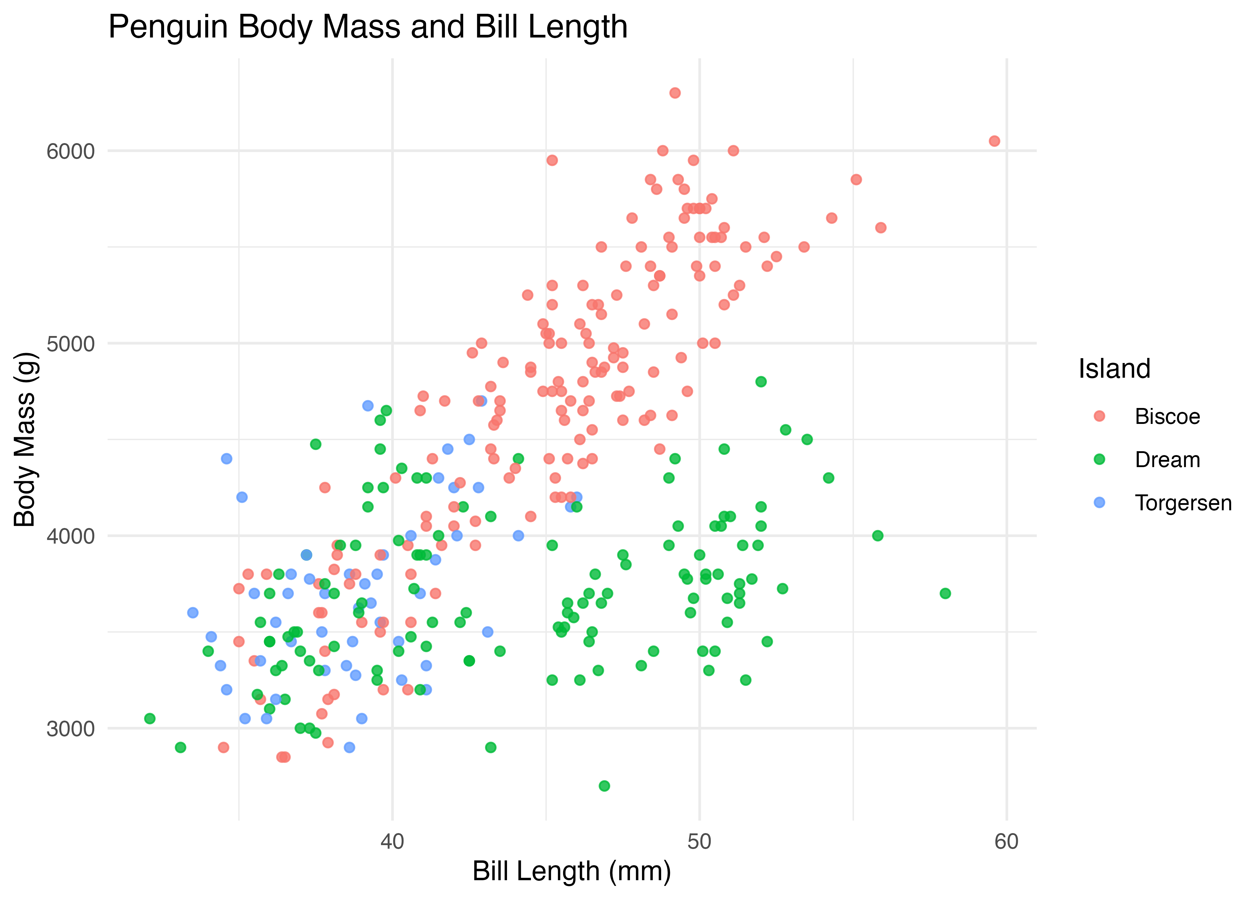
theme_bw() (Black & White) は背景が白、グリッド線が灰色の、論文などでよく使われるシンプルなテーマです。
theme_minimal() は、theme_bw() よりもさらにシンプルで、背景の枠やグリッド線が最小限に抑えられたテーマです。
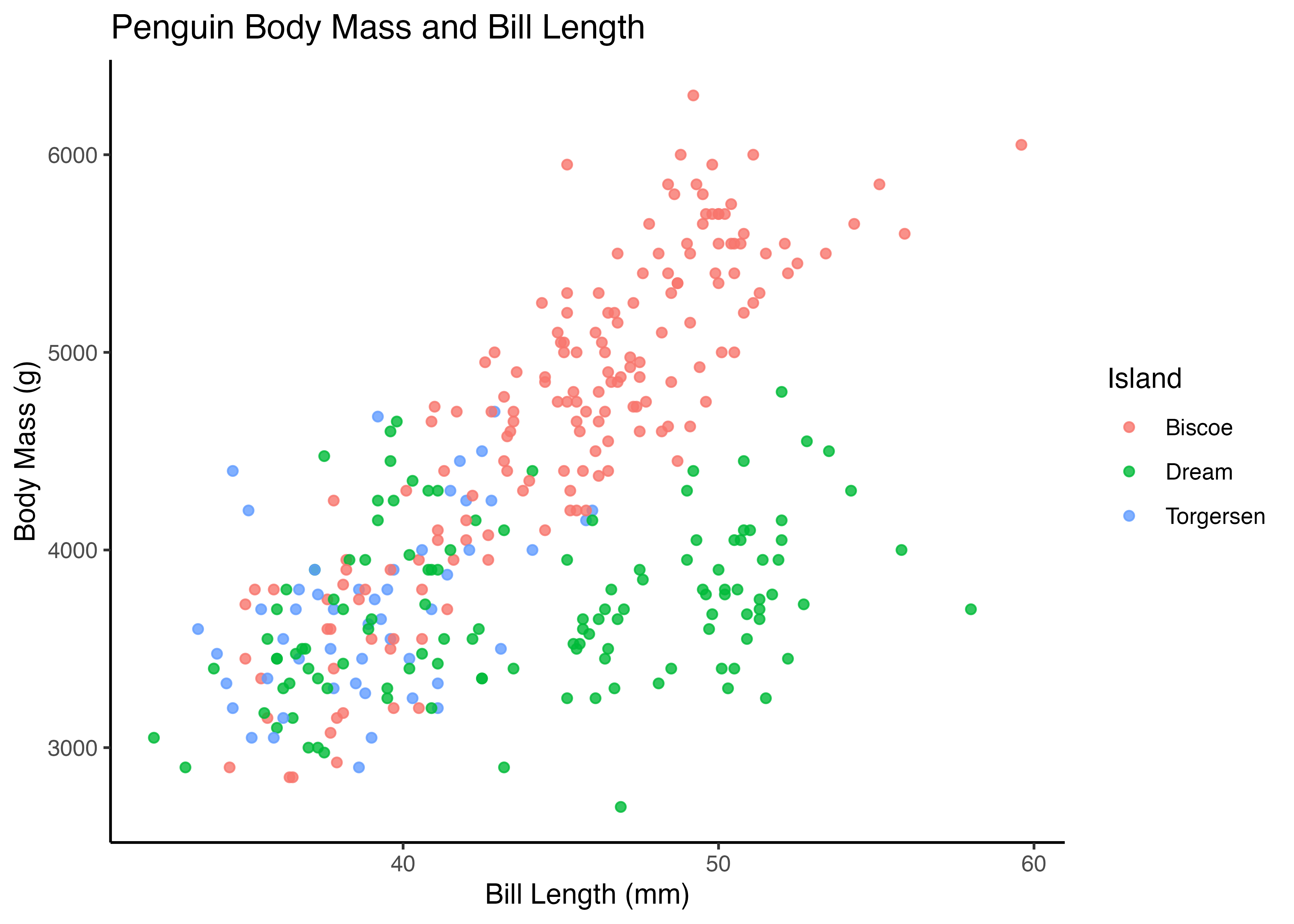
theme_classic() は古典的な科学グラフのように、グリッド線がなくX軸とY軸の線だけを持つテーマです。
個別設定の調整 (theme())
theme() 関数を使うと、グラフの要素を個別に細かく調整できます。上述した theme_*() で全体を変更した後、theme() で微調整を行うのが一般的です。
theme() 関数の中で、設定したい見た目の指示を行います。たとえば、凡例の位置を変更する legend.position 引数で凡例の位置を指定できます。
- "top", "bottom", "left", "right": 上下左右に配置
- "none": 凡例を非表示にする
theme()関数の中で指定できるのは凡例の設定でけではありません。実際にはグラフが持つさまざまな視覚的特徴をtheme()関数内で指定することができます。
たとえば、グラフ内の文字のスタイル(フォントの大きさや書体など)を指定するには、以下の引数に対して element_text() を使うことで文字のサイズ (size)、書体 (face = "bold" など)、色 (color) などを指定します。
- plot.title: グラフ全体のタイトル
- axis.title: 軸ラベル(XとYの両方)
- axis.text: 軸の目盛りテキスト
- legend.title: 凡例のタイトル
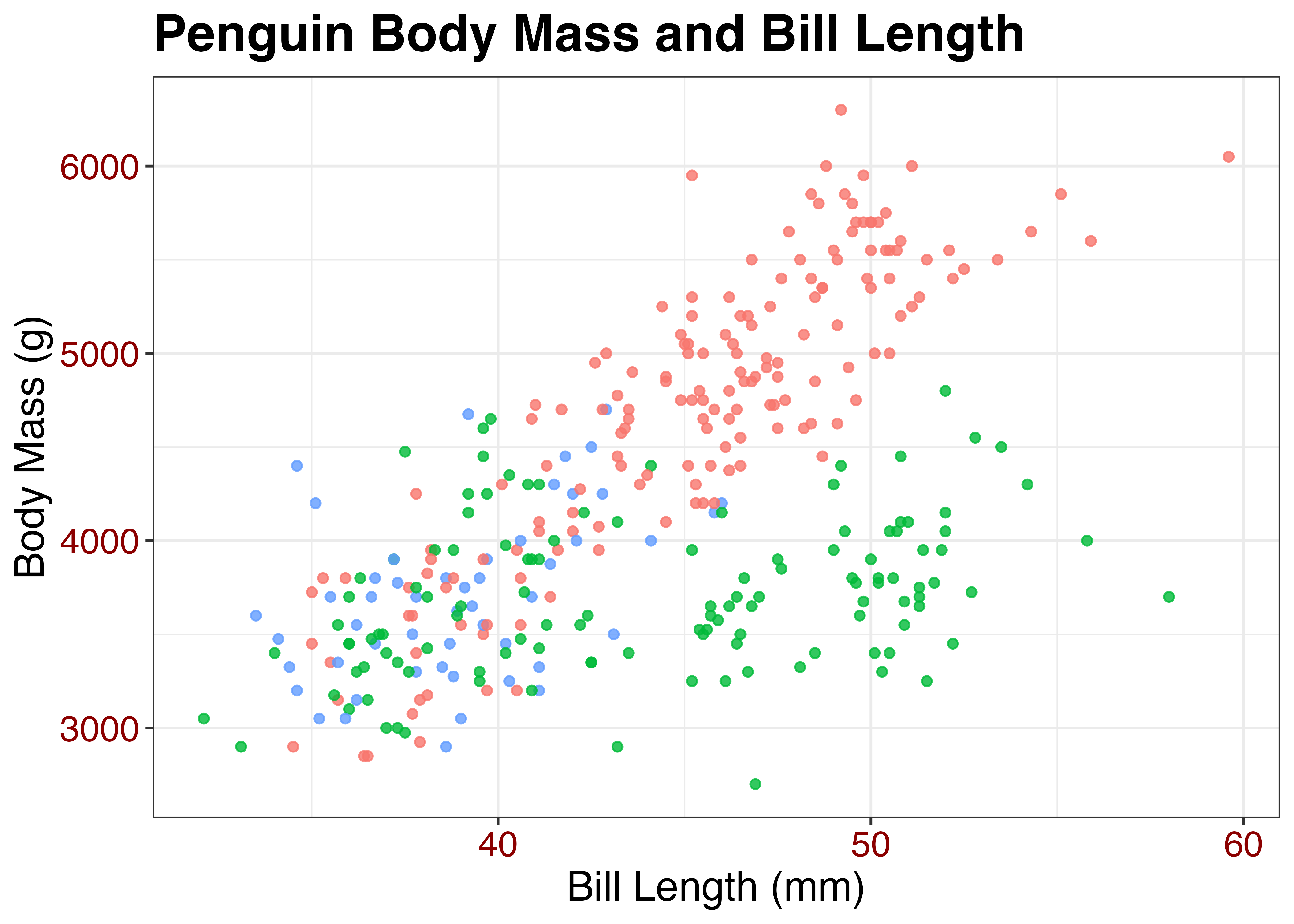
fig = ggplot(dat, aes(x = bill_length_mm, y = body_mass_g, color = island)) +
  geom_point(alpha = 0.8) +
  labs(
    title = "Penguin Body Mass and Bill Length",
    x = "Bill Length (mm)",
    y = "Body Mass (g)",
    color = "Island"
  ) +
  theme_bw() +
  theme(
    plot.title = element_text(size = 20, face = "bold"), # タイトルを太字・20ptに
    axis.title = element_text(size = 16), # 軸ラベルを16ptに
    axis.text = element_text(size = 14, color = "blue"), # 目盛りを青色に
    legend.position = "none" # 凡例を非表示に
  )
plot(fig)
さらに、グラフ内のグリッド線を調整するには panel.grid.major や panel.grid.minor 引数を使います。以下では element_blank() を使ってグリッド線を削除しています。
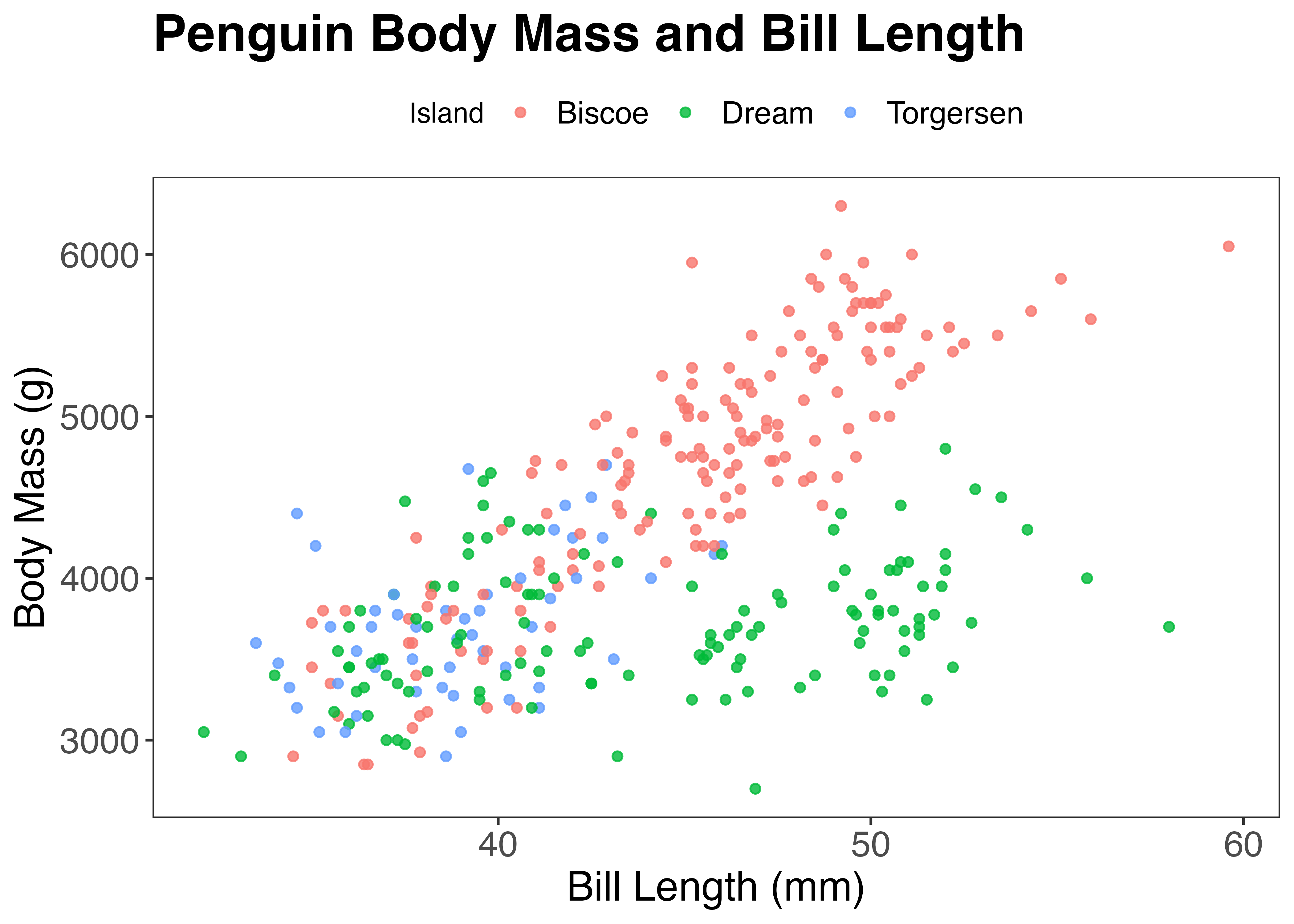
fig = ggplot(dat, aes(x = bill_length_mm, y = body_mass_g, color = island)) +
  geom_point(alpha = 0.8) +
  labs(
    title = "Penguin Body Mass and Bill Length",
    x = "Bill Length (mm)",
    y = "Body Mass (g)",
    color = "Island"
  ) +
  theme_bw() +
  theme(
    plot.title = element_text(size = 20, face = "bold"),
    axis.title = element_text(size = 16),
    axis.text = element_text(size = 14),
    legend.position = "top",
    legend.text = element_text(size = 12), # 凡例の文字サイズ
    panel.grid.major = element_blank(), # 主要なグリッド線を消す
    panel.grid.minor = element_blank() # 補助的なグリッド線を消す
  )
plot(fig)
上記の例では凡例の文字サイズやグリッド線なども調整しています。このように、theme() 関数を使うことで図のさまざまな見た目の要素を調整することができます。
theme()関数でできることは他にもたくさんあります。こちらのページやこちらのページなどに情報がまとまっているので参考にしてください。これらは別に記憶する必要はなく、やりたいことがあったらその都度調べればよいという感じのものです。
8.8.5 レイヤーの順序
ggplot2 では、geom 系の関数を+記号を使って追加するたびに、グラフにレイヤー(層)が追加されます。後から追加された要素ほど、グラフでは手前に表示されます。
この違いを、棒グラフにエラーバーを追加する例をもとに説明します。
library(ggplot2)
library(palmerpenguins)
dat = palmerpenguins::penguins

# 種(species)ごとの体重の平均値と標準偏差を計算
d_mean = aggregate(body_mass_g ~ species, data = dat, FUN = mean, na.rm = TRUE)
d_sd = aggregate(body_mass_g ~ species, data = dat, FUN = sd, na.rm = TRUE)
df = data.frame(
  species = d_mean$species,
  avg = d_mean$body_mass_g,
  sd = d_sd$body_mass_g
)

# ベースとなるプロットを作成
fig = ggplot(df, aes(x = species, y = avg))
例1: 棒グラフが上に来る場合(非推奨)
geom_errorbar() を先に追加し、geom_col() を後から追加します。
geom_col()(棒)が最後に描画されたため、棒がエラーバーの上に重なっています。これにより、エラーバーの下半分(棒グラフの内部にある部分)が棒によって隠されてしまい、上側のT字部分しか見えなくなっています。
# 先にエラーバーを描き、次に棒を描く場合
fig1 = fig +
  geom_errorbar(aes(ymin = avg - sd, ymax = avg + sd), width = 0.2) +
  geom_col()

plot(fig1)
例2: エラーバーが上に来る場合(推奨)
geom_col() を先に追加し、geom_errorbar() を後から追加します。
geom_errorbar() が後で描画されたため、エラーバーの下半分も今回は見えています。
# 先に棒を描き、次にエラーバーを描く場合
fig2 = fig +
  geom_col() +
  geom_errorbar(aes(ymin = avg - sd, ymax = avg + sd), width = 0.2)

plot(fig2)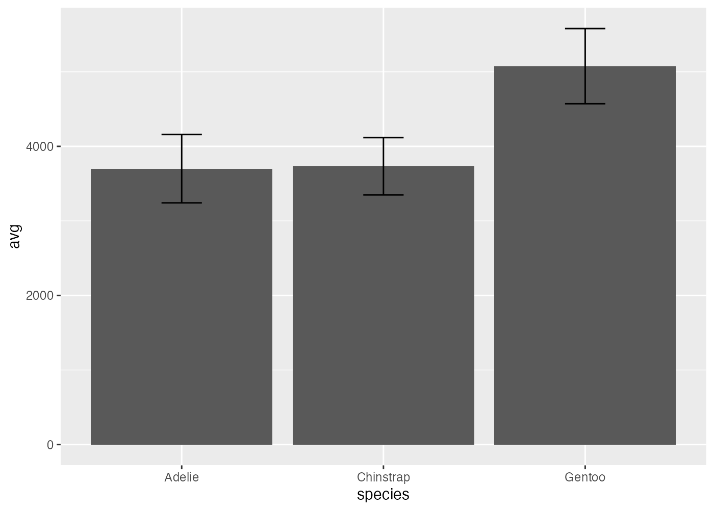
このように、レイヤーの順序はグラフの見た目に影響します。どの要素を手前に表示したいかを意識し、+ で追加する順序を決めるようにしましょう。
8.8.6 グラフの分割
ggplot2 の facet(ファセット)機能は、データセット全体を1つのグラフで表現する代わりに、指定したカテゴリ(グループ)ごとにグラフを分割して表示するための機能です。
facet_wrap(): 1つの変数で分割する(自動折り返し)
facet_wrap() は、1つの変数に基づいてグラフを分割し、利用可能なスペースに自動的に折り返して配置します。
facet_wrap(~ species)のように、~(チルダ)の後に分割の基準となる変数名を指定します。
ペンギンデータのクチバシ長と体重の散布図を種ごとに分割表示します。
fig = ggplot(dat, aes(x = bill_length_mm, y = body_mass_g)) +
  geom_point(color = "#00afcc", alpha = 0.75, size = 1.5) +
  theme_bw() +
  facet_wrap(~ species)
plot(fig)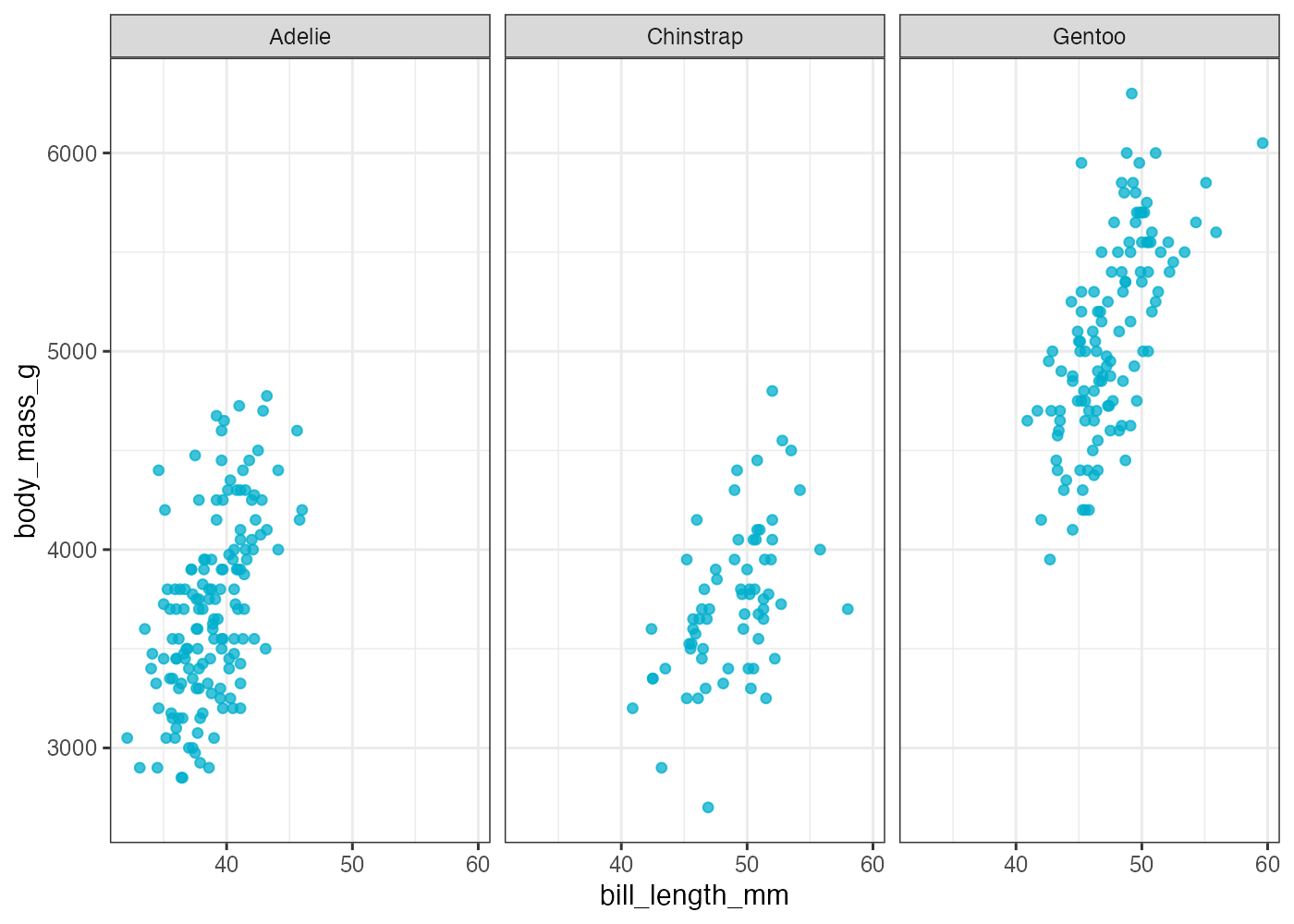
種ごとの3つのプロットが並んで作成され、各プロットの上部にカテゴリ名(Adelie, Chinstrap, Gentoo)が表示されます。
カテゴリ数が3までの場合、facet_wrap()を使うとすべてのグラフが横に並んで作成されます。しかし、カテゴリ数が4以上になると、縦方向にもグラフが並びます。たとえば、カテゴリ数が4であれば2×2(2行2列)という配置になります。
ncol(列数)や nrow(行数)を使うことで、グラフの配置を指定できます。
fig = ggplot(dat, aes(x = bill_length_mm, y = body_mass_g)) +
  geom_point(color = "#00afcc", alpha = 0.75, size = 1.5) +
  theme_bw() +
  facet_wrap(~ species, nrow = 2) # 行数を指定した
plot(fig)
図が2行になってひょうじされました。種には3カテゴリしかないので、図の右下の箇所は空欄になっています。
facet_grid(): 2つの変数で分割する(格子状)
facet_grid() は、2つの変数に基づいてグラフを格子(グリッド)状に分割します。
facet_grid(行の変数 ~ 列の変数)という形式で指定します。
種と島の組み合わせでグラフを分割してみます。
fig = ggplot(dat, aes(x = bill_length_mm, y = body_mass_g)) +
  geom_point(color = "#00afcc", alpha = 0.75, size = 1.2) +
  theme_bw() +
  facet_grid(island ~ species)
plot(fig)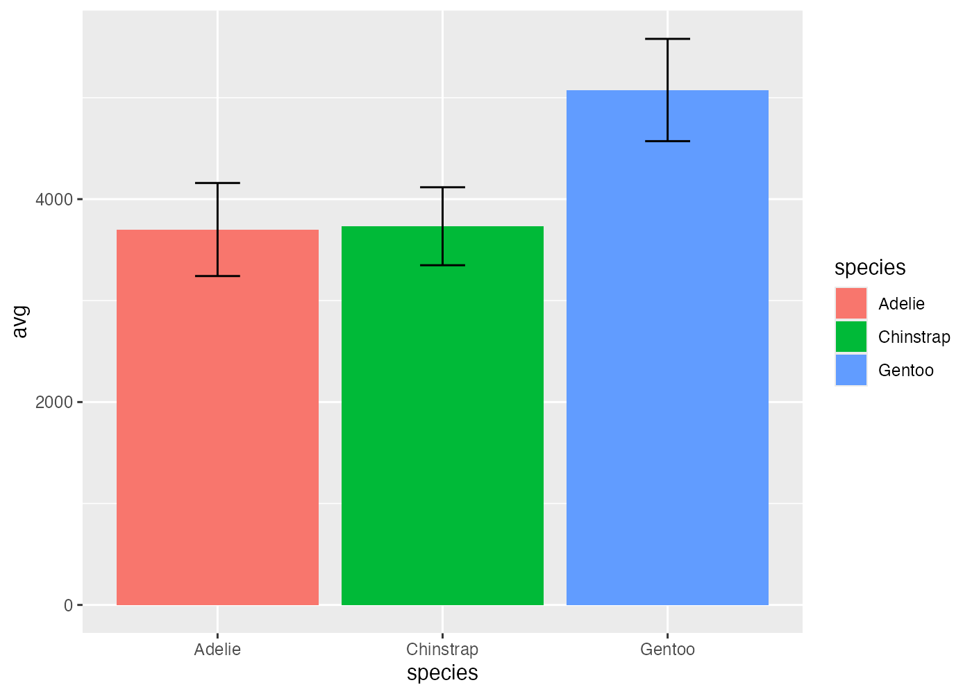
島の3行 x 種の3列、合計6つのグラフが格子状に並びます。ただし、特定の組み合わせ(Chinstrap × Biscoeなど)にはデータがないので、グラフの中身は空白になっています。
なお、facet_grid(island ~ .)のように .(ドット)を使うと、列(または行)には分割せず、行(または列)にのみ変数を割り当てることができます。
8.8.7 複数のグラフを結合する
ggplot() 関数を使って作成した個別のグラフを結合し、1枚のグラフにまとめたい場合があります。
この作業には専用のパッケージを使用します。patchwork パッケージと cowplot パッケージが有名ですが、それぞれ特徴が異なります。
- patchwork: + や / といった演算子を使い、直感的にグラフ同士を組み合わせてレイアウトできるパッケージ。複雑なレイアウトも簡単に作成することができます。
- cowplot: plot_grid() 関数を使い、グラフを格子状に配置します。特に、軸の整列(align)機能が強力で、異なるY軸を持つグラフ同士でもプロット領域の端(軸)を厳密に揃えることができます。
このページでは patchwork パッケージを使った方法を解説します。
patchwork のインストールと読み込み
以下の文を Console で実行してパッケージをインストールします。 。
使用する際は、ggplot2 などと合わせて library() で読み込んでおきます。
patchwork によるグラフの結合
patchwork は、ggplot() で作成したグラフオブジェクト(変数に格納したもの)同士を+や/で計算できるようにします。
まず、例として3つの異なるグラフ(p1, p2, p3)を作成し、それぞれ変数に格納します。
# グラフ1 (散布図)
p1 = ggplot(dat, aes(x = bill_length_mm, y = body_mass_g, color = species)) +
  geom_point(alpha = 0.7) +
  theme_bw() +
  theme(legend.position = "none") # 凡例を非表示に

# グラフ2 (箱ひげ図)
p2 = ggplot(dat, aes(x = species, y = flipper_length_mm, fill = species)) +
  geom_boxplot() +
  theme_bw()

# グラフ3 (ヒストグラム)
p3 = ggplot(dat, aes(x = body_mass_g, fill = species)) +
  geom_histogram(position = "identity", alpha = 0.7) +
  theme_bw()
横に並べる
グラフを横に並べるには、p1 + p2のように+を使います。

あるいは、+の代わりに-や|を使うこともできます。つまり、p1 - p2やp1 | p2と書いても、グラフを横に並べることができます。
実は、+を使った場合にグラフが意図した通りのレイアウトにならない場合があり、その際は-や|を使うと解決することがあります。

複雑なレイアウト
() を使って優先順位を制御することで、数学の計算式のように複雑なレイアウトを組むことができます。
例えば、「上段に p1 と p2 を横に並べ、下段に p3 を配置する」場合は、(p1 + p2) を先に計算し、それを p3 の上(/)に配置します。

plot_layout() によるレイアウトの調整
patchwork の + や / は非常に直感的ですが、グラフが自動的に配置されます。plot_layout() は、この自動配置を上書きし、列数、行数、または各グラフが占める幅や高さの比率を明示的に制御するために使います。
複数のグラフを + で結合しただけでは、patchwork が最適と判断したレイアウトになりますが、plot_layout() で ncol(列数)を指定すると、その列数で折り返されます。その結果、p1, p2 が1行目に、p3 が2行目に自動で折り返されて配置されます。
# 3つのグラフを単純に足し合わせ、2列 (ncol = 2) でレイアウト
fig_ncol = p1 + p2 + p3 +
  plot_layout(ncol = 2)

plot(fig_ncol)
横に並べたグラフの幅の比率を制御したい場合は、plot_layout() の widths 引数に数値ベクトル(c(…))を指定します。その結果、p1 が p2 の2倍の幅で描画され、p1 のグラフ(散布図)がより強調されます。
# p1 の幅を 2、p2 の幅を 1 の比率 (2:1) に指定
fig_widths = p1 + p2 +
  plot_layout(widths = c(2, 1))

plot(fig_widths)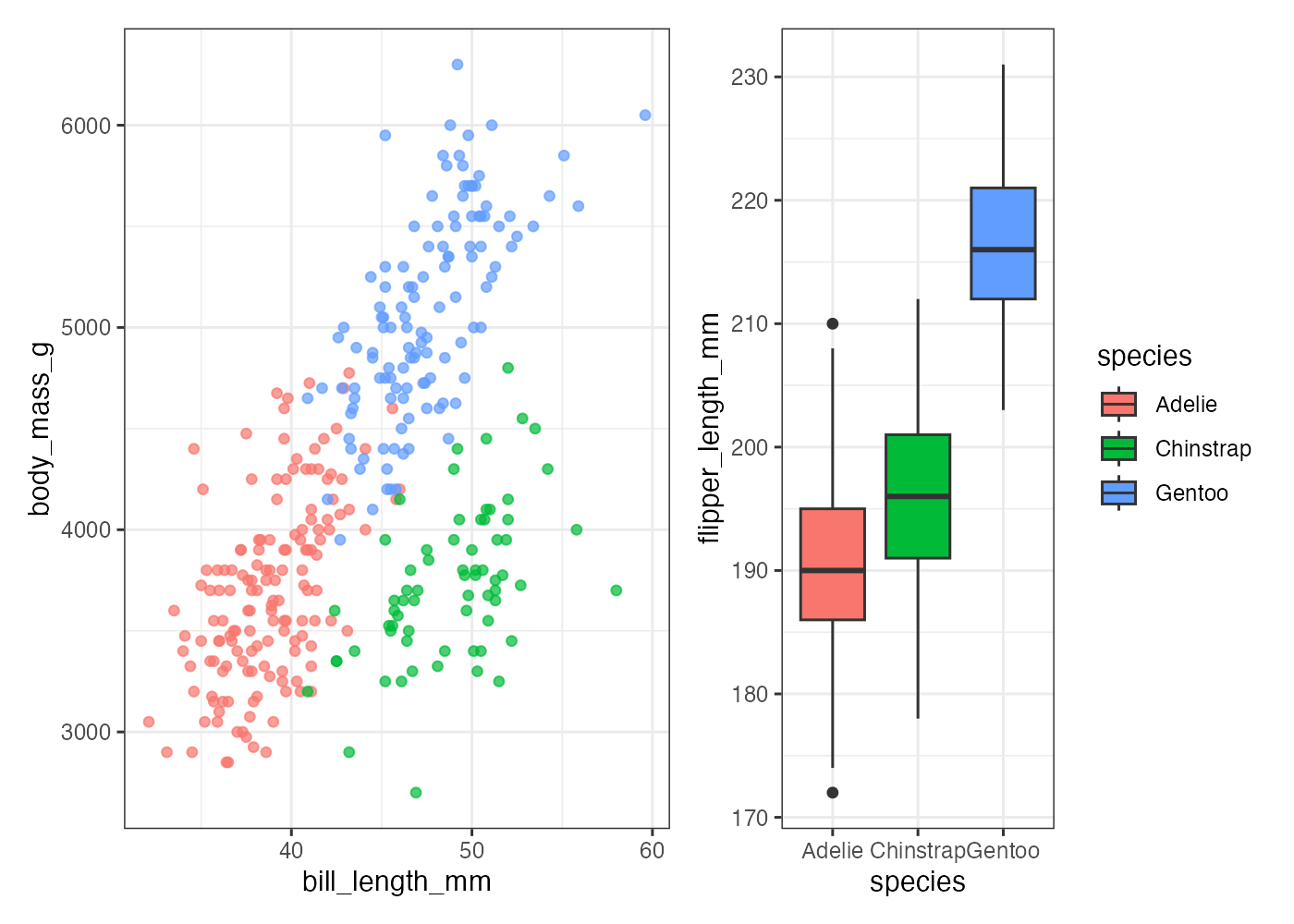
縦に並べたグラフ(/ を使用)の高さの比率を制御したい場合は、heights 引数を使います。その結果、p2(箱ひげ図)が p1 よりも縦に大きく描画されます。
# p1 の高さを 1、p2 の高さを 3 の比率 (1:3) に指定
fig_heights = p1 + p2 +
  plot_layout(nrow = 2, heights = c(1, 3)) # nrow = 2 も明示

plot(fig_heights)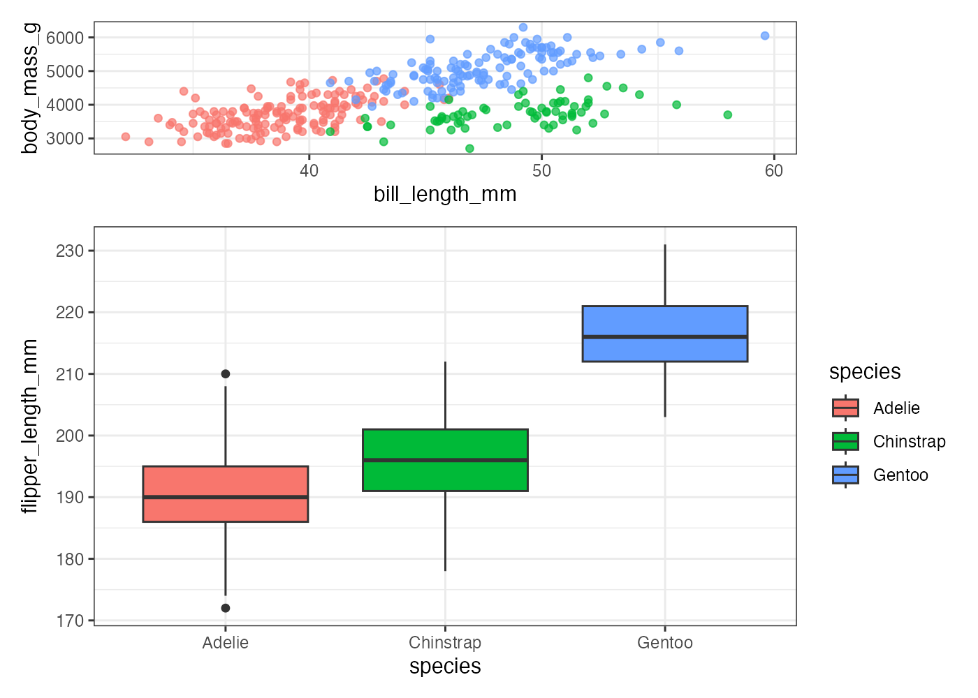
(p1 / p2) - p3 というレイアウト(左側に縦積み、右側にp3)に対しても、左右の幅を調整できます。
# (p1 / p2) が左側 (1番目)、p3 が右側 (2番目)
# 左側 (p1/p2) の幅を 1、右側 (p3) の幅を 2 の比率 (1:2) に指定
fig_complex = (p1 / p2) - p3 +
  plot_layout(widths = c(1, 2))

plot(fig_complex)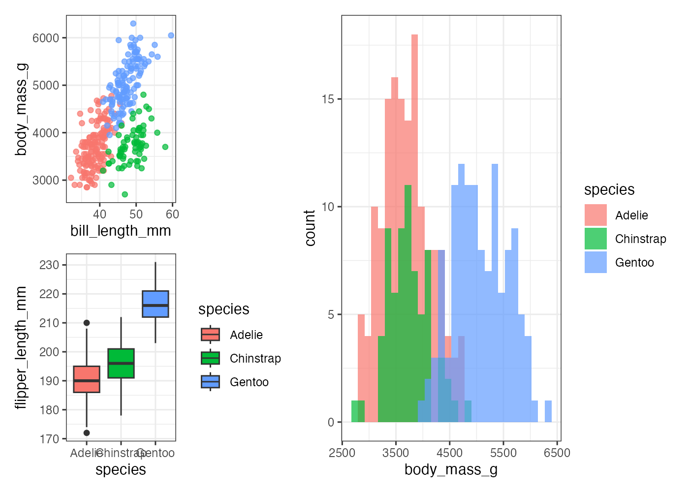
このように plot_layout() を使うことで、patchwork の最終的なレイアウトの微調整が可能になります。
8.9 ggplot2のトラブルシューティング
8.10 まとめと参考資料
このページではさまざまな種類のグラフを作成する方法を解説しました。さらに、scale_*() 系の関による色・形・軸の目盛りの調整や、theme() 関数によるグラフのデザインの調整についても解説しました。
参考になるページを挙げておきます。
- ggplot2 チートシート
ggplot2 の主要な関数と引数が視覚的にまとめられています。RStudioのメニュー Help > Cheatsheets から Data Visualization with ggplot2 を探すか、Webで検索してください。
こちらに日本語版が掲載されています。
https://raw.githubusercontent.com/rstudio/cheatsheets/main/translations/japanese/data-visualization_ja.pdf - ggplot2 公式ドキュメント
各関数(geom_point など)のすべての引数と、豊富な使用例が掲載されています。 ggplot2.tidyverse.org
8.11 確認問題
8.11.1 散布図
penguins データを使い、以下のすべての条件を満たす散布図を作成してください。
- X軸に flipper_length_mm、Y軸に body_mass_g をマッピングする。
- geom_point() で点をプロットする。点のalphaを0.7にする。
- species に応じて色をマッピングする。
- scale_color_manual() を使い、Adelie に "darkorange"、Chinstrap に "purple"、Gentoo に "cyan4" の色を手動で割り当てる。
- theme_bw() を適用する。
- theme() を使い、凡例をグラフの "bottom"(下部)に配置する。
解答と解説(クリックして展開)
# 準備
library(ggplot2)
library(palmerpenguins)
dat = penguins

# グラフ作成
fig = ggplot(dat, aes(x = flipper_length_mm, y = body_mass_g, color = species)) +
  geom_point(alpha = 0.7) +
  scale_color_manual(values = c("darkorange", "purple", "cyan4")) +
  theme_bw() +
  theme(legend.position = "bottom")

plot(fig)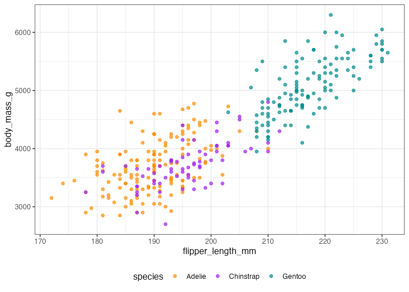
[解説] ggplot() と aes() で基本設定(条件1, 3)をし、geom_point()(条件2)を追加します。scale_color_manual() を + で追加し、values = c(…) に指定の3色をベクトルとして渡します(条件4)。色は species の因子レベルの順(Adelie, Chinstrap, Gentoo)に適用されます。theme_bw() を適用した後(条件5)、さらに theme() を + で追加し、legend.position = "bottom" を指定して凡例の位置を個別に調整します(条件6)。
8.11.2 棒グラフ
penguins データを使い、species ごとの body_mass_g の平均値を示す棒グラフ(geom_col)を作成してください。以下の条件を満たしてください。
- aggregate() を使い、species ごとの「平均値 (avg)」と「標準偏差 (sd)」を計算し、df という名前のデータフレームにまとめてください。
- ggplot() には df をデータとして使用します。
- geom_col() で avg(平均値)を棒の高さにします。aes() で species ごとに fill(塗りつぶし)もマッピングしてください。
- geom_errorbar() を使い、「平均値 ± 標準偏差」の範囲を示すエラーバーを追加してください。
ヒント:aes(ymin = avg - sd, ymax = avg + sd) - エラーバーが棒グラフで隠れないよう、レイヤーの順序に注意してください(エラーバーが上に来るようにする)。
解答と解説(クリックして展開)
# 準備
library(ggplot2)
library(palmerpenguins)
dat = penguins

# 1. 平均値(avg)と標準偏差(sd)を計算
d_mean = aggregate(body_mass_g ~ species, data = dat, FUN = mean, na.rm = TRUE)
d_sd = aggregate(body_mass_g ~ species, data = dat, FUN = sd, na.rm = TRUE)

# df にまとめる
df = data.frame(
  species = d_mean$species,
  avg = d_mean$body_mass_g,
  sd = d_sd$body_mass_g
)

# 2. グラフ作成
fig = ggplot(df, aes(x = species, y = avg)) +
  geom_col(aes(fill = species)) +
  geom_errorbar(aes(ymin = avg - sd, ymax = avg + sd), width = 0.2)

plot(fig)
[解説] aggregate() で事前に mean と sd を計算し、df に格納します(条件1)。 ggplot(df, …) で df をデータとして使用します(条件2)。 geom_col() を追加し、aes(fill = species) を geom_col() の中(または ggplot() の中でもOK)で指定します(条件3)。 geom_errorbar() を追加し、aes() の中で ymin(下端)と ymax(上端)を df に含まれる avg と sd を使って指定します(条件4)。 エラーバーが棒で隠れないよう、geom_col() を先に記述し、geom_errorbar() を後で記述します(条件5)。width = 0.2 はエラーバーの横幅を調整するための設定です。
8.11.3 折れ線グラフ1
penguins データを使い、year ごとの bill_length_mm の平均値を示す折れ線グラフを作成してください。以下の条件を満たしてください。
- aggregate() を使い、year ごとの bill_length_mm の平均値 (avg) を計算し、df という名前のデータフレームに格納してください。
- geom_line() で折れ線を描画してください。
- geom_point() で点を描画してください。
- X軸の目盛りを2007, 2008, 2009の3つにしてください。
解答と解説(クリックして展開)
# 準備
library(ggplot2)
library(palmerpenguins)
dat = penguins

# 1. year ごとの平均クチバシ長を計算
df = aggregate(bill_length_mm ~ year, data = dat, FUN = mean, na.rm = TRUE)
# Y軸の列名を avg に変更 (任意だが分かりやすい)
names(df)[names(df) == "bill_length_mm"] = "avg"

# 2. グラフ作成
fig = ggplot(df, aes(x = year, y = avg)) +
  geom_line() +
  geom_point() +
  scale_x_continuous(breaks = c(2007, 2008, 2009))

plot(fig)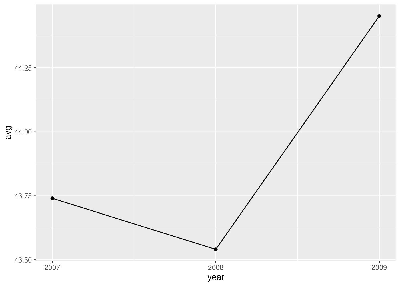
[解説] aggregate() でX軸(year)ごとに集計したデータフレーム df を作成します(条件1)。 ggplot(df, …) で df をデータとして使用し、aes(x = year, y = avg) を指定します。 geom_line()(条件2)と geom_point()(条件3)を + で追加することで、線と点の両方を描画できます。scale_x_continuous() を使い、X軸の目盛りを指定します(条件4)。
列名を変更するnames(df)[names(df) == "bill_length_mm"] = "avg"という箇所は少しわかりにくいかもしれません。まず、ここで作成した df には year と bill_length_mm という2つの列があります(Consoleでnames(df)とすると確認できます)。2列目の bill_length_mm という列名を変えたいので、names(df)[2] = "avg"とすることで、2列目の名前を avg にすることができます。
これで問題ないのですが、上の回答では、2という数字(インデックス)を直接書く代わりに、bill_length_mm という名前の列がどの位置にいるかをnames(df) == "bill_length_mm"によって調べ、それをインデックスとして使っています。このような書き方であれば、仮に df の列の構成が変化して、2番目ではなく3番目や4番目の列に bill_length_mm が存在するようになった場合でも、プログラムに変更を加える必要がありません。2というインデックスの数値を直接記入する書き方だと、データの変更に合わせてその数値を3や4に書き直すという手間が発生し、それを忘れてしまうとプログラムにバグが発生します。
8.11.4 折れ線グラフ2
penguins データを使い、year ごとの bill_depth_mm の平均値を、species ごとに色分けした折れ線グラフで作成してください。以下の条件を満たしてください。
- aggregate() を使い、year と species の両方の組み合わせで bill_depth_mm の平均値 (avg) を計算し、df に格納してください。
- ggplot() で df を使い、aes() で color = species をマッピングしてください。
- geom_line() と geom_point() の両方を描画してください。
- X軸の目盛りを2007, 2008, 2009の3つにしてください。
- scale_y_continuous() を使い、Y軸の表示範囲 (limits) を 10 から 25 までに指定してください。
解答と解説(クリックして展開)
# 準備
library(ggplot2)
library(palmerpenguins)
dat = penguins

# 1. year と species の組み合わせで平均クチバシ深さを計算
df = aggregate(bill_depth_mm ~ year + species, data = dat, FUN = mean, na.rm = TRUE)
# Y軸の列名を avg に変更
names(df)[names(df) == "bill_depth_mm"] = "avg"

# 2. color = species をマッピング
fig = ggplot(df, aes(x = year, y = avg, color = species)) +
  geom_line() +
  geom_point() +
  scale_y_continuous(limits = c(10, 25)) +
  scale_x_continuous(breaks = c(2007, 2008, 2009)) +
  theme_bw()

plot(fig)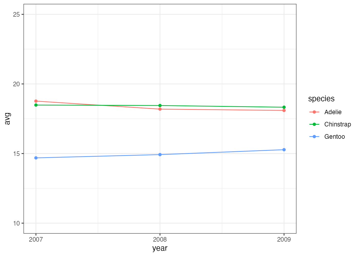
[解説] グループ別の折れ線グラフを描画するには、aggregate() の ~ の右側に year + species のように、グループ化したい変数をすべて指定します(条件1)。ggplot() の aes() で color = species を指定する(条件2)と、geom_line と geom_point(条件3)が自動的に species ごとに色分けされます。 Y軸の表示範囲を調整するには、scale_y_continuous() を追加し、limits = c(最小値, 最大値) を指定します(条件5)。
8.11.5 ヒストグラム
penguins データを使い、flipper_length_mm の分布を示すヒストグラムを作成してください。以下の条件を満たしてください。
- geom_histogram() を使用します。
- binwidth(階級の幅)を 5 に設定してください。
- aes() を使い、species ごとに fill をマッピングしてください。
- グラフが積み上げ(stack)だと見にくいため、geom_histogram() の position を "identity" に設定し、alpha(透明度)を 0.5 に設定して、分布が重なって見えるようにしてください。
- theme_bw() を適用してください。
解答と解説(クリックして展開)
# 準備
library(ggplot2)
library(palmerpenguins)
dat = penguins

# グラフ作成
fig = ggplot(dat, aes(x = flipper_length_mm, fill = species)) +
  geom_histogram(binwidth = 5, position = "identity", alpha = 0.5) +
  theme_bw()

plot(fig)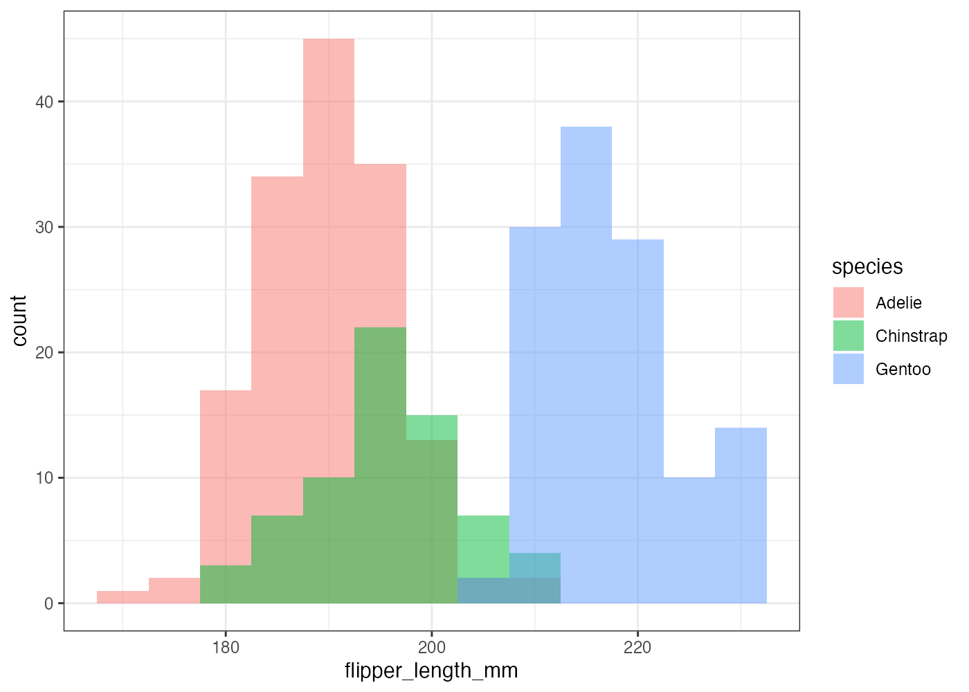
[解説] ggplot() の aes() で x(数値)と fill(カテゴリ)をマッピングします(条件3)。geom_histogram() の中で、binwidth = 5 を設定し、階級の幅を明示的に指定します(条件2)。デフォルトの position = "stack"(積み上げ)では分布の形状が比較しにくいため、position = "identity"(重ねる)を指定し、alpha = 0.5(半透明)を設定します(条件4)。 theme_bw() を追加し、背景を白にします(条件5)。
8.11.6 密度プロット
penguins データを使い、body_mass_g の分布を示す密度プロットを作成してください。以下の条件を満たしてください。
- geom_density() を使用します。
- aes() を使い、species ごとに fill と color をマッピングしてください。
- geom_density() で alpha を 0.6 と size = 0.8 を設定してください。
- 図のタイトルを Body Mass Distribution by Species にしてください。
解答と解説(クリックして展開)
# 準備
library(ggplot2)
library(palmerpenguins)
dat = penguins

# グラフ作成
fig = ggplot(dat, aes(x = body_mass_g, fill = species, color = species)) +
  geom_density(alpha = 0.6, size = 0.8) +
  labs(title = "Body Mass Distribution by Species") +
  theme_bw()

plot(fig)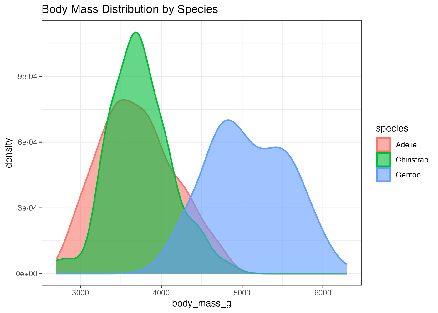
[解説] ggplot() の aes() で x(数値)に body_mass_g を指定します。 fill = species と color = species の両方を aes() でマッピングすることで、塗りつぶしと枠線の両方に species の情報が反映されます(条件2)。 geom_density() の中で alpha = 0.6 を設定することで、塗りつぶしが半透明になり、重なった部分も視認できます(条件3)。 size = 0.8 を設定することで、デフォルトよりも線が少し太くなり、強調されます(条件3)。labs() を使いタイトルを設定します(条件4)。
8.11.7 箱ひげ図
penguins データを使い、island ごとの flipper_length_mm の分布を示す箱ひげ図を作成してください。以下の条件を満たしてください。
- geom_boxplot() を使用します。
- X軸に island、Y軸に flipper_length_mm をマッピングしてください。
- aes() を使い、island ごとに fill もマッピングして、箱を色分けしてください。
- theme_bw() を適用してください。
解答と解説(クリックして展開)
# 準備
library(ggplot2)
library(palmerpenguins)
dat = penguins

# グラフ作成
fig = ggplot(dat, aes(x = island, y = flipper_length_mm, fill = island)) +
  geom_boxplot() +
  theme_bw()

plot(fig)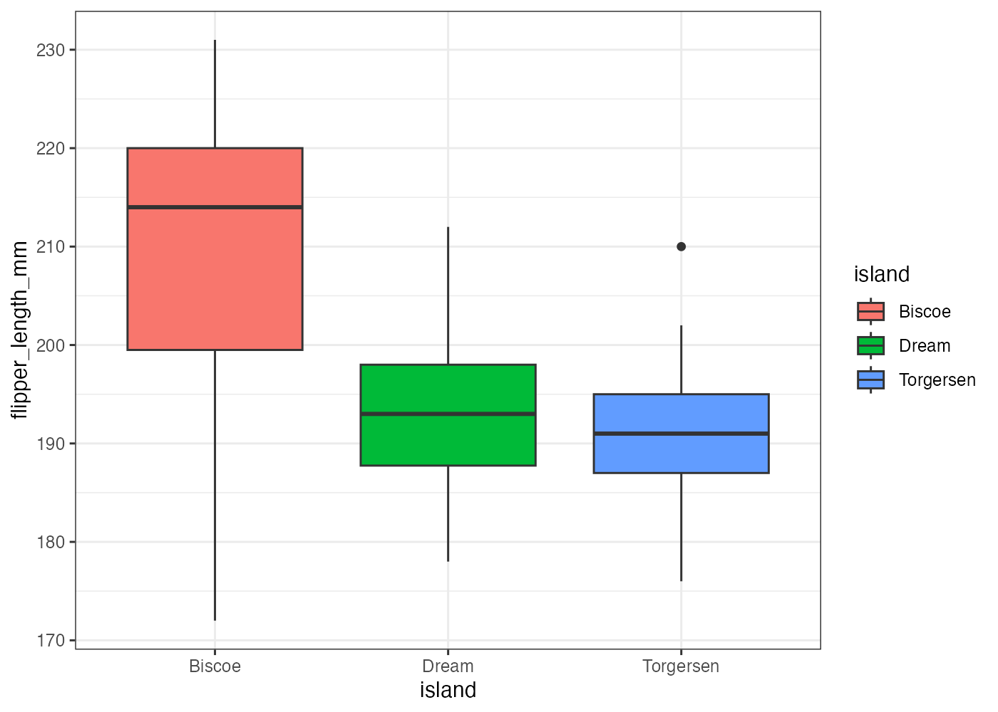
[解説] ggplot() の aes() で、X軸(カテゴリ)に island、Y軸(数値)に flipper_length_mm を指定します(条件2)。aes() の中に fill = island を追加する(条件3)ことで、island のカテゴリに応じて箱の塗りつぶし色が自動で割り当てられます。
8.11.8 バイオリンプロットと箱ひげ図の組み合わせ
penguins データを使い、species ごとの flipper_length_mm の分布について、バイオリンプロットと箱ひげ図を重ねて描画してください。 以下の条件を満たしてください。
- ベースとして geom_violin() を描画します。
- geom_violin() の塗りつぶし色を "#00afcc" という色で一括設定してください(マッピングではありません)。
- geom_violin() の輪郭線を削除してください。
- geom_boxplot() をバイオリンプロットの上に重ねて描画します。
- geom_boxplot() において、バイオリンプロットの内部に収まるよう width = 0.1 に設定してください。
- geom_boxplot() において、塗りつぶし色を白に設定し、見やすくしてください。
解答と解説(クリックして展開)
# 準備
library(ggplot2)
library(palmerpenguins)
dat = penguins

# グラフ作成
fig = ggplot(dat, aes(x = species, y = flipper_length_mm)) +
  geom_violin(fill = "#00afcc", color = NA) +
  geom_boxplot(width = 0.1, fill = "white") +
  theme_bw()

plot(fig)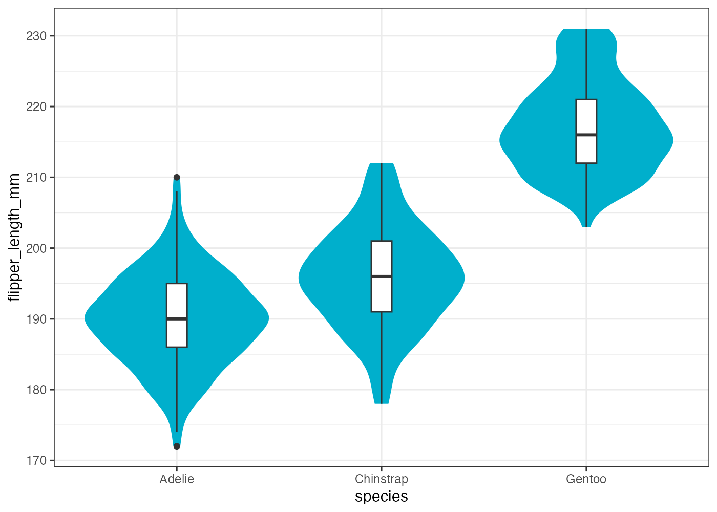
[解説] ggplot() で x と y をマッピングします。まず geom_violin() を + で追加します(条件1)。geom_violin() の中で、fill = "#00afcc" と設定することで、species に関係なくすべてのバイオリンが指定された色で塗りつぶされます(条件2)。color = NA と設定することで、デフォルトで描画される黒い輪郭線が削除されます(条件3)。次に geom_boxplot() を追加し(条件4)、width = 0.1(条件5)と fill = "white"(条件6)を設定して、バイオリンプロットの上に重ねて表示します。
8.11.9 ヒートマップ
penguins データを使い、species と island の組み合わせごとの、flipper_length_mm の平均値を示すヒートマップを作成してください。以下の条件を満たしてください。
- aggregate() を使い、species と island の組み合わせで flipper_length_mm の平均値(avg)を計算し、df に格納してください。
- ggplot() で df を使い、X軸に island、Y軸に species、塗りつぶしに avg をマッピングしてください。
- geom_tile() でヒートマップを描画します。
- scale_fill_gradient() を使い、色のグラデーションを low = "white" から high = "darkblue" に設定してください。
- geom_text() を使い、各タイルに avg の値(小数点以下を四捨五入した整数)をテキストで表示してください。
ヒント:geom_text(aes(label = round(avg))) - geom_text() で表示するテキストの色を "gray50" に設定してください。
- theme_minimal() を適用して背景をシンプルにしてください。
解答と解説(クリックして展開)
# 準備
library(ggplot2)
library(palmerpenguins)
dat = penguins

# 1. species と island の組み合わせで平均フリッパー長を計算
df = aggregate(flipper_length_mm ~ species + island, data = dat, FUN = mean, na.rm = TRUE)
# 平均値の列名を avg に変更 (分かりやすくするため)
names(df)[names(df) == "flipper_length_mm"] = "avg"

# 2. グラフ作成
fig = ggplot(df, aes(x = island, y = species, fill = avg)) +
  geom_tile() +
  scale_fill_gradient(low = "white", high = "darkblue") +
  geom_text(aes(label = round(avg)), color = "gray50") +
  theme_minimal()

plot(fig)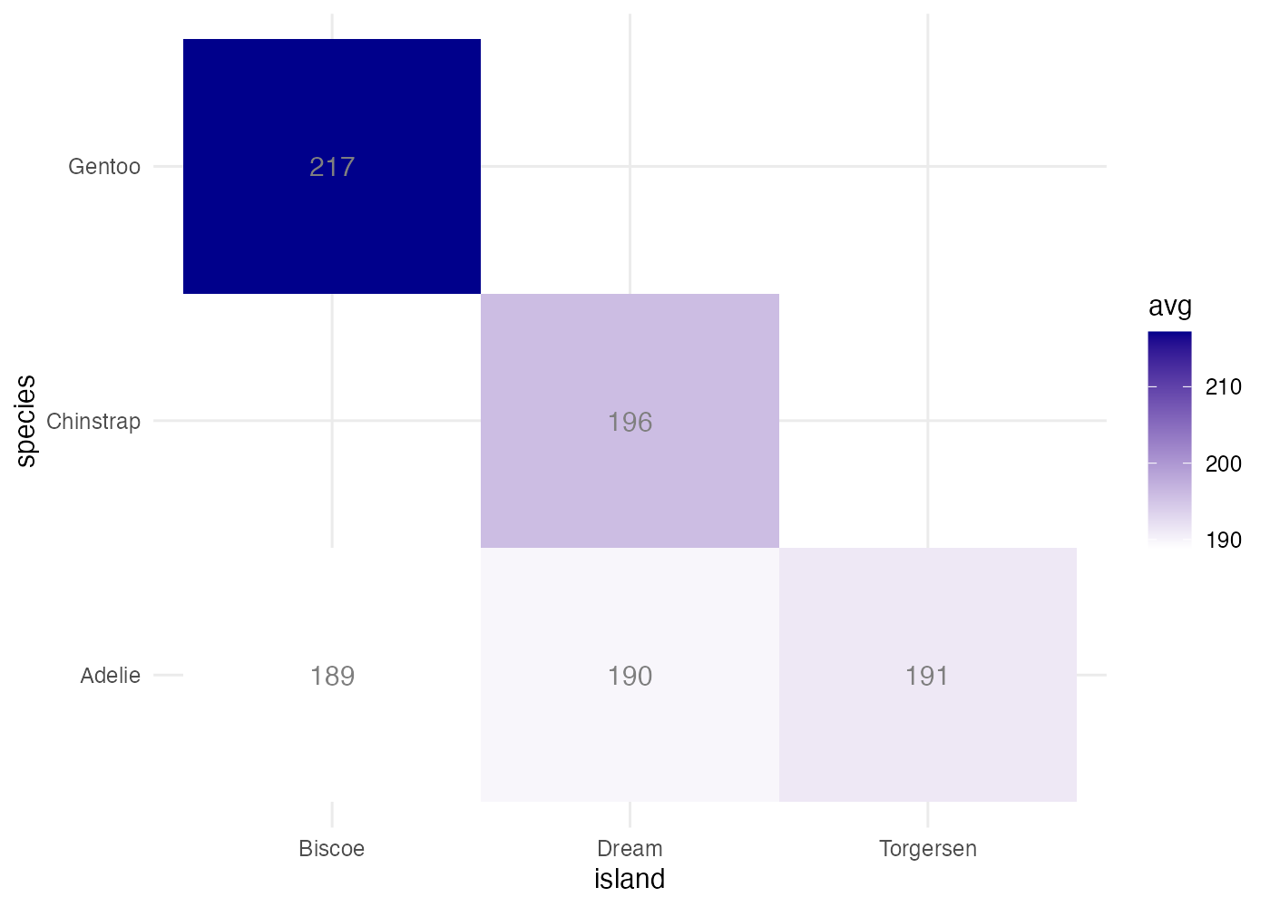
[解説] geom_tile で平均値のような連続値を扱う場合、aggregate() で FUN = mean を指定して、集計済みのデータフレームを準備する必要があります(条件1)。ggplot() の aes() で、x と y にカテゴリ変数、fill に集計した数値(avg)をマッピングします(条件2)。geom_tile()(条件3)の後、scale_fill_gradient() を追加し、low と high を指定して色のグラデーションを変更します(条件4)。geom_text() を追加し、aes() の中で label = round(avg) と指定します(条件5)。round() 関数を使うことで、表示される数値を整数に丸めることができます。geom_text() の aes() の外側で color = "gray50" と設定することで、テキストの色がデータに関係なく固定されます(条件6)。最後に theme_minimal() を適用し、ヒートマップに適したすっきりとした見た目にします(条件7)。