16 図の作成
16.2 はじめに
R のグラフィックス機能は graphics パッケージに基づくものと grid パッケージに基づくものに大別されます。grid の方が新しくパワフルですが、複雑でもあるので、最初に学ぶにはgraphics の方が向いているかもしれません。grid を使う際には ggplot2 や lattice などのパッケージを利用することが多いです(それぞれは異なる視覚的スタイルを持ちます)。
本ページでは graphics を用いた簡易なグラフ作成の方法を最初に解説し、次に ggplot2 を用いたカスタマイズ性の高い作図の方法について解説します。
16.3 データセット
作図に使うデータセットをまずは用意します。
本項では datarium パッケージのデータセットを利用することにします。
datarium パッケージはデータ分析の演習に適した様々なデータセットを提供しています。下記のページでデータセットの一覧とその概要を見ることができます。
https://rpkgs.datanovia.com/datarium/reference
datarium パッケージがインストールされていない場合はまずインストールしておきます。
パッケージの読み込みをします。
このパッケージが持つデータセットのうち jobsatisfaction と marketing の中身を確認してみます。
head( jobsatisfaction, 3 )
##   id gender education_level score
## 1  1   male          school  5.51
## 2  2   male          school  5.65
## 3  3   male          school  5.07
levels( jobsatisfaction$gender )
## [1] "male"   "female"
levels( jobsatisfaction$education_level )
## [1] "school"     "college"    "university"

head( marketing, 3 )
##   youtube facebook newspaper sales
## 1  276.12    45.36     83.04 26.52
## 2   53.40    47.16     54.12 12.48
## 3   20.64    55.08     83.16 11.16
jobsatisfaction は仕事満足度(score)のデータで、説明変数として性別(male/female)と学歴(school/college,university)の2要因があります。
marketing はメディア(youtube/facebook/newspaper)への広告出稿料と売上げ額(sales)のデータです。
変数名が長いので、短い変数名で使えるようにしておきます。
16.4 graphics による作図
16.4.1 plot 関数
plot() 関数の引数に数値ベクトルを渡すと図が出力されます。
図の横軸(X軸)はベクトルのインデックス、縦軸(Y軸)はベクトルの要素の値になります。
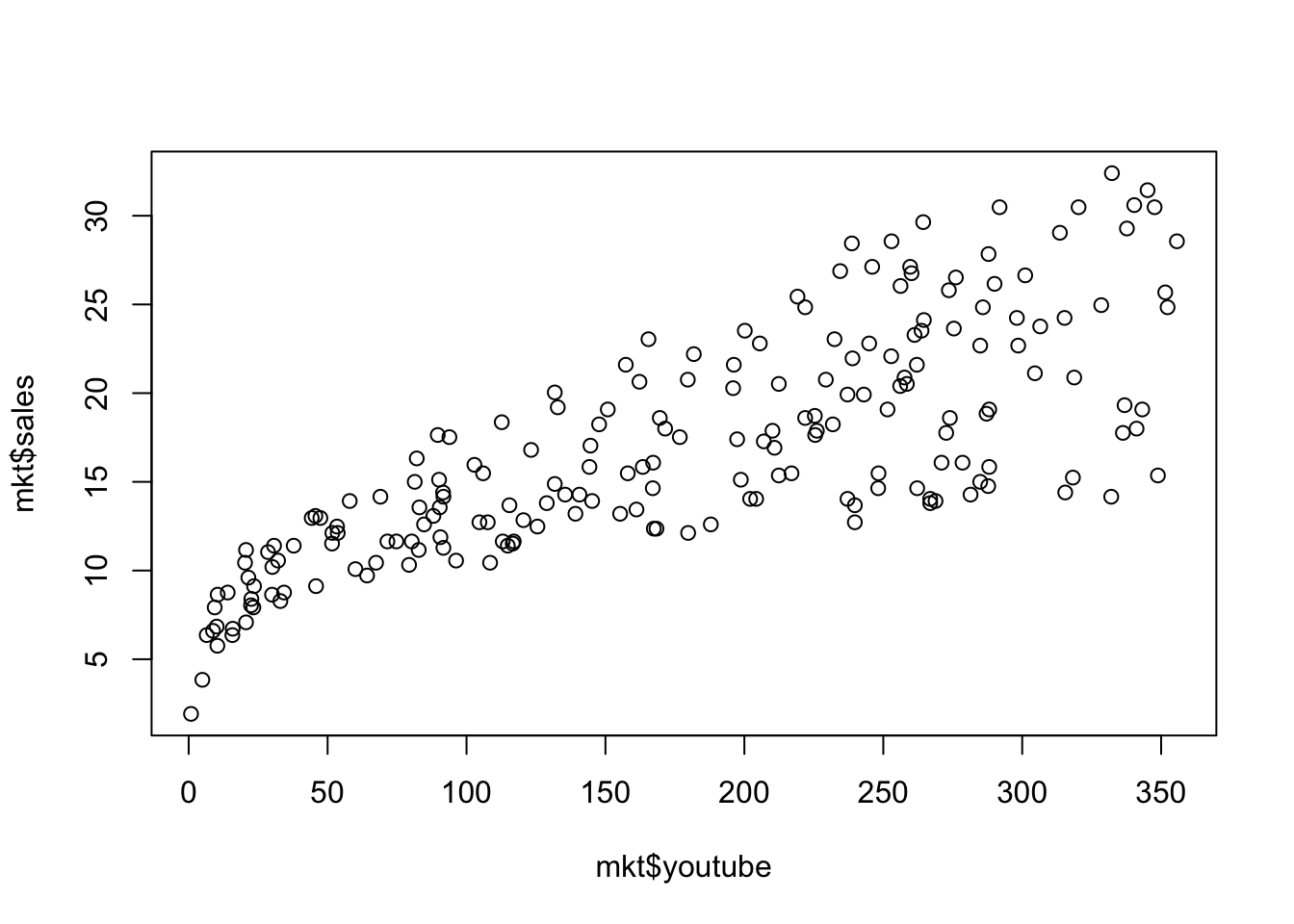
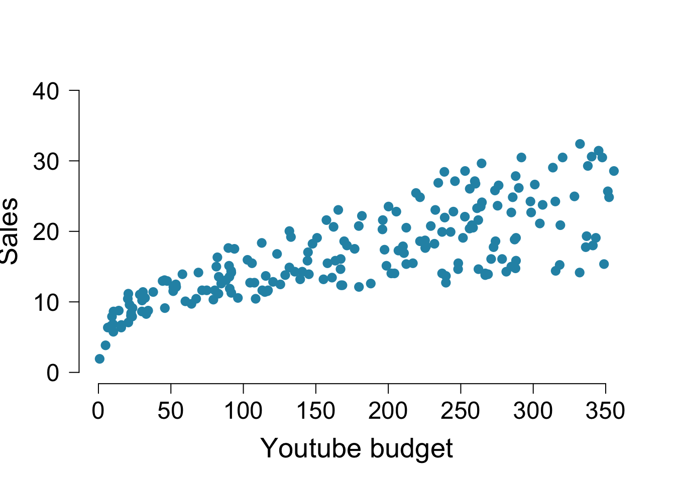
2変数の場合は以下のようにします。

x軸は youtube への宣伝費、y軸は売り上げです。
なお、引数については以下のような扱いが可能です。
# 1変数の場合、以下のどちらの書き方でも良い
plot( dat )
plot( x = dat )
# 2変数の場合、以下のどちらの書き方でも良い
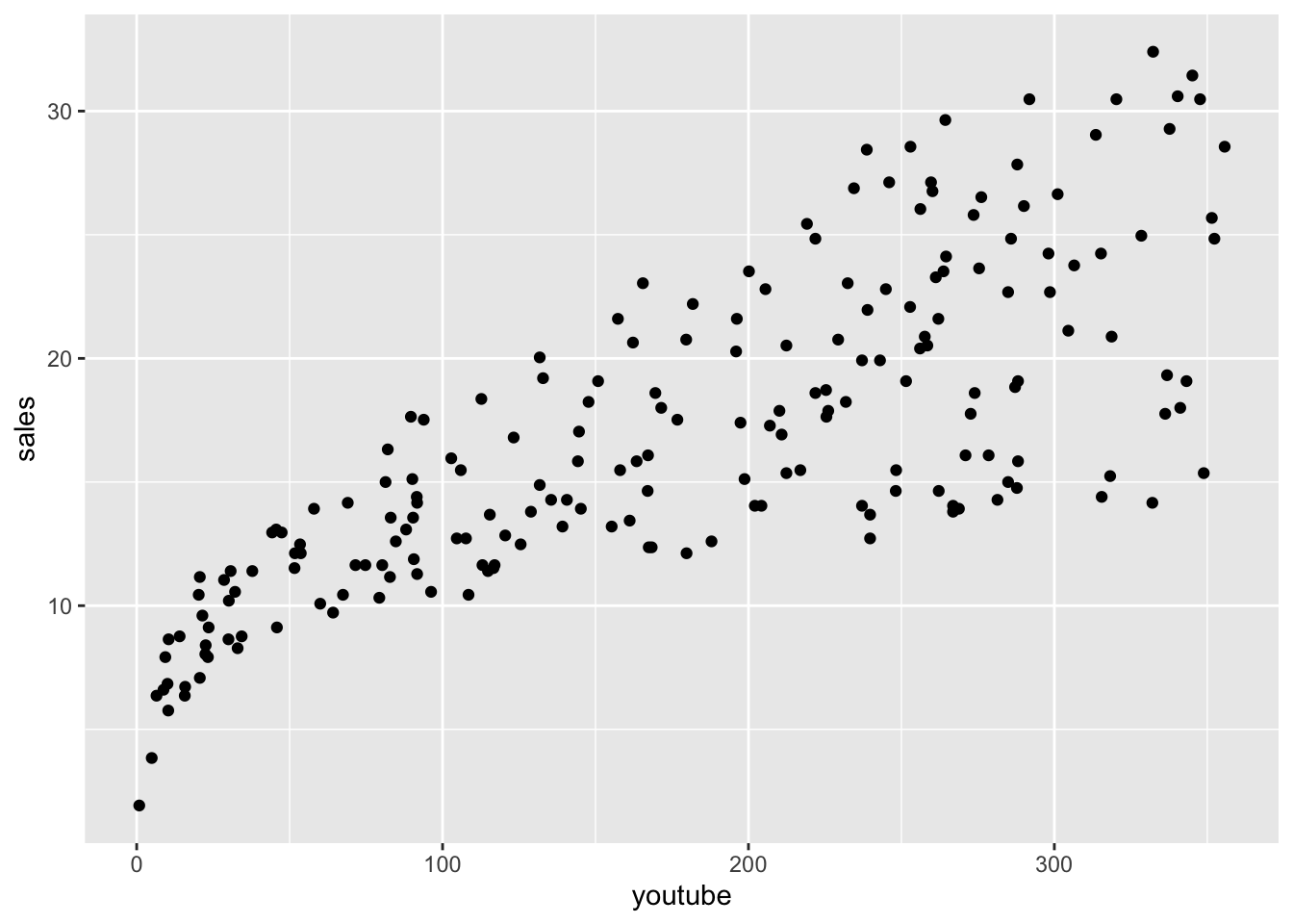
plot( mkt$youtube, mkt$sales )
plot( x = mkt$youtube, y = mkt$sales )以上のように、図にしたいデータ(ベクトル)を plot() 関数に入れるだけで点グラフや散布図を描くことができます。データを確認するために手っ取り早く図にしたい場合はこれだけで十分でしょう。ただし、発表用に使えるようなクオリティの見た目にしたい場合には様々な修飾を図に加える必要があります。その方法について以下に解説します。
16.4.2 図の種類の変更
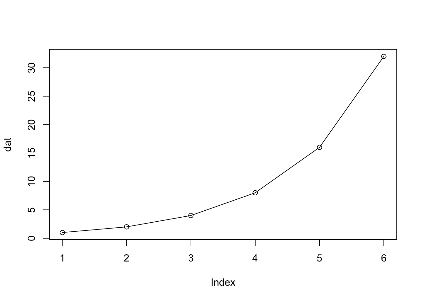
plot() 関数の引数に type を指定することで図の種類を変更できます。
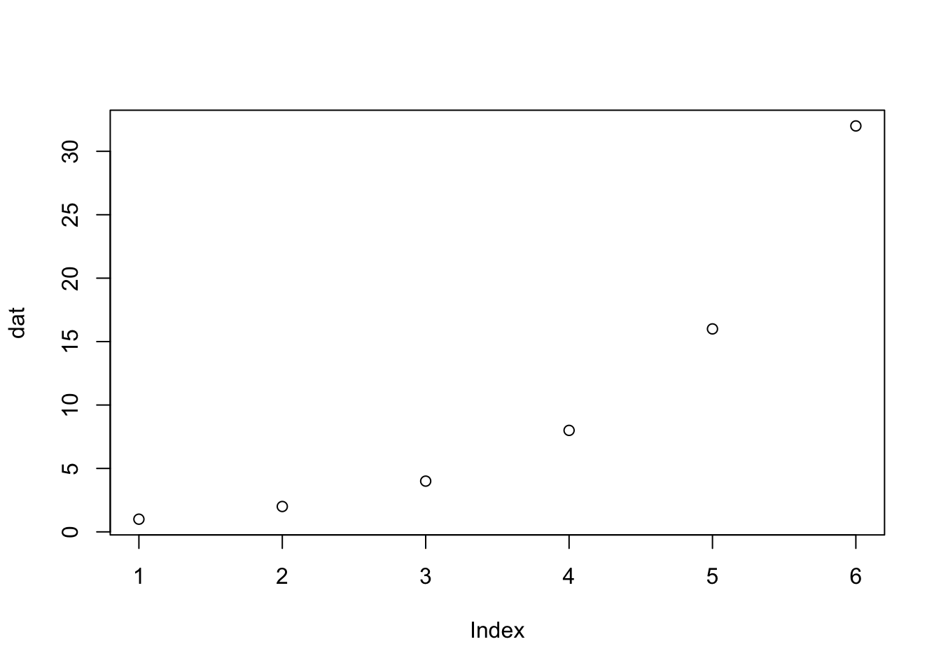
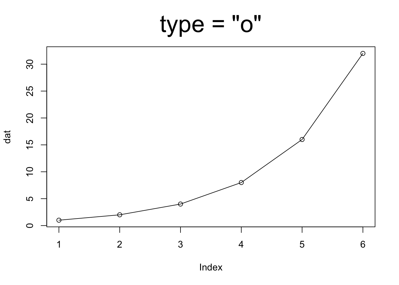
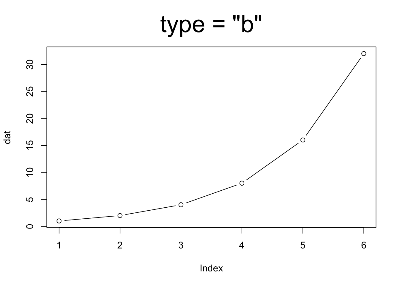
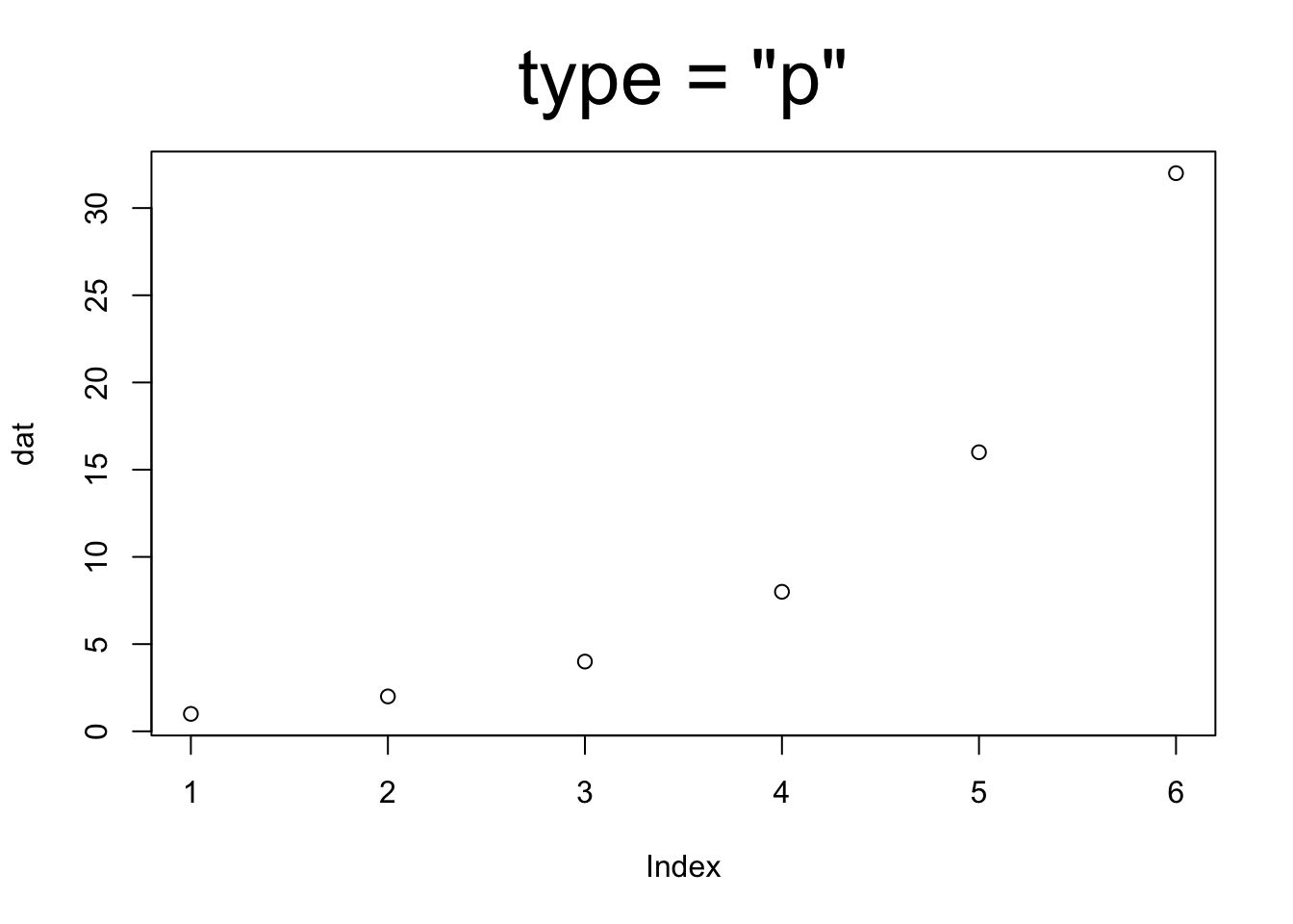
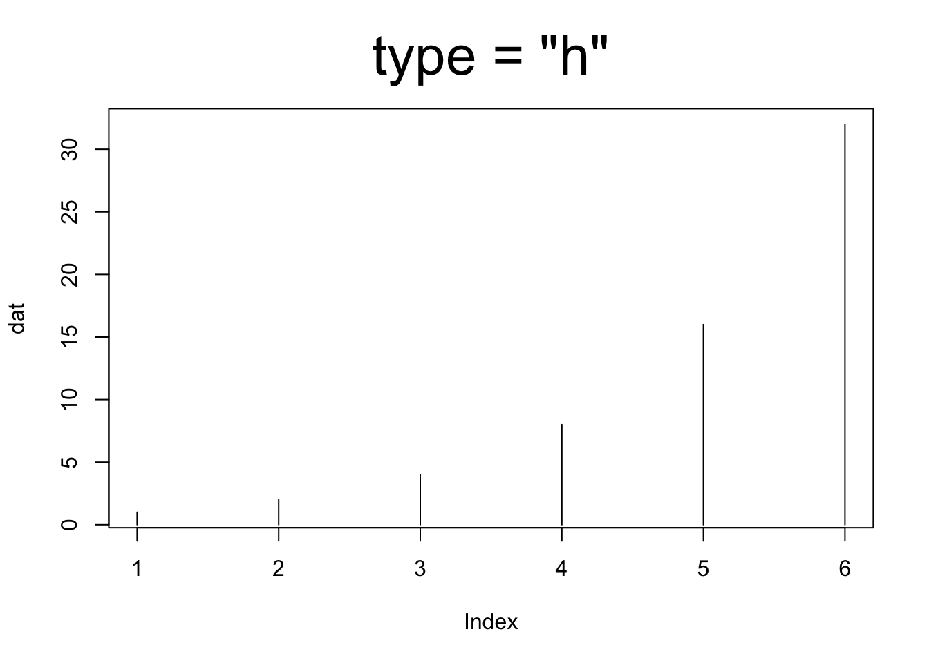
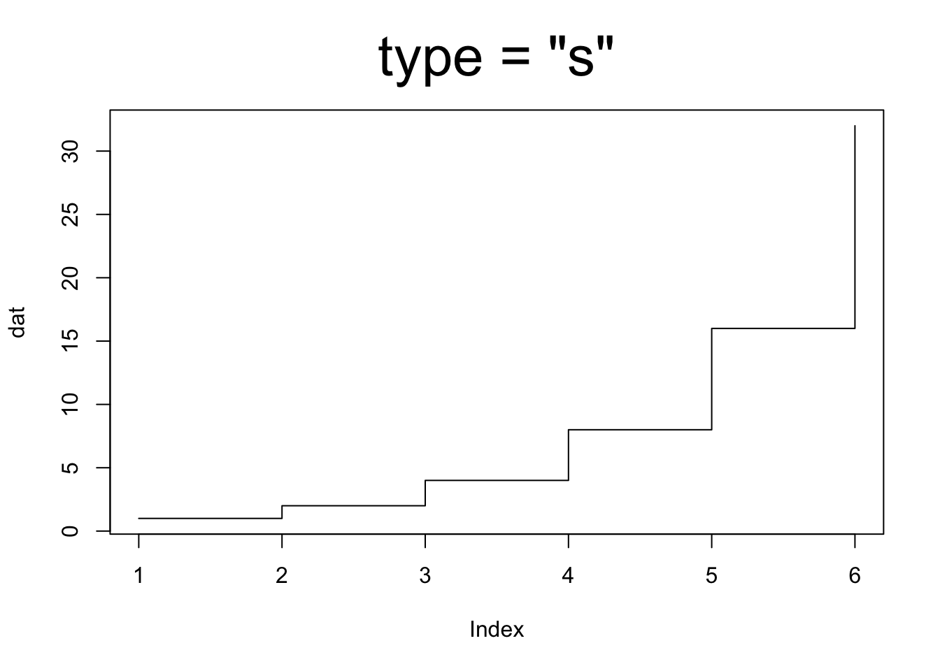
dat = c( 1, 2, 4, 8, 16, 32 )

plot( dat, type = "l" ) # 折れ線グラフ
plot( dat, type = "o" ) # 点と折れ線
plot( dat, type = "b" ) # 点と折れ線
plot( dat, type = "p" ) # 点だけ
plot( dat, type = "h" ) # 縦線
plot( dat, type = "s" ) # 階段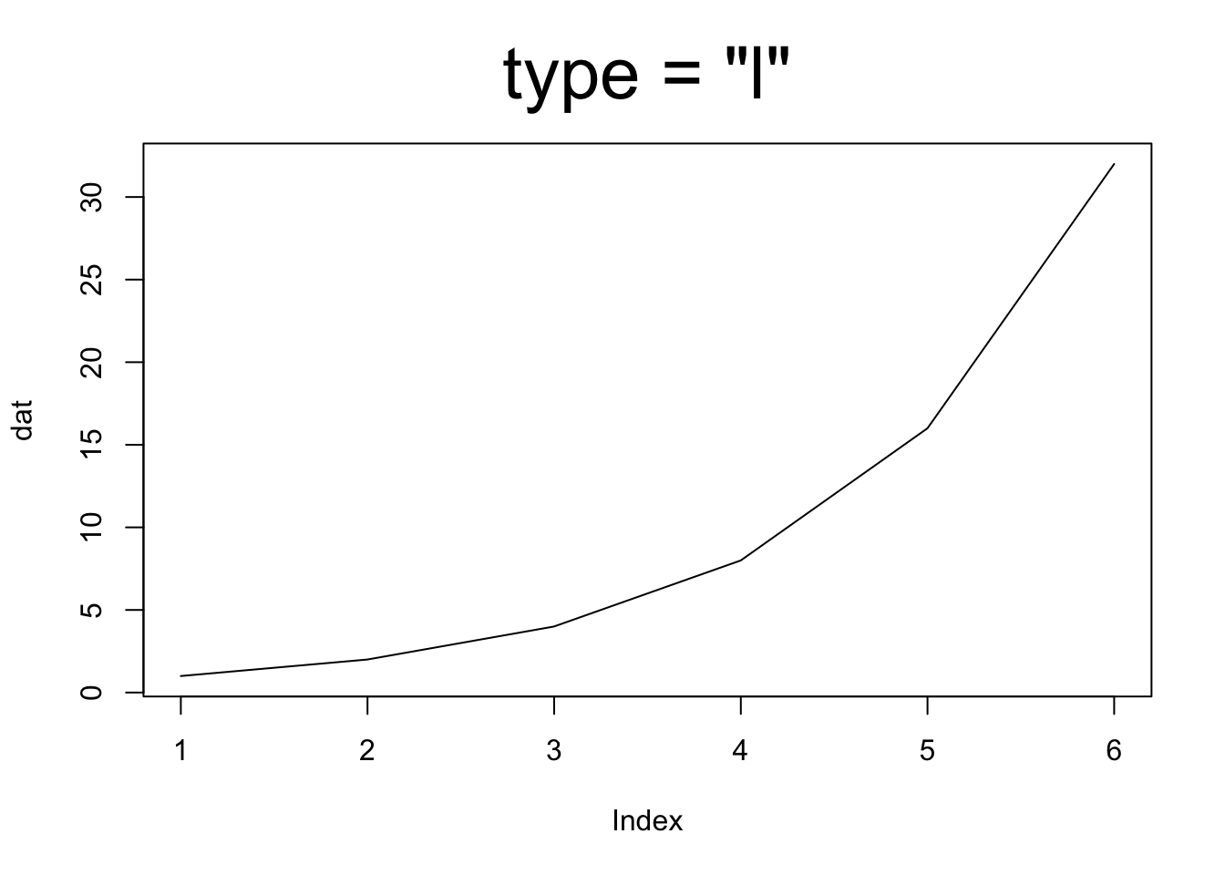
16.4.3 図のスタイルの変更
plot() 関数に様々な引数を渡すことで図の見た目を変更できます。
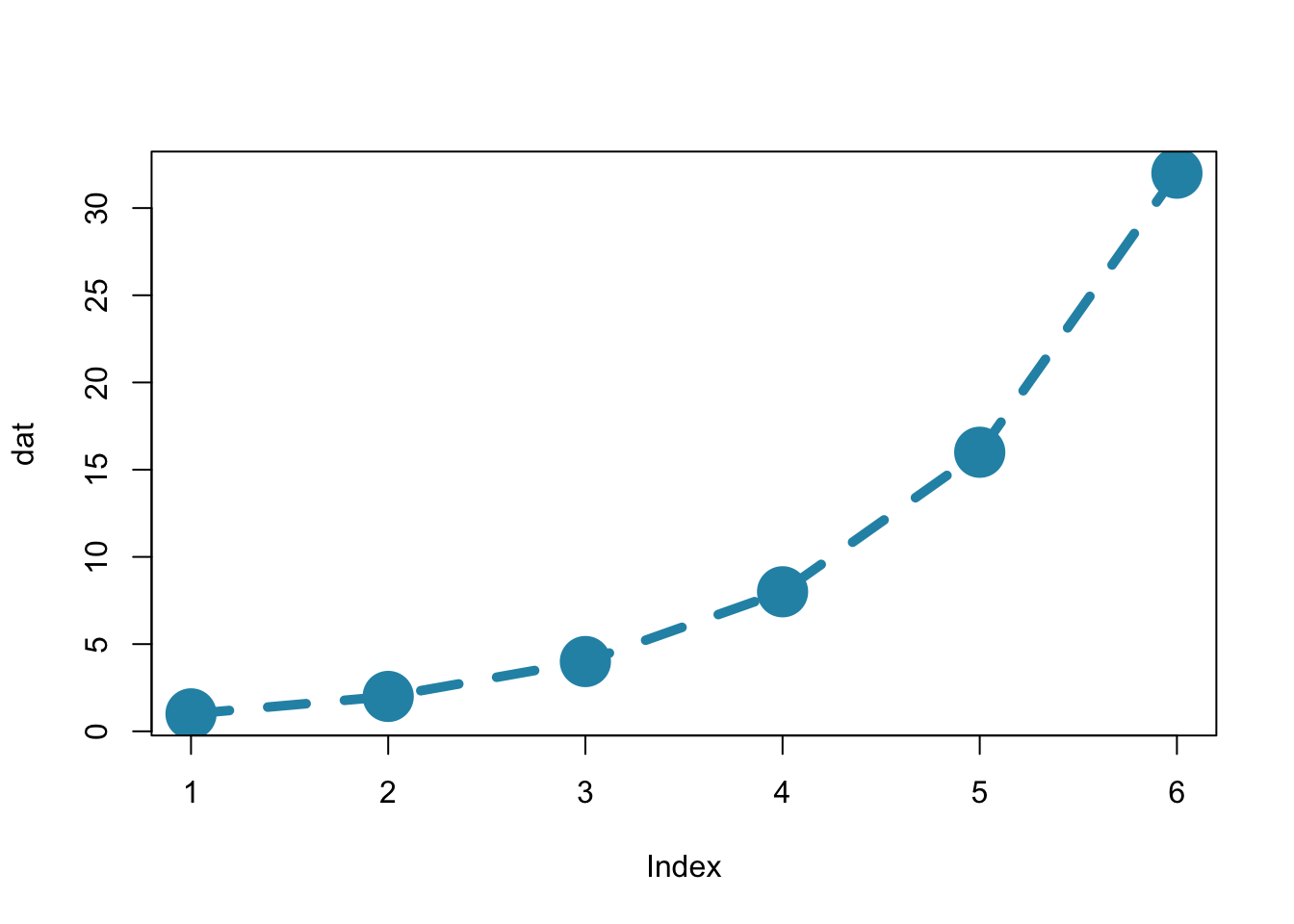
dat = c( 1, 2, 4, 8, 16, 32 )

plot( dat, type = "o", col = "red" )

plot( dat,
    type = "o", # 点と折れ線
    col = "#2792b3", # 色
    pch = 19, # 点の種類
    cex = 3, # 点の大きさ
    lty = 2, # 線の種類
    lwd = 5 # 線の太さ
)

# plot( dat, type = "o", col = "red", pch = 19, cex = 3, lty = 2, lwd = 5 )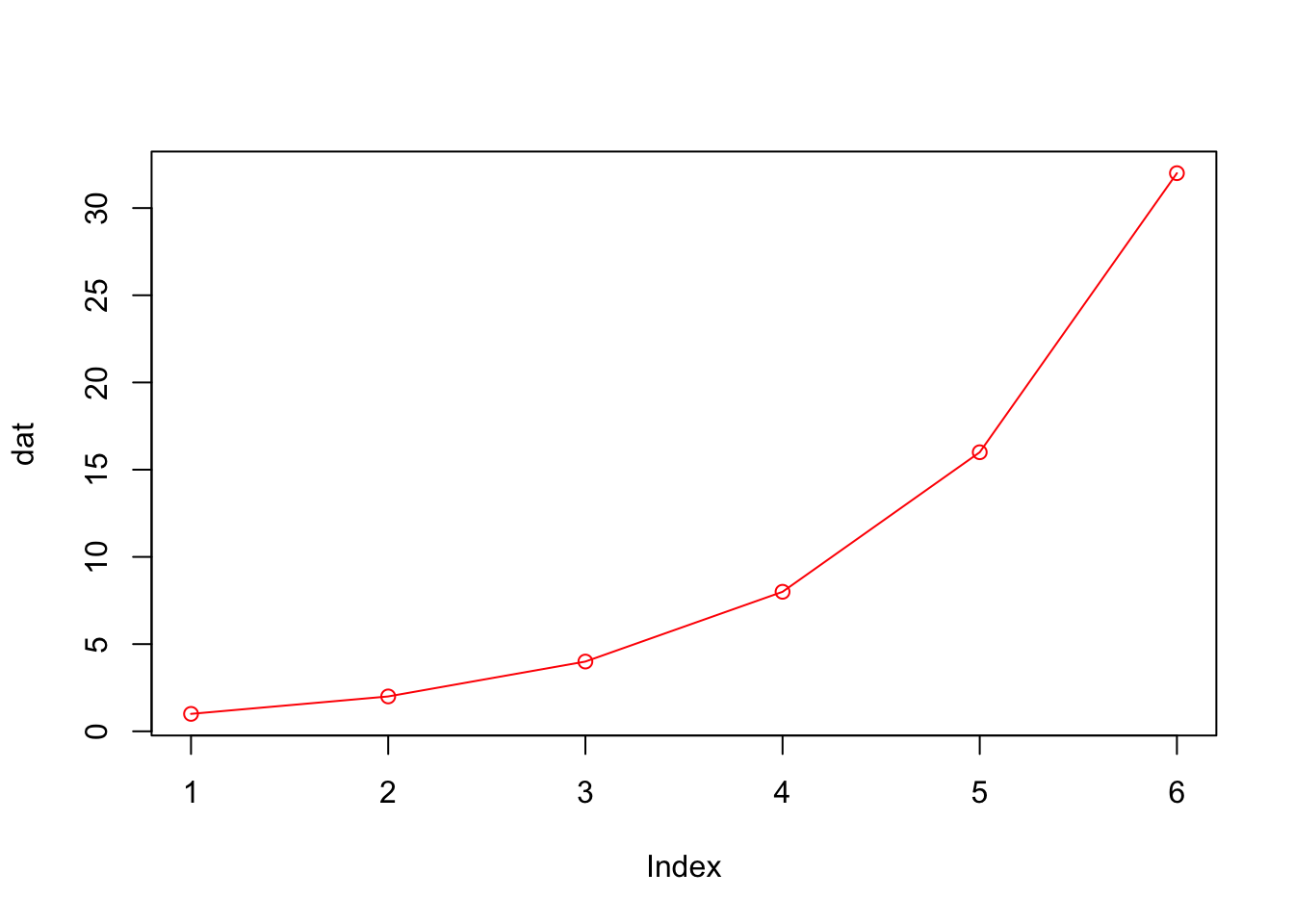
col
col で色を指定します。
col = “red” や col = “blue” などとするか、16進数カラーコードで色を指定します。
また、col = "gray20" や col = "gray70" など、gray + 0から100までの数字という形式で様々な濃さの灰色を指定できます。
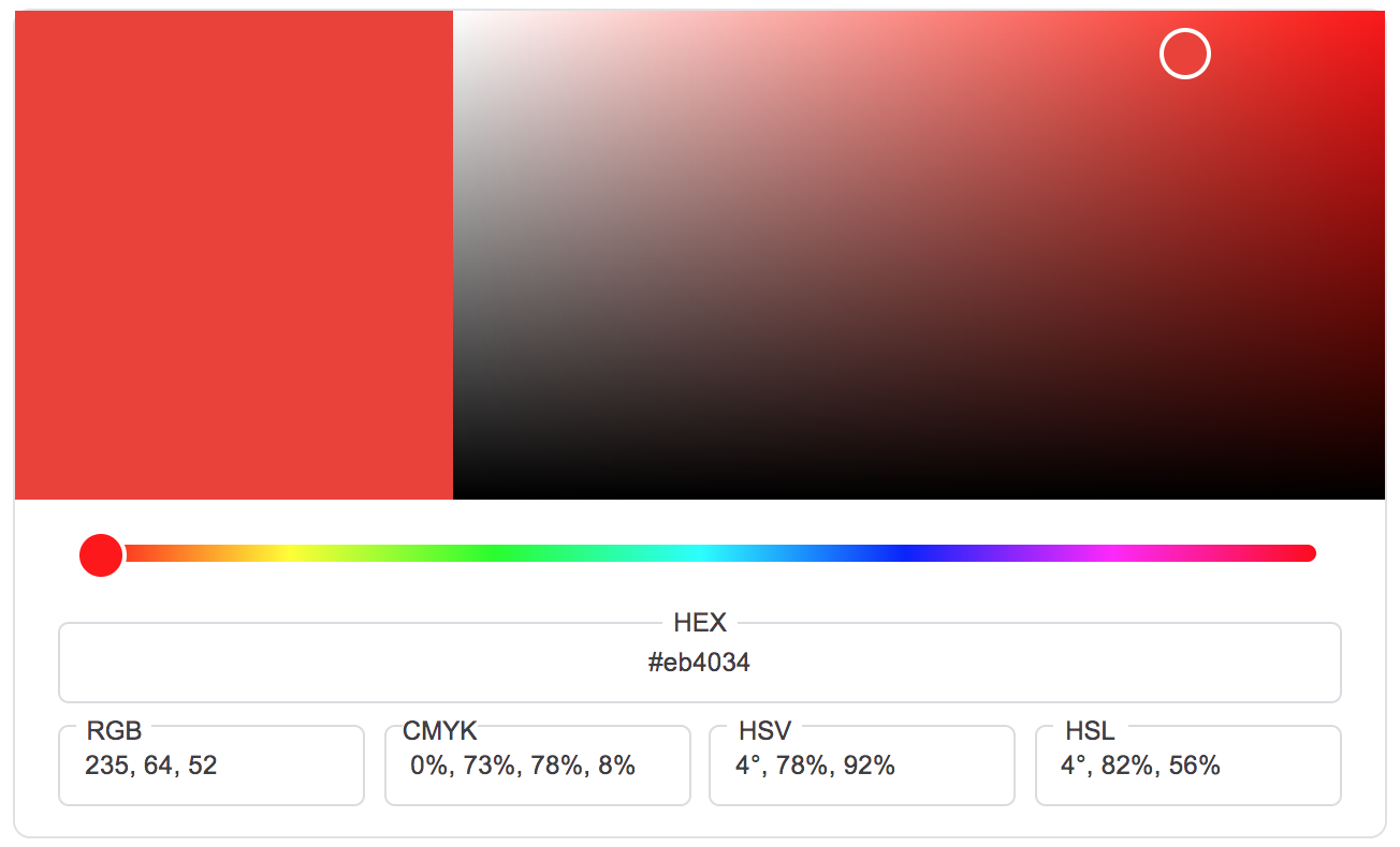
16進数カラーコードは#と6桁の文字で色を指定する方法です。「カラーピッカー」などで検索すると16進数カラーコードを求めるためのウェブサイトが多くヒットするのでそれを利用して色を決めるのが便利です。
Google で hex color と検索すると以下のような画面が検索画面の上部に表示されるので、それを使っても簡単に16進数カラーコードを調べることができます。
16.4.4 表示設定の変更
以下のような引数で図の表示スタイルを変更できます。
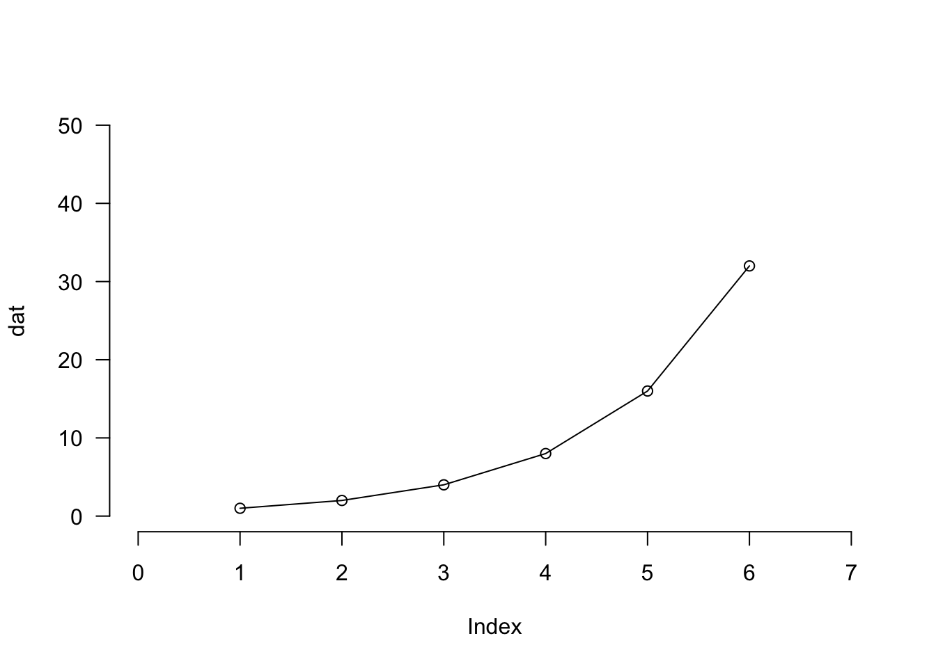
dat = c( 1, 2, 4, 8, 16, 32 )

plot( dat, type = "o" )

plot( dat, type = "o",
    xlim = c( 0, 7 ), # X軸の範囲
    ylim = c( 0, 50 ), # Y軸の範囲
    frame.plot = FALSE, # 枠線を表示するかどうか
    las = 1 # 軸の添え字の方向
)
16.4.5 タイトルと軸ラベルの変更
図のタイトルや軸ラベルを変更したり、フォントの変更ができます。
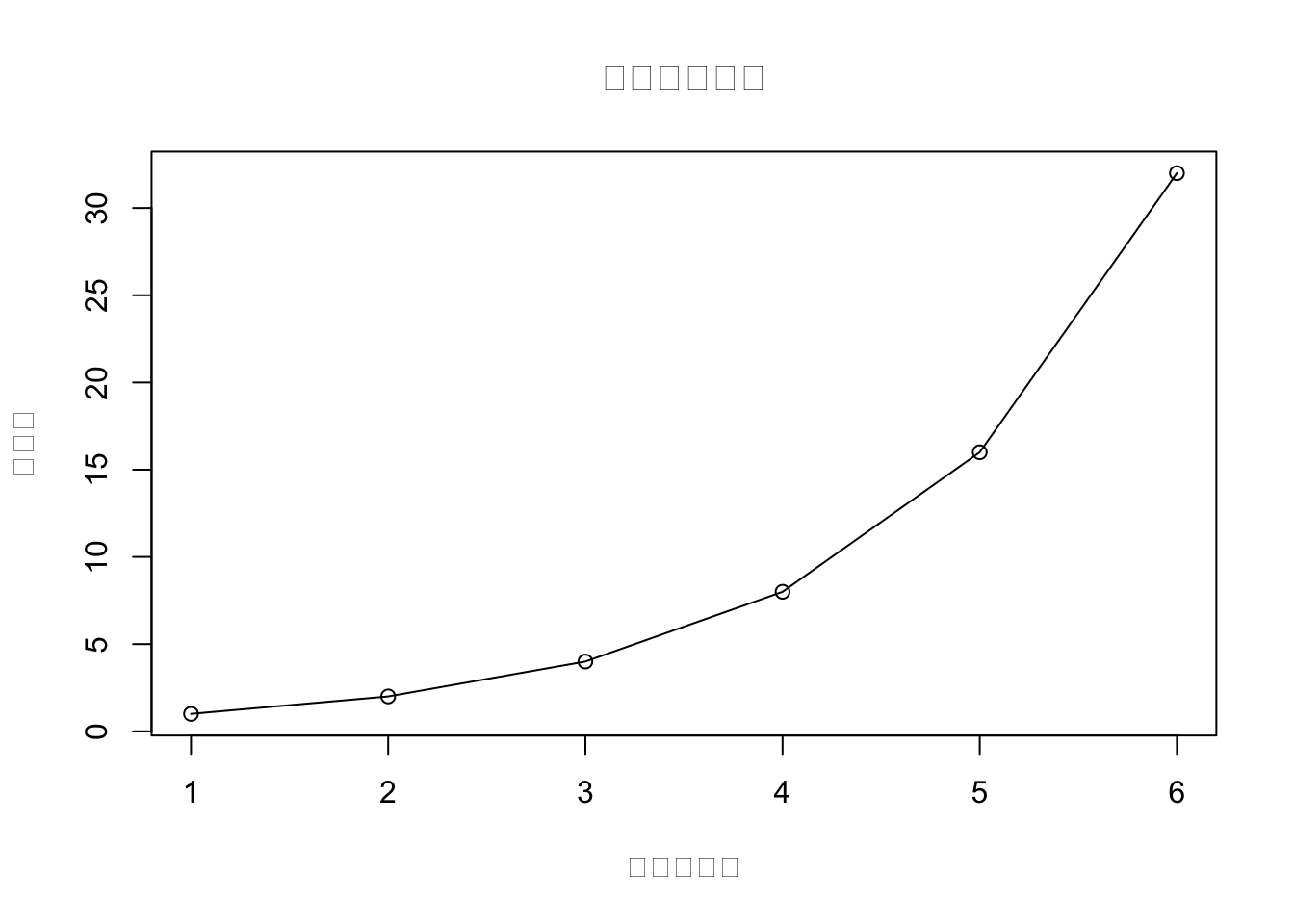
dat = c( 1, 2, 4, 8, 16, 32 )
#par( family = "HiraKakuProN-W3" ) # Mac の場合

plot( dat, type = "o",
    main = "図のタイトル",
    xlab = "データ番号",
    ylab = "スコア"
)

plot( dat, type = "o", main = "図のタイトル", xlab = "データ番号", ylab = "スコア",
    font.main = 1,
    font.lab = 2,
    font.axis = 2,
    cex.main = 3, # 図タイトルの文字サイズ
    cex.lab = 1.5, # 図ラベルの文字サイズ
    cex.axis = 1.5,# 軸目盛りの文字サイズ
    col.lab = "gray50" # 図ラベルの文字色
)
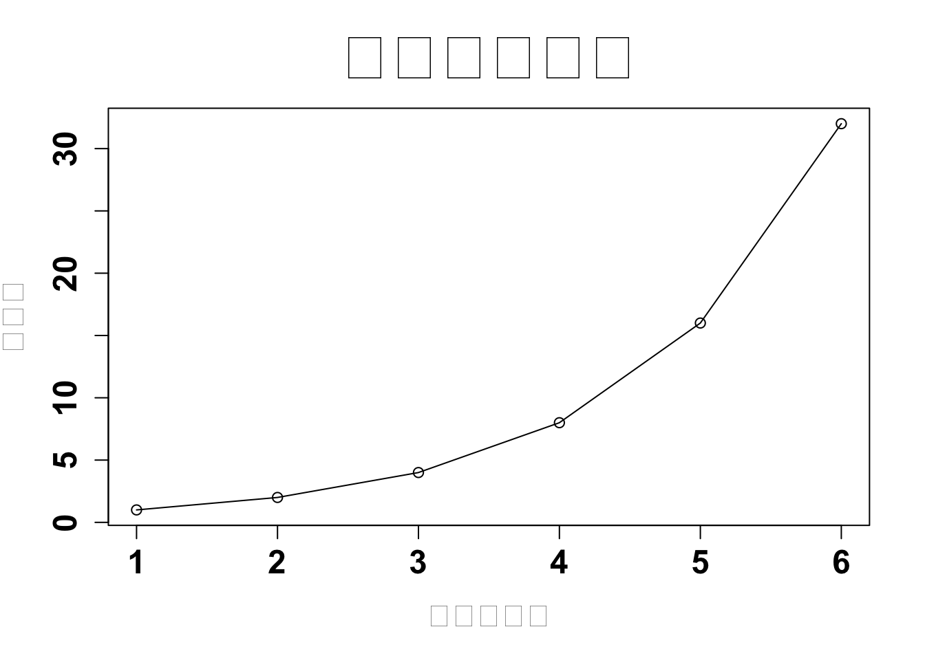
font.main, font.lab, font.axis
font.main: タイトルのフォントfont.lab: 軸ラベルのフォントfont.axis: 軸目盛りのフォント
フォントは数字で指定します。1はデフォルト、2は太字、3は斜体、4は太字の斜体です。
16.4.6 まとめ
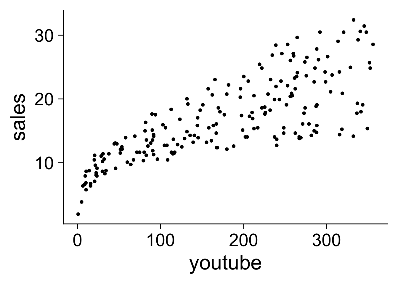
plot 関数の様々なパラメータをまとめて指定した例を以下に示します。
デフォルトだと軸のラベルや目盛りの文字が小さいので大きめにするのが見やすいでしょう。
# デフォルトの図
plot( x = mkt$youtube, y = mkt$sales )

# 様々なパラメータを指定して盛った図
plot( x = mkt$youtube, y = mkt$sales,
    col = "#2792b3", # 点や線の色
    pch = 19, # 点の種類
    cex = 1.2, # 点の大きさ
    ylim = c( 0, 40 ), # Y軸の範囲
    frame.plot = FALSE, #枠線なし
    las = 1, # 添字の向きを平行に
    xlab = "Youtube budget", # X軸のラベル
    ylab = "Sales", # Y軸のラベル
    font.aixs = 2, # 軸目盛りのフォント
    cex.axis = 1.5, # 軸目盛りの文字サイズ
    cex.lab = 1.7 # 軸ラベルの文字サイズ
)
以下では、散布図以外の図の例としてヒストグラムの作図について解説します。
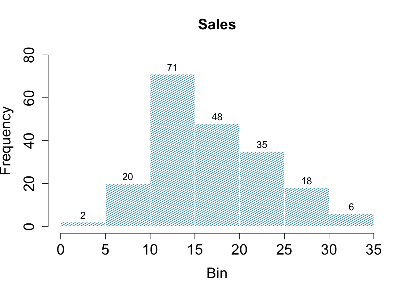
16.4.7 ヒストグラム
hist() 関数を使うことでヒストグラムが作成できます。
breaks を指定することでビンの数を変更できます。
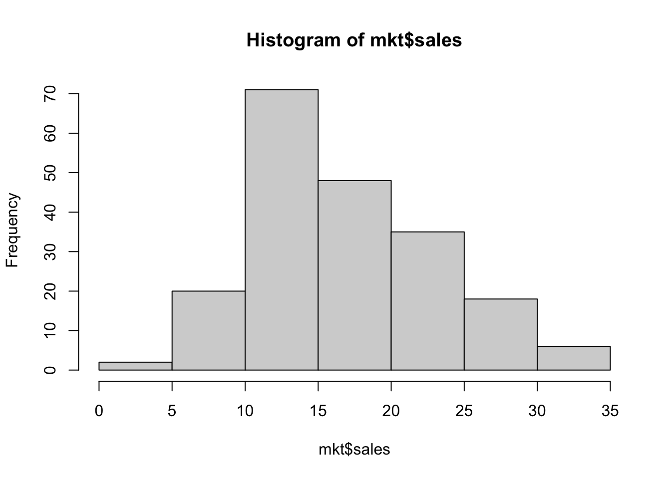
様々なパラメータによって図のスタイルを変更できます。
hist( mkt$sales,
    main = "Sales", # 図のタイトル
    xlab = "Bin", # X軸のラベル
    col = "#2792b3", # 斜線の色
    density = 30, # 斜線の密度
    angle = 30, # 斜線の角度
    border = "gray100", # 棒の枠線の色
    labels = TRUE, # 棒の高さの値を表示するかどうか
    ylim = c( 0, 80 ), # Y軸の範囲
    cex.main = 1.5, # タイトルのフォントサイズ
    cex.lab = 1.5, # 軸ラベルのフォントサイズ
    cex.axis = 1.5 # 軸目盛りのフォントサイズ
)
16.5 ggplot2 パッケージによる作図
最初に ggplot2 パッケージの読み込みを行います。
また、このページの作例で使用する他のパッケージの読み込みも行っておきます。
ggplot2 が作図用の R パッケージです。
Hmisc は stat_summary で fun.data = mean_cl_normal などを使えるようにするために必要です。
16.6 棒グラフ
16.6.1 最小限の要素のみ
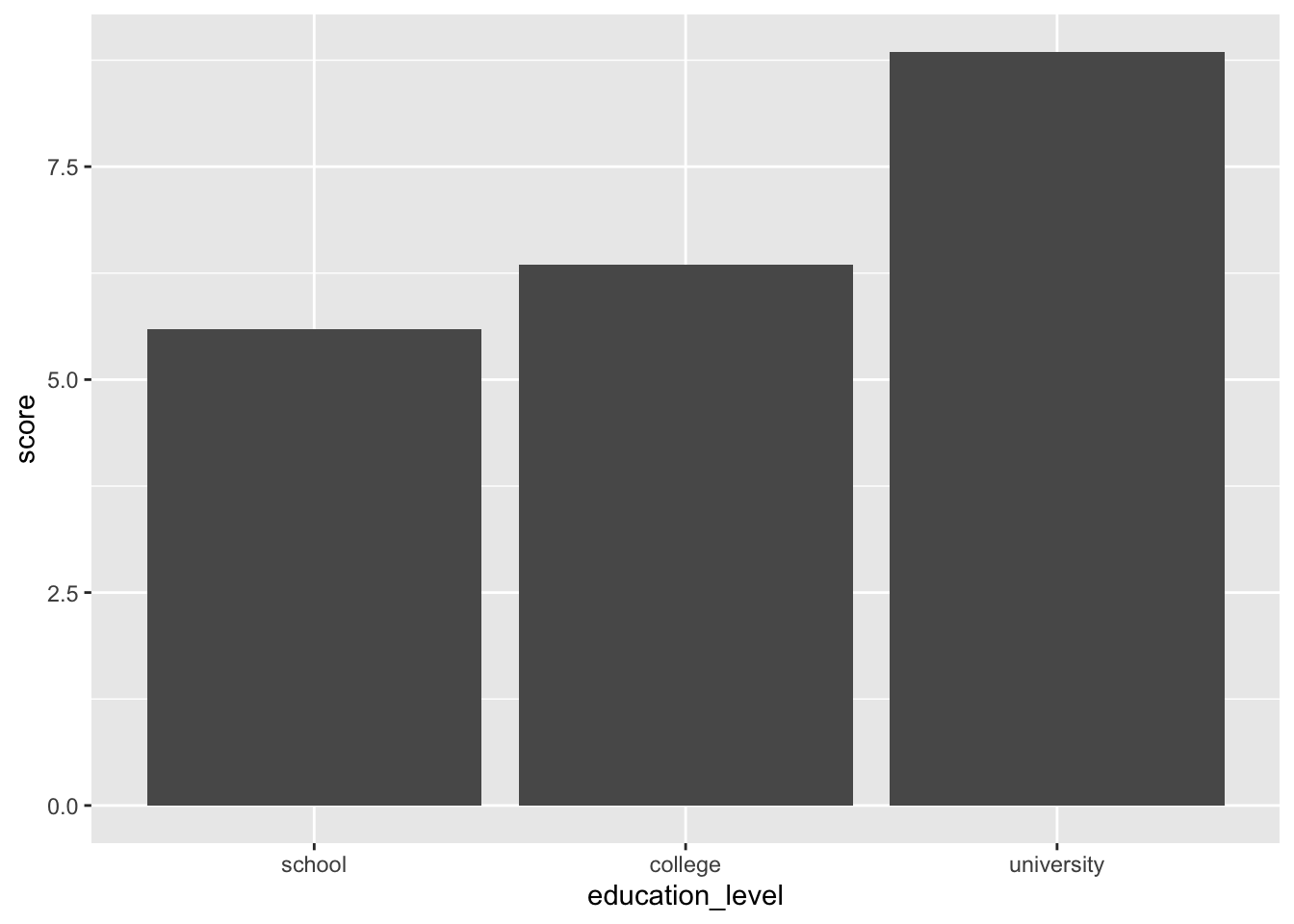
1要因の場合
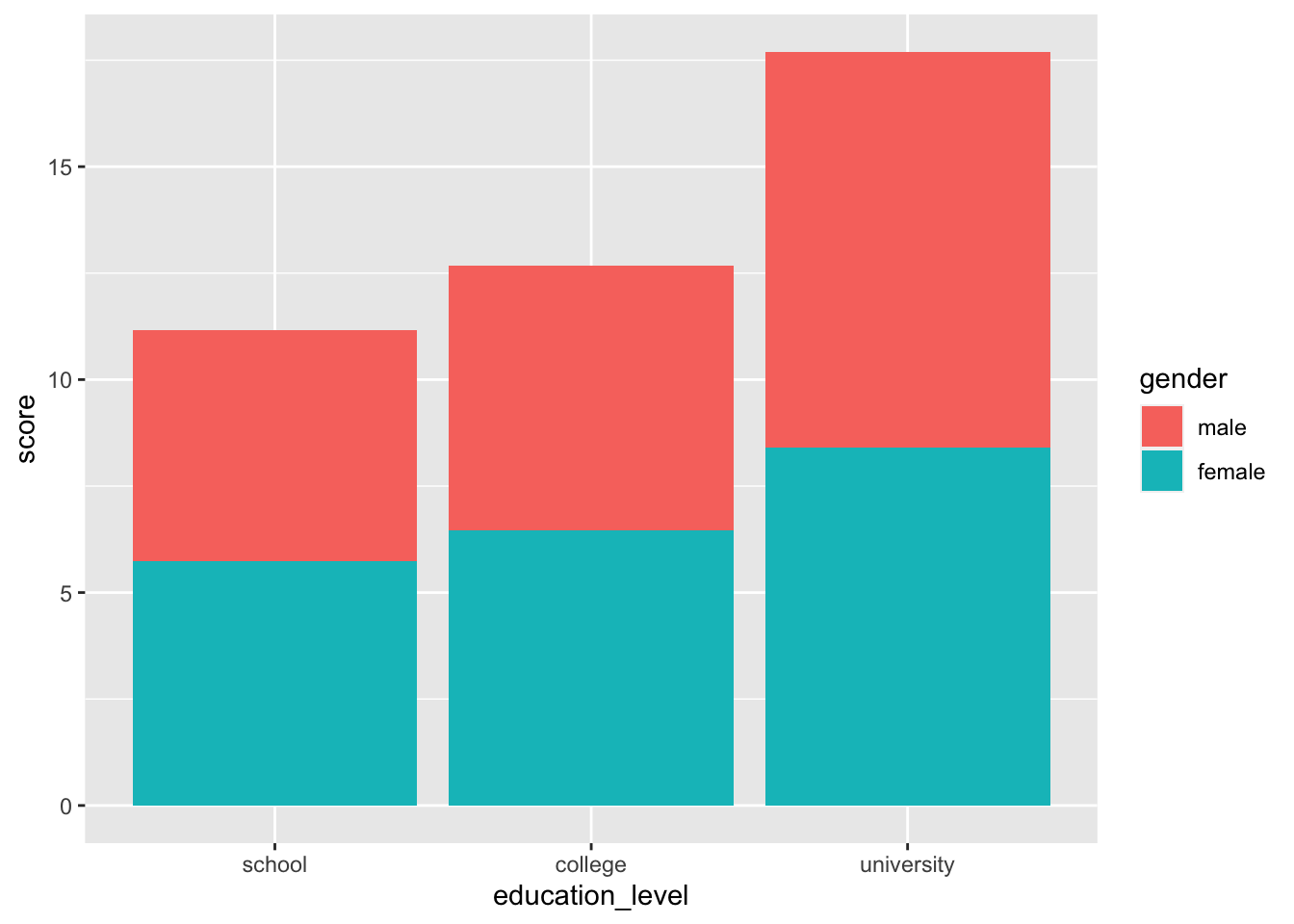
2要因の場合
# 集合棒グラフ
ggplot( job, aes( x = education_level, y = score, fill = gender ) ) +
    stat_summary( fun.y = "mean", geom = "bar", position = position_dodge() )

# 積み上げ棒グラフ
ggplot( job, aes( x = education_level, y = score, fill = gender ) ) +
    stat_summary( fun.y = "mean", geom = "bar", position = position_stack() )
16.6.2 装飾を加えた例
1要因の場合
# 色分け
ggplot( job, aes( x = education_level, y = score, fill = education_level ) ) +
stat_summary( fun.y = "mean", geom = "bar" )
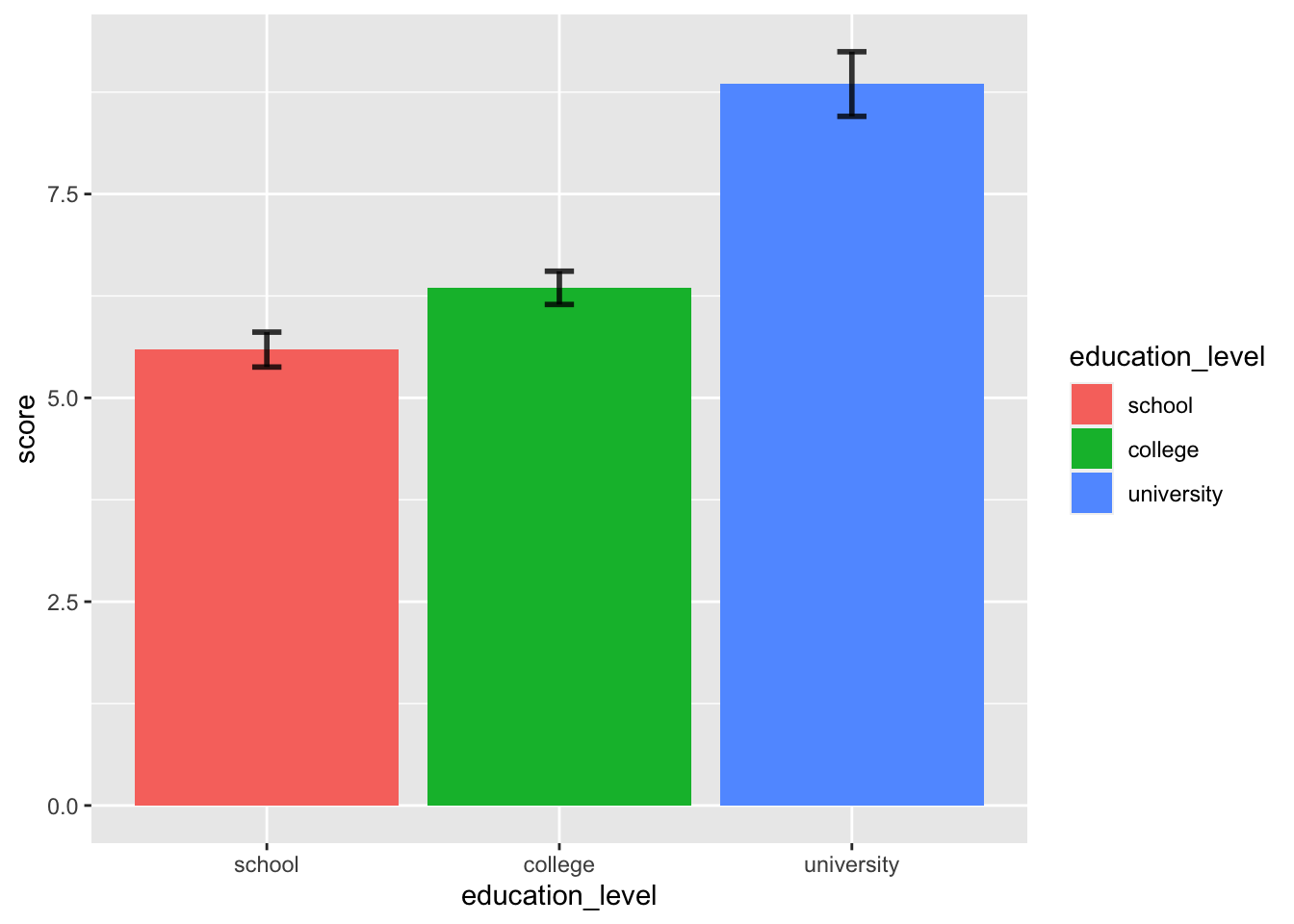
# エラーバーを追加
ggplot( job, aes( x = education_level, y = score, fill = education_level ) ) +
stat_summary( fun.y = "mean", geom = "bar" ) +
stat_summary( fun.data = mean_cl_normal, geom = "errorbar",
alpha = 0.8, size = 1, width = 0.1 )
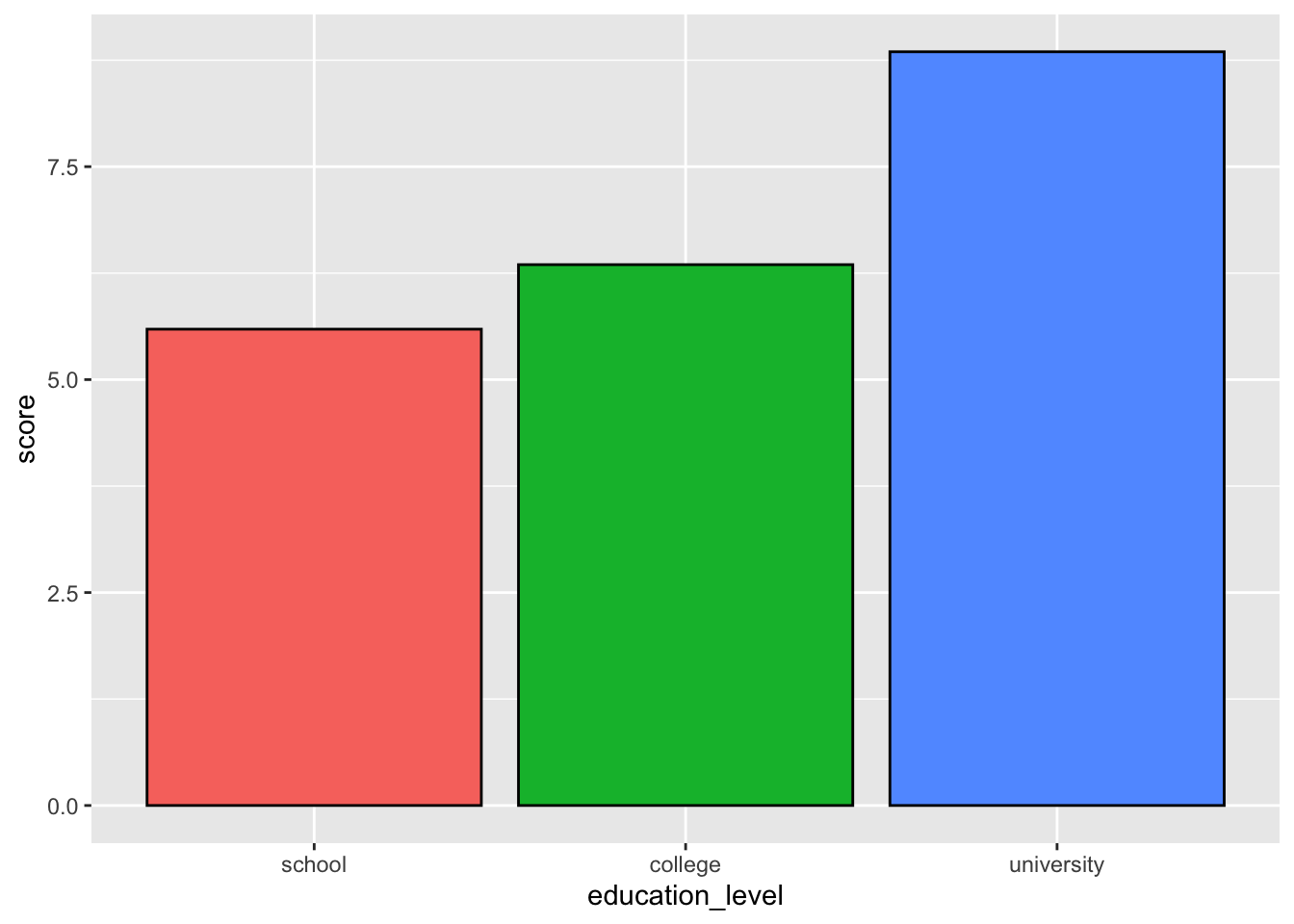
# 凡例を消す、棒の枠線を追加
ggplot( job, aes( x = education_level, y = score, fill = education_level ) ) +
stat_summary( fun.y = "mean", geom = "bar", color = "black" ) +
theme( legend.position = "none" )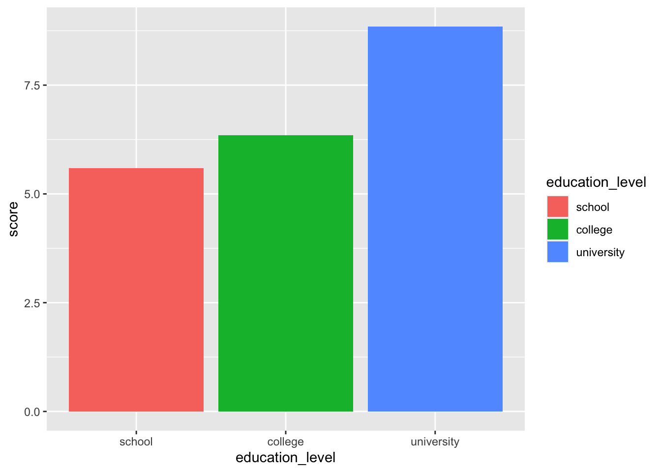
2要因の場合
# 棒だけ
ggplot( job, aes( x = education_level, y = score, fill = gender ) ) +
stat_summary( fun.y = "mean", geom = "bar", position = position_dodge() )
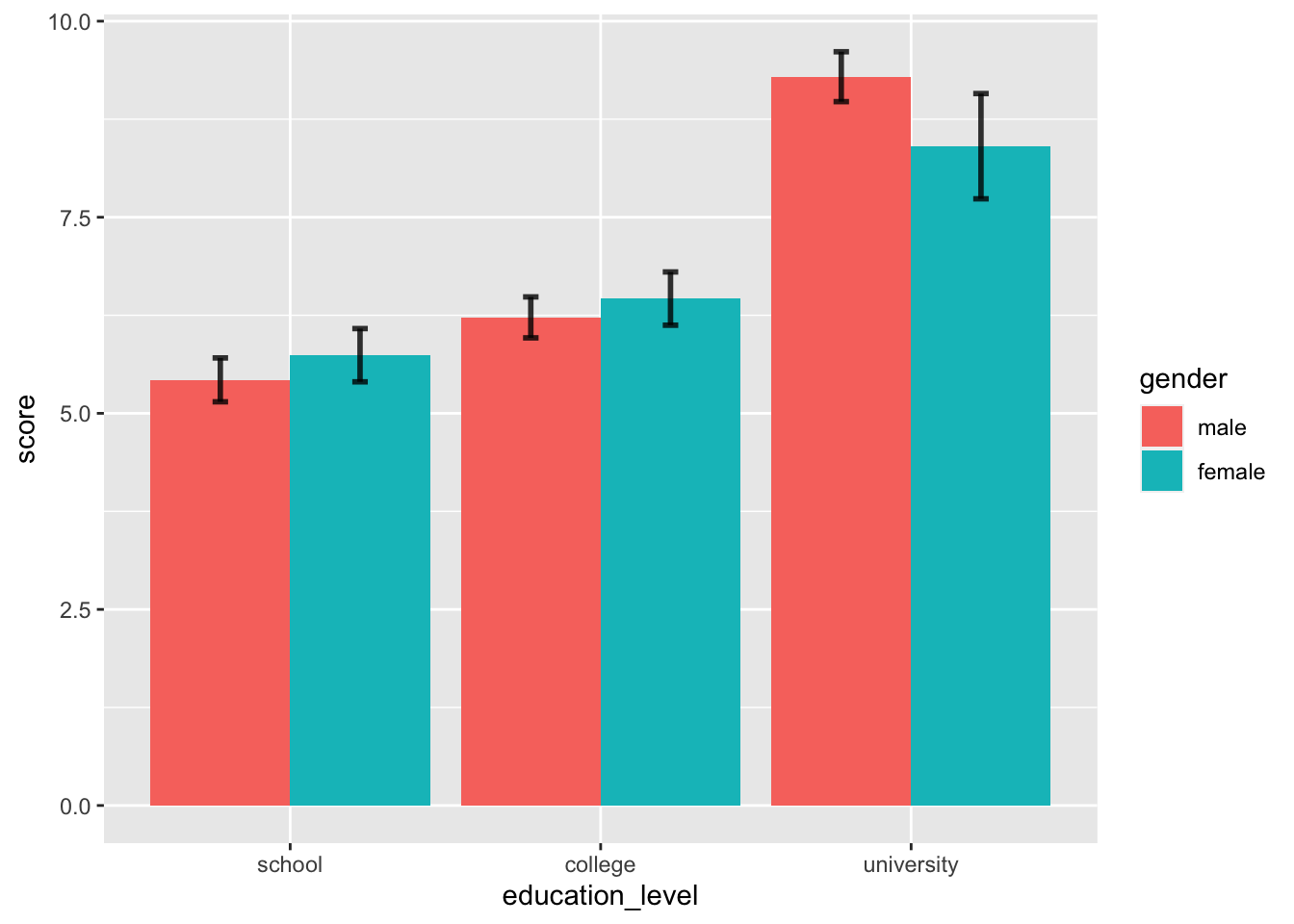
# エラーバーを追加
ggplot( job, aes( x = education_level, y = score, fill = gender ) ) +
stat_summary( fun.y = "mean", geom = "bar", position = position_dodge() ) +
stat_summary( fun.data = mean_cl_normal, geom = "errorbar", alpha = 0.8, size = 1,
width = 0.1, position = position_dodge( width = .9 ) )
# 色を変更
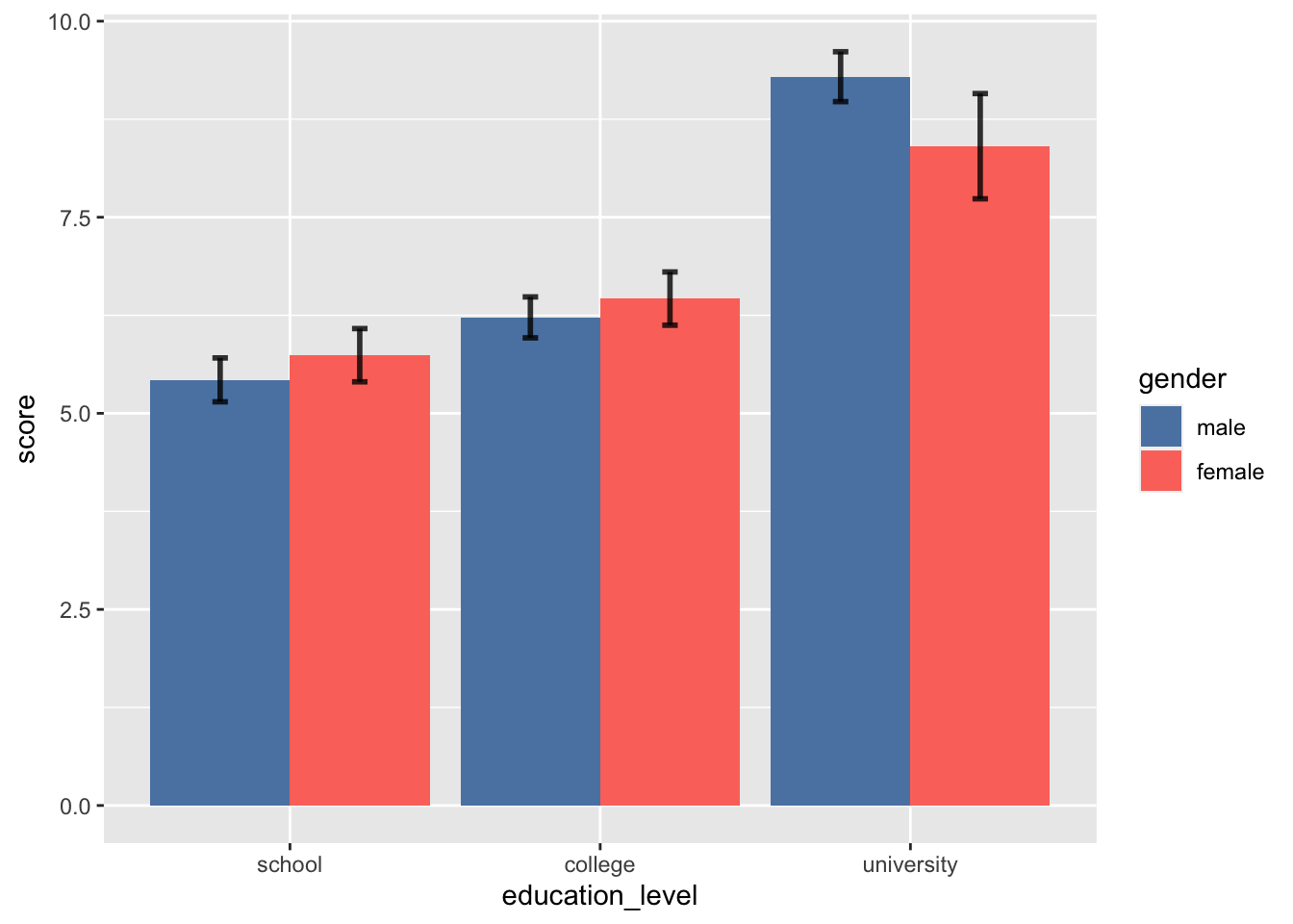
ggplot( job, aes( x = education_level, y = score, fill = gender ) ) +
stat_summary( fun.y = "mean", geom = "bar", position = position_dodge() ) +
stat_summary( fun.data = mean_cl_normal, geom = "errorbar", alpha = 0.8, size = 1,
width = 0.1, position = position_dodge( width = .9 ) ) +
scale_fill_manual( values = c( "#5B84B1FF", "#FC766AFF" ) )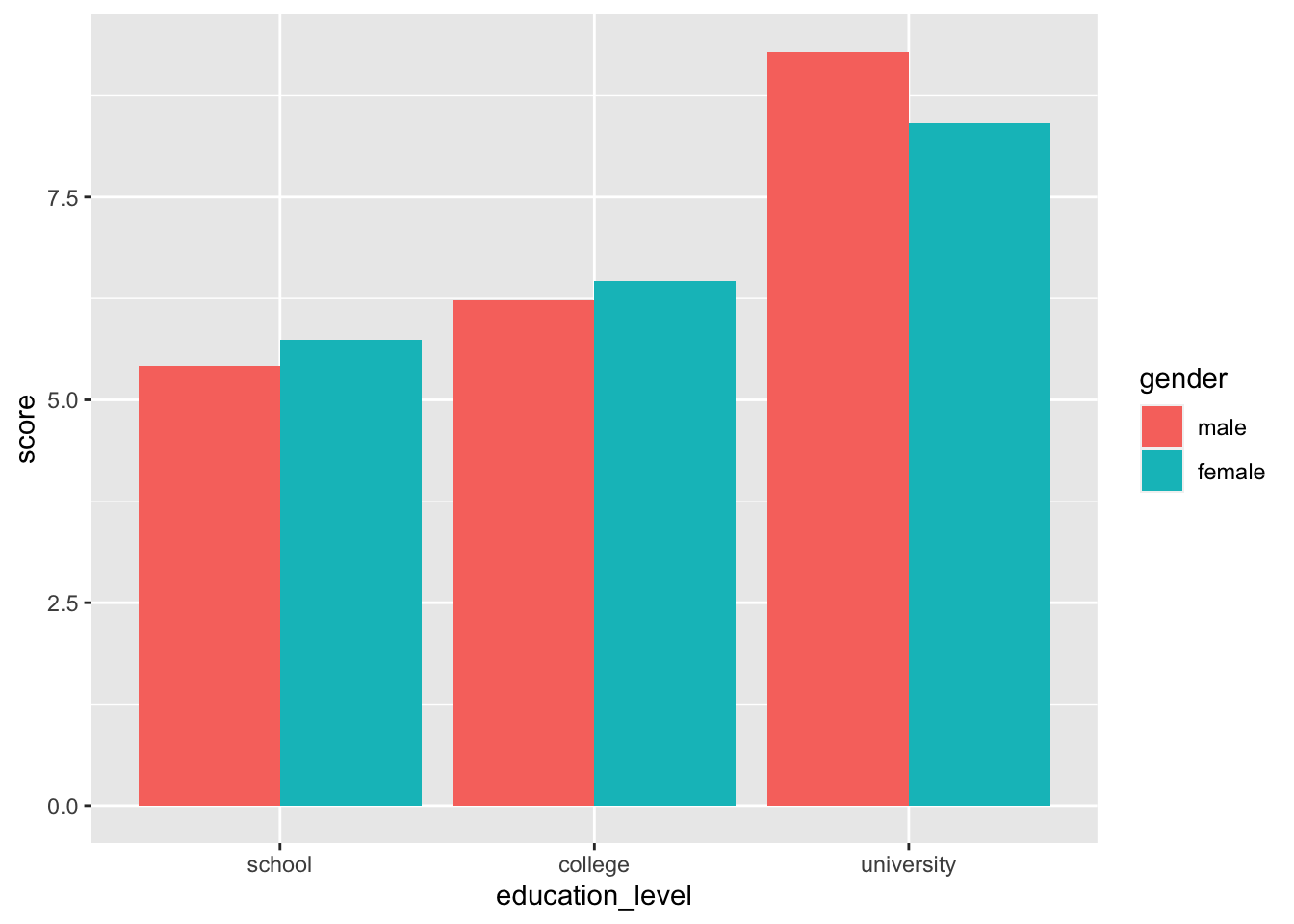
16.6.3 発表用
library( cowplot )
library( RColorBrewer )

ggplot( job, aes( x = education_level, y = score, fill = gender ) ) +
    stat_summary( fun.y = "mean", geom = "bar", position = position_dodge() ) +
    stat_summary( fun.data = mean_cl_normal, geom = "errorbar",
        alpha = 0.7, size = 1, width = 0.2, position = position_dodge( width = 0.9 ) ) +
    scale_y_continuous( limits = c( 0, 12 ), breaks = 0:4 * 3, expand = c( 0, 0 ) ) +
    theme_cowplot( 26 ) +
    scale_fill_manual( values = c( "#5B84B1FF", "#FC766AFF" ) ) +
    xlab( "Education level" ) +
    ylab( "Score" )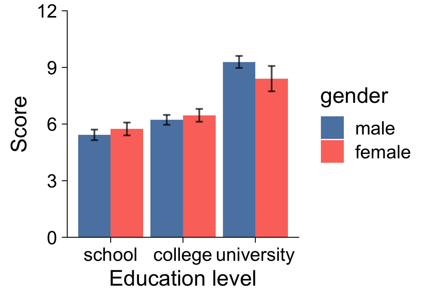
16.7 折れ線グラフ
16.7.1 最小限の要素のみ
1要因の場合
ggplot( job, aes( x = education_level, y = score ) ) +
    stat_summary( fun.y = "mean", geom = "line", group = 1 )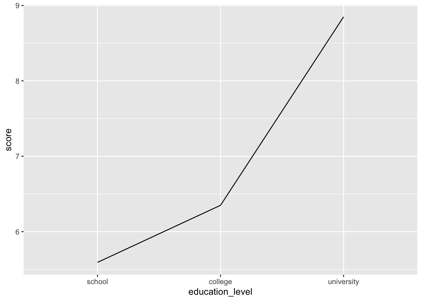
2要因の場合
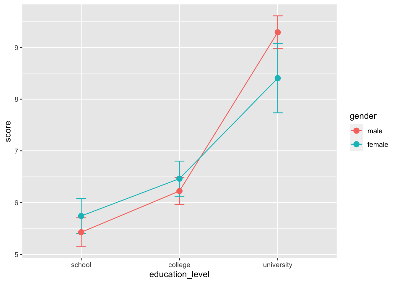
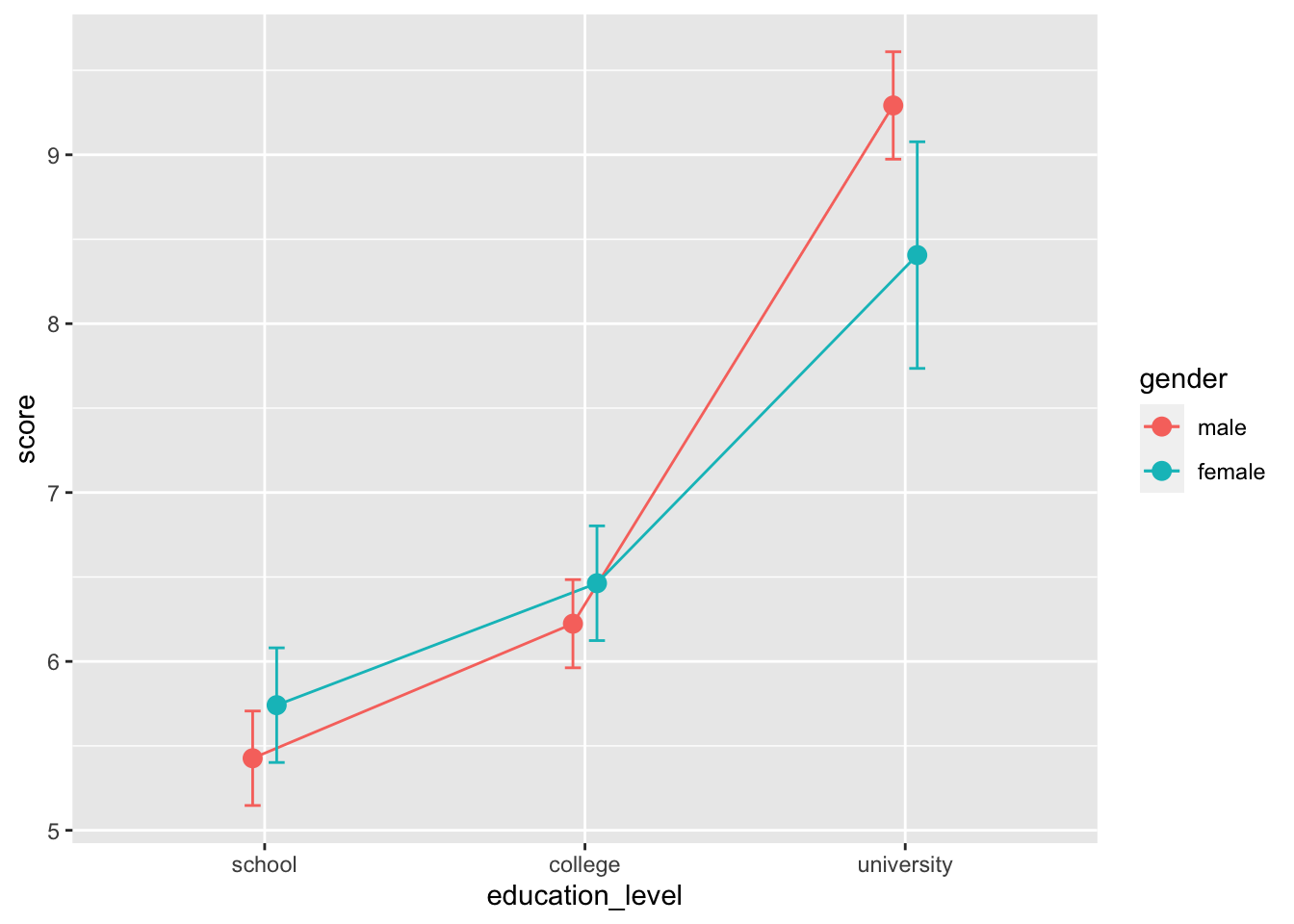
# 線だけ
ggplot( job, aes( x = education_level, y = score, color = gender, group = gender ) ) +
    stat_summary( fun.y = "mean", geom = "line" )

# 点とエラーバーを追加
ggplot( job, aes( x = education_level, y = score, color = gender, group = gender ) ) +
    stat_summary( fun.y = "mean", geom = "line" ) +
    stat_summary( fun.data = mean_cl_normal, geom = "errorbar", width = 0.1 ) +
    stat_summary( fun.y = "mean", geom = "point", size = 3 )

# ずれを追加
pd = position_dodge( width = 0.15 )
ggplot( job, aes( x = education_level, y = score, color = gender, group = gender ) ) +
    stat_summary( fun.y = "mean", geom = "line", position = pd ) +
    stat_summary( fun.data = mean_cl_normal, geom = "errorbar", width = 0.1, position = pd ) +
    stat_summary( fun.y = "mean", geom = "point", size = 3, position = pd )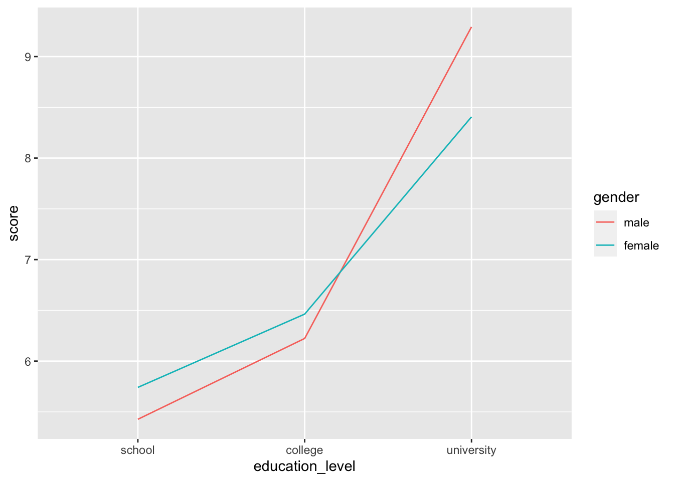
16.7.2 発表用
pd = position_dodge( width = 0.15 )
ggplot( job, aes( x = education_level, y = score, color = gender, group = gender ) ) +
    stat_summary( fun.y = "mean", geom = "line", size = 1.2, position = pd ) +
    stat_summary( fun.data = mean_cl_normal, geom = "errorbar",
        alpha = 0.8, size = 1, width = 0.2, position = pd ) +
    stat_summary( fun.y = "mean", geom = "point", size = 3.5, position = pd ) +
    scale_y_continuous( limits = c( 4, 10 ), breaks = 2:6 * 2, expand = c( 0, 0 ) ) +
    theme_cowplot( 26 ) +
    scale_colour_manual( values = c( "#5B84B1FF", "#FC766AFF" ) ) +
    xlab( "Education level" ) +
    ylab( "Score" )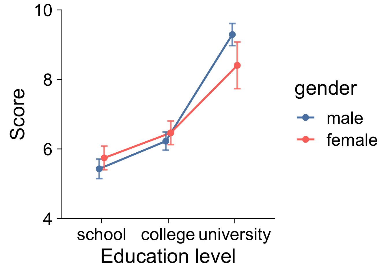
16.8 箱ひげ図
16.8.1 最小限の要素のみ
boxdata = function( x ) {
    v = c( min(x), quantile(x, 0.25), mean(x), quantile(x, 0.75), max(x) )
    names( v ) = c( "ymin", "lower", "middle", "upper", "ymax" )
    v
}

ggplot( job, aes( x = education_level, y = score, group = education_level ) ) +
    stat_summary( fun.data = boxdata, geom = "boxplot" ) +
    geom_jitter( width = 0.1, size = 3, alpha = 0.3 )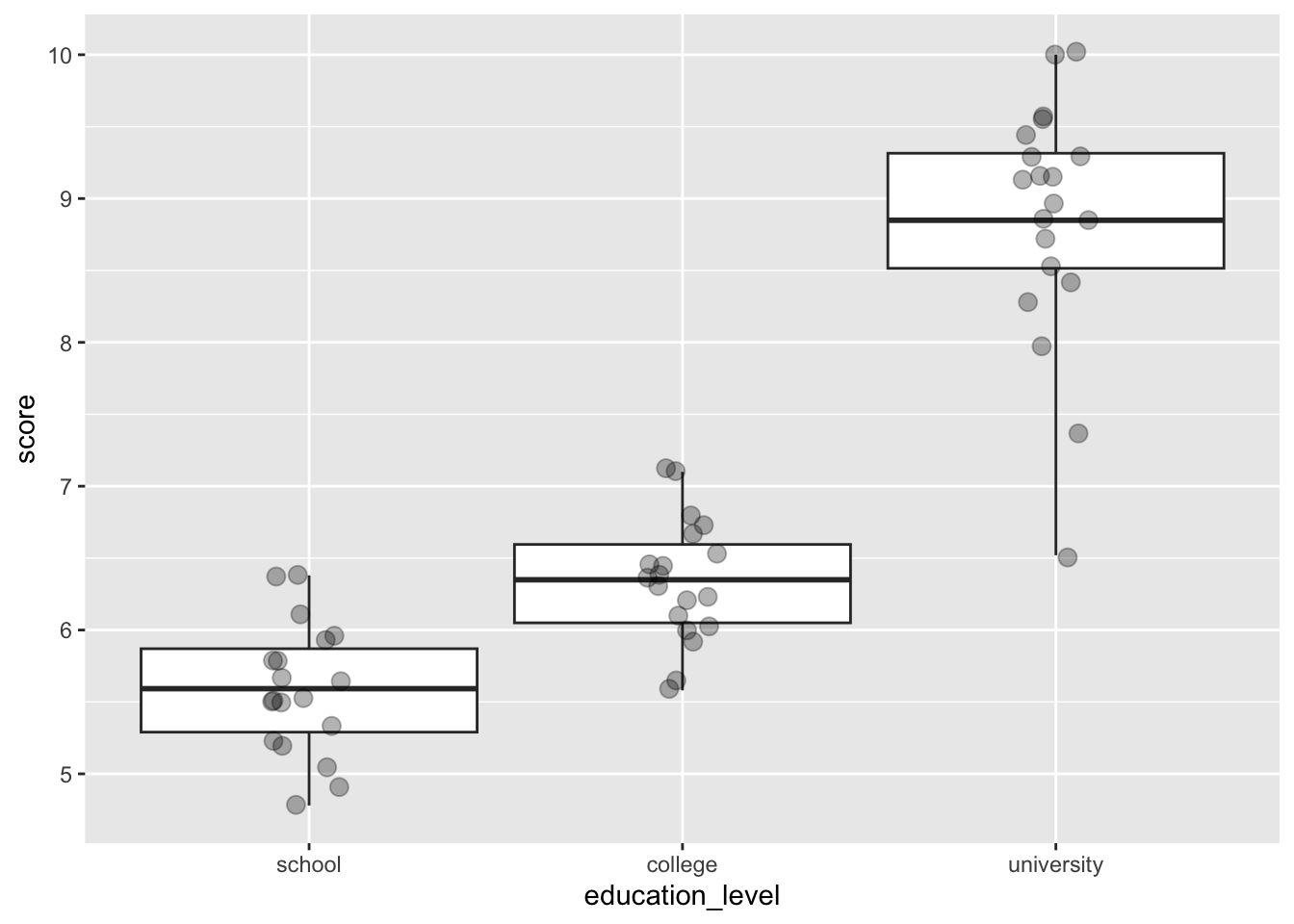
http://qaru.site/questions/17186121/ggplot-geomboxplot-middle-aes-no-effect
16.8.2 発表用
library( cowplot )
library( RColorBrewer )

boxdata = function(x) {
    v = c( min(x), quantile(x, 0.25), mean(x), quantile(x, 0.75), max(x) )
    names( v ) = c( "ymin", "lower", "middle", "upper", "ymax" )
    v
}

ggplot( job, aes( x = education_level, y = score, fill = education_level ) ) +
    stat_summary( fun.data = boxdata, geom = "boxplot", width = 0.5, lwd = 0.7 ) +
    geom_jitter( shape = 21, width = 0.1, size = 2, alpha = 0.7, stroke = 1, aes( fill = education_level) ) +
    scale_y_continuous( limits = c( 4, 12 ), breaks = 1:6 * 2, expand = c( 0, 0 ) ) +
    xlab( "Education level" ) +
    ylab( "Score" ) +
    theme_cowplot( 26 ) +
    scale_fill_brewer( palette = "YlGnBu" ) +
    scale_color_brewer( palette = "YlGnBu" ) +
    theme( legend.position = "none" )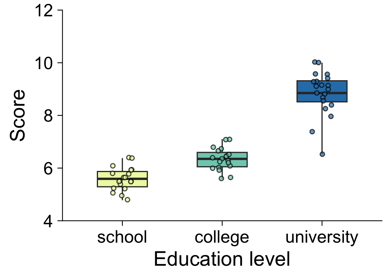
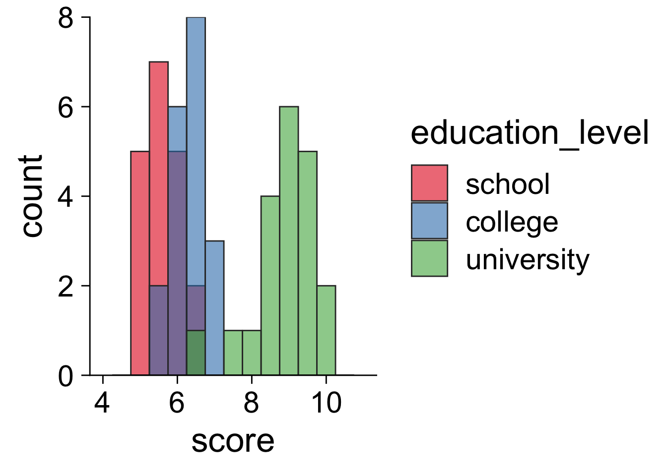
16.9 ヒストグラム
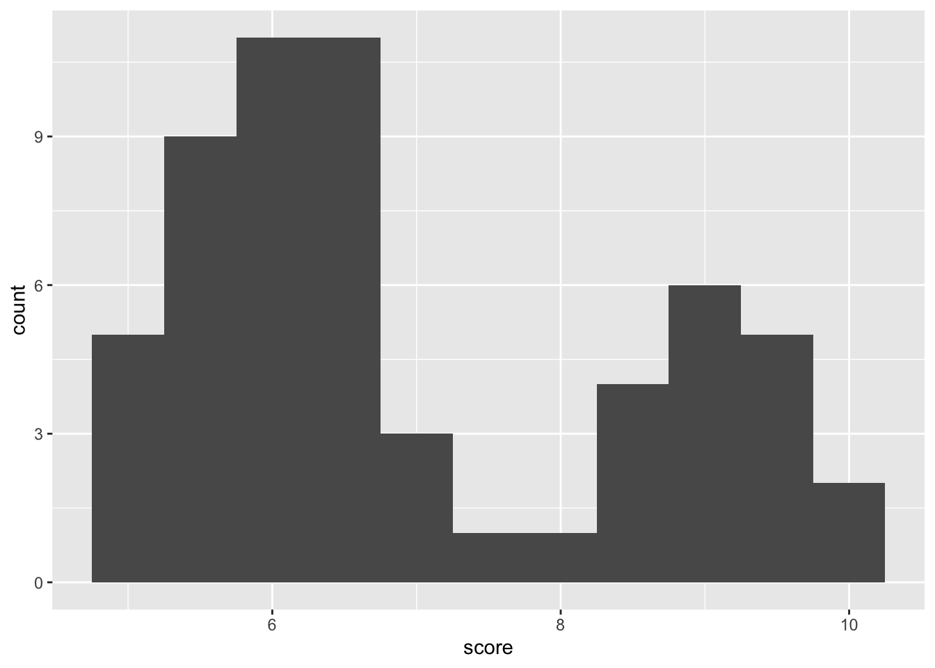
16.9.2 発表用
library( cowplot )
library( RColorBrewer )
ggplot( job, aes( x = score, fill = education_level ) ) +
    geom_histogram( binwidth = .5, color = "gray20", alpha = .6, position = "identity" ) +
    scale_y_continuous( limits = c( 0, 8 ), breaks = 0:4 * 2, expand = c( 0, 0 ) ) +
    scale_x_continuous( limits = c( 4, 11 ), breaks = 2:5 * 2 ) +
    theme_cowplot( 26 ) +
    scale_fill_brewer( palette = "Set1" )